December 2023
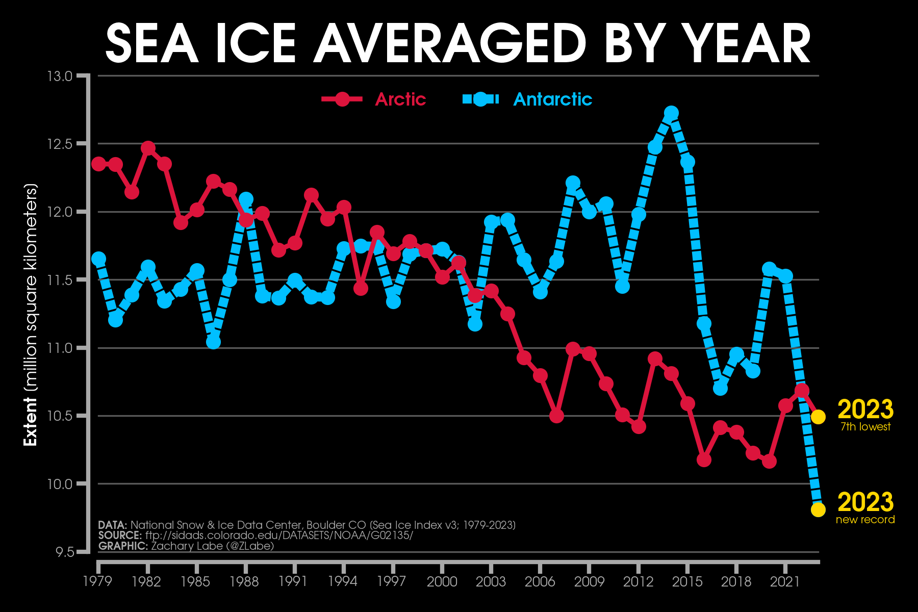
Hello! My last ‘climate viz of the month’ blog for ‘2023’ is short and simple. It describes a timeseries visualization in the form of a line graph that compares annual mean Arctic sea-ice extent and annual mean Antarctic sea-ice extent. For example, this means that all 12 months in 1979 are averaged together to calculate the annual mean for that specific year. This timeseries begins in 1979, since this is the start of the consistent passive microwave satellite record. Yes, there are scattered data collections of other satellite information available from the 1960s and 1970s using NASA’s Nimbus program, but it is inconsistent in both time and space. In other words, we do not have enough data from this record to reasonably calculate annual means for the pan-Arctic. There are, however, other reconstructions of sea-ice extent (and volume/thickness) prior to 1979, which have their own uncertainties, and you can compare some of these visualizations on my other polar climate change page: https://zacklabe.com/arctic-sea-ice-figures/. I just finished updating most of these graphs with data through 2023. Feel free to use and share these graphs anytime.
Okay, back to this month’s visualization. This sea ice graph compares our two polar regions, which clearly display some substantially different characteristics in terms of their trends and year-to-year variability. Note that although there are a few studies that attempt to identify linkages between the poles, such as indirect responses to tropically-forced teleconnections, the mean weather and climate patterns between the two poles are mostly distinct and unrelated. This is especially due to the distribution of land versus ocean. The Arctic is an ocean surrounded by land, and the Antarctic is a high-elevation land mass (ice sheet) surrounded by ocean.
The thin, solid red line shows data for the Arctic, which reveals a statistically significant long-term decreasing trend. This is due to decreases in sea ice that are now observed in all months of the year (Stroeve and Notz, 2018). There are also short-term periods of greater sea-ice loss (e.g., 2000-2012) and years of slower ice decline (e.g., 2013-present). This is totally expected and consistent with our understanding of natural climate variability. While we know that the long-term trend is downward due to the influence of human-caused climate change, natural/internal climate variability on interannual to multi-decadal timescales can act to either accelerate or reduce the rate of this long-term trend (see this bouncing ball analogy). There is plenty of research in recent years that discusses this point, and the phenomenon is well simulated by global climate models (Swart et al. 2015). Despite occasional outlandish media headlines/predictions, this natural variability is also another reason that we cannot narrow down the timing of a potentially ice-free summer in the Arctic. As I have discussed in previous blogs, my view is that this range of uncertainty in the future projections of Arctic sea ice can be a decade or more (see my Twitter thread). Overall, 2023 was effectively tied for the 7th lowest annual mean Arctic on record, and yes, we are currently in one of these temporary slowdown periods in the rate of ice loss particularly for the summertime minimum. However, the current records for the lowest yearly averages are a virtual tie between 2016 and 2020.
On the other hand, the Antarctic timeseries, which is shown with a dashed blue line, is quite peculiar. Through 2015, there was a small, but steadily increasing trend in Antarctic sea-ice extent. Plenty of papers have investigated the cause of this increase and proposed a wide range of physical mechanisms (e.g., response to changes in ozone, changes in subsurface ocean heat/convection, variability in the Southern Annular Mode, teleconnections from tropical sea surface temperature anomalies, freshening of the Southern Ocean, and more), but substantial uncertainties remain. Some of these mechanisms are related to internal/natural climate variability, but others are related to human-induced changes (i.e., indirect responses to external forcings). Then, in 2016, we observed a dramatic shift to a lower sea ice regime in the Antarctic (Parkinson, 2019). This was further amplified in 2023 with historic losses of Antarctic that clearly contributed to the lowest level of yearly Antarctic sea-ice extent in the satellite record. The previous record low was in 2017 (annual mean). Of course, there are several natural questions that arise from this shift in the last 5+ years, especially for what physical drivers led to this unprecedented low in 2023. I discussed some of this in a previous blog (see under June 2023), and despite a few more months of data points and subsequent analysis/research, we still don’t really know. While research is ongoing, we do not know whether this is part of a permanent shift to a lower sea ice regime in the Antarctic or whether this is part of multidecadal variability driven by internal oscillations of the atmospheric and/or oceanic circulations. Due to these two distinct periods, and questions regarding changes in the variance that I will leave for another day, there is no obvious long-term trend (or cause) in Antarctic sea-ice extent when looking at the full 1979-2023 record.
Global climate models do predict a decrease in Antarctic sea-ice extent with future climate warming, but I will point out that they have also generally struggled with simulated observed variability, trends, and the mean state (i.e., capturing the real-world distribution of the ice cover) (Roach et al. 2020). Understanding and predicting changes in Antarctic sea ice will continue to be one of the big challenges for climate scientists over the next 5-10 years and beyond.
As for last month, temperatures were the 2nd warmest on record in the Arctic according to ERA5 reanalysis. This warmth was particularly amplified across north-central North America that extended toward the Arctic Ocean and into the Laptev and Kara Seas region. However, sea-ice levels did not clearly reflect this warmth. Remember, it is still extremely cold in the Arctic during winter, so temperature departures do not necessarily correlate to lower sea ice. In fact, using the JAXA dataset, daily sea-ice extent briefly rose above the 2000s decadal average for the first time in over a decade during a time in early January 2024. This is particularly due to northerly winds contributing to ice growth/expansion in several outer margins of the Arctic (e.g., the Greenland Sea and Sea of Okhotsk). This is weather-related and quite an interesting contrast relative to the warmth across many areas of the globe over the last few months. I am planning to discuss the circulation drivers of this sea-ice growth in a future blog, though remember that this variability on daily and weekly timescales scales says absolutely nothing about changes in the direction of the long-term trend. It is instead another reminder about how critical it is to account for local and regional weather patterns, even in a warming world. I am sure that everyone in central North America would especially agree after this week’s brutal winter cold.
November 2023
Welcome! My next ‘climate viz of the month’ describes a recent extreme event in the Arctic, which is related to the evolution of 2023’s sea ice refreeze around the Hudson Bay basin. The first line graph shows daily sea-ice extent in the Hudson Bay for every year available from the temporarily-consistent passive microwave satellite record. This dataset begins in 1978/1979. The Hudson Bay observes a sharp seasonal cycle. In other words, there are very distinct melt and freeze seasons. During the wintertime, the entire basin freezes over with ice. This continues to occur even in our warmer world, and for this reason, all of the lines meet at the top of the graph in a straight horizontal line from about late December to mid-April. Then, as air temperatures begin to quickly warm with increasing solar insolation in boreal spring, we see a corresponding rapid decline in ice coverage over the basin. Conditions then become effectively ice-free in most years by September. This extensive area of open water is short-lived, and the refreeze starts back up by October. In fact, the rate of refreeze is usually so fast that the Hudson Bay basin becomes almost completely ice-covered in just around one month’s time.
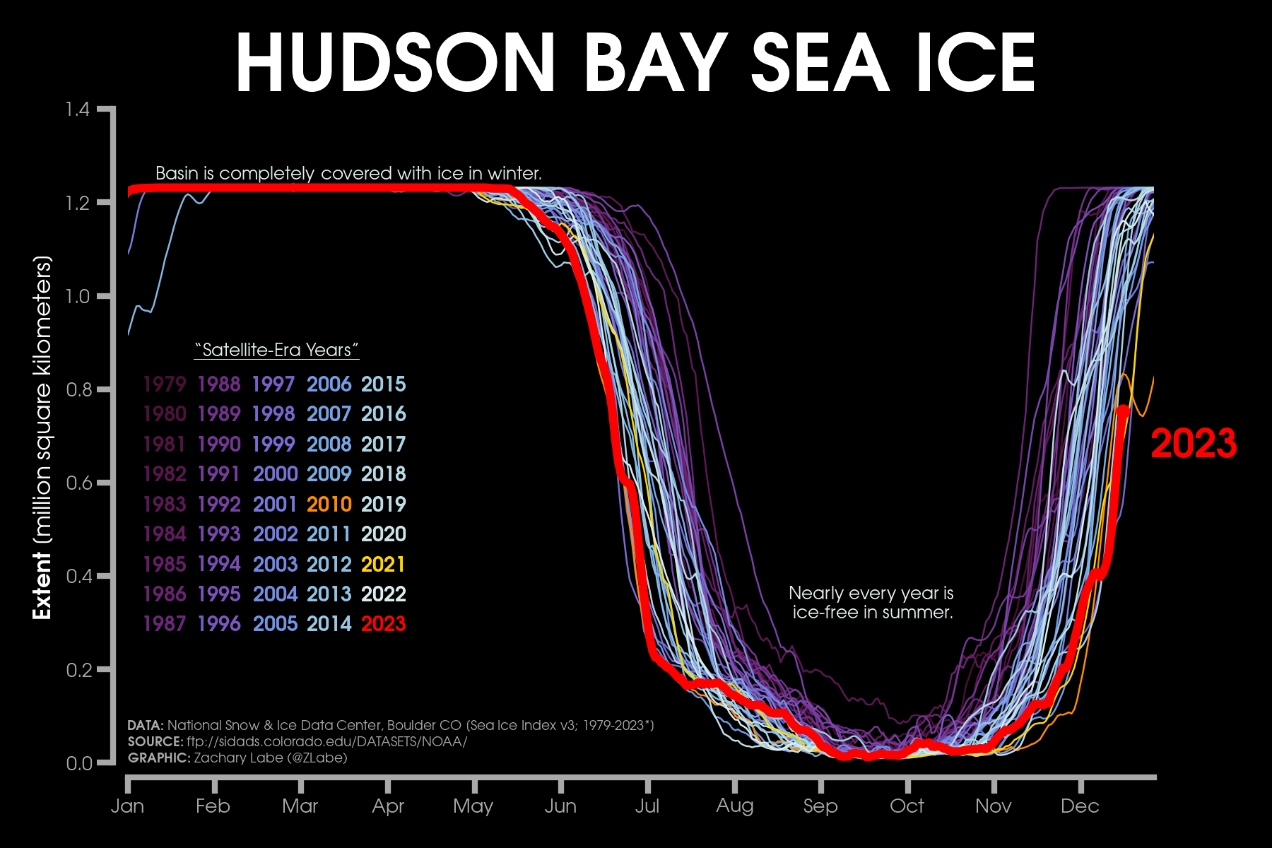
However, due to long-term climate warming, we are observing changes in the characteristics of Hudson Bay sea ice. The length of the melt season is becoming longer. This is related to both an earlier start to melt in spring and a later refreeze in autumn. You can observe these long-term trends in sea-ice extent by considering the color of the individual lines. The older years are in purple (e.g., the 1980s), and the more recent years are shaded in white (e.g., the 2010s). There is also significant year-to-year variability, which is related to the influence of regional weather conditions, but in general you can see that purple lines are positioned inward corresponding to the shorter/colder melt season. For a more clear depiction of monthly trends over the satellite-era for the Hudson Bay, I recommend checking out this interactive bar graph: https://www.ncei.noaa.gov/access/monitoring/regional-sea-ice/extent/Hudson/11. There are no long-term trends in wintertime sea-ice extent in the Hudson Bay because temperatures still fall persistently well below freezing every winter. Yes, a winter in northern Canada is still absurdly cold even though the Arctic is warming more than three times faster than the global average…
The red line on this graph shows daily sea-ice extent for 2023 in the Hudson Bay, which observed an early start to the melt season in June with near-record low ice conditions. This was related to historic warmth from an expansive upper-level ridge of high pressure over northern Canada. Remember all of the wildfires that initiated in early summer? In fact, coastal regions around the Hudson Bay observed May and June temperature departures at more than 6°C above the 1981-2010 average according to ERA5 reanalysis. June snow cover over North America was also a historic low. As expected, the basin then became effectively open water by September. However, the reason for this blog is associated with the freeze-up over the last few weeks, which is one of the latest on record. In fact, ice charts from the Canadian Ice Service show that sea-ice coverage across the broader region of northeastern Canada, including the Hudson Bay and surrounding areas, is the lowest on record for the last week. Ice coverage in this region is only about 30%, compared to the more typical 60% for this time of year.
Meteorological conditions related to surface winds and air temperatures (e.g., warm southerly winds versus cold northwesterly winds) are some of the primary drivers of sea-ice variability in the Hudson Bay region. Looking over the last several weeks, temperatures have been well above average across nearly all of northern Canada. Northern parts of the Hudson Bay basin around Foxe Basin were actually up to 8°C above the 1981-2010 average in November 2023. High-resolution ice charts from the Canadian Ice Service documented that the freeze-up in Foxe Basin and the northern Hudson Bay region was about 2-3 weeks late this year. Looking at the previous line graph, sea-ice levels this year are close to 2021 in terms of sea-ice extent. If you are wondering about that strange dip for one year in December, that was 2010, and you can read more about those conditions in articles from the National Snow and Ice Data Center (NSIDC) for November and December of that year.
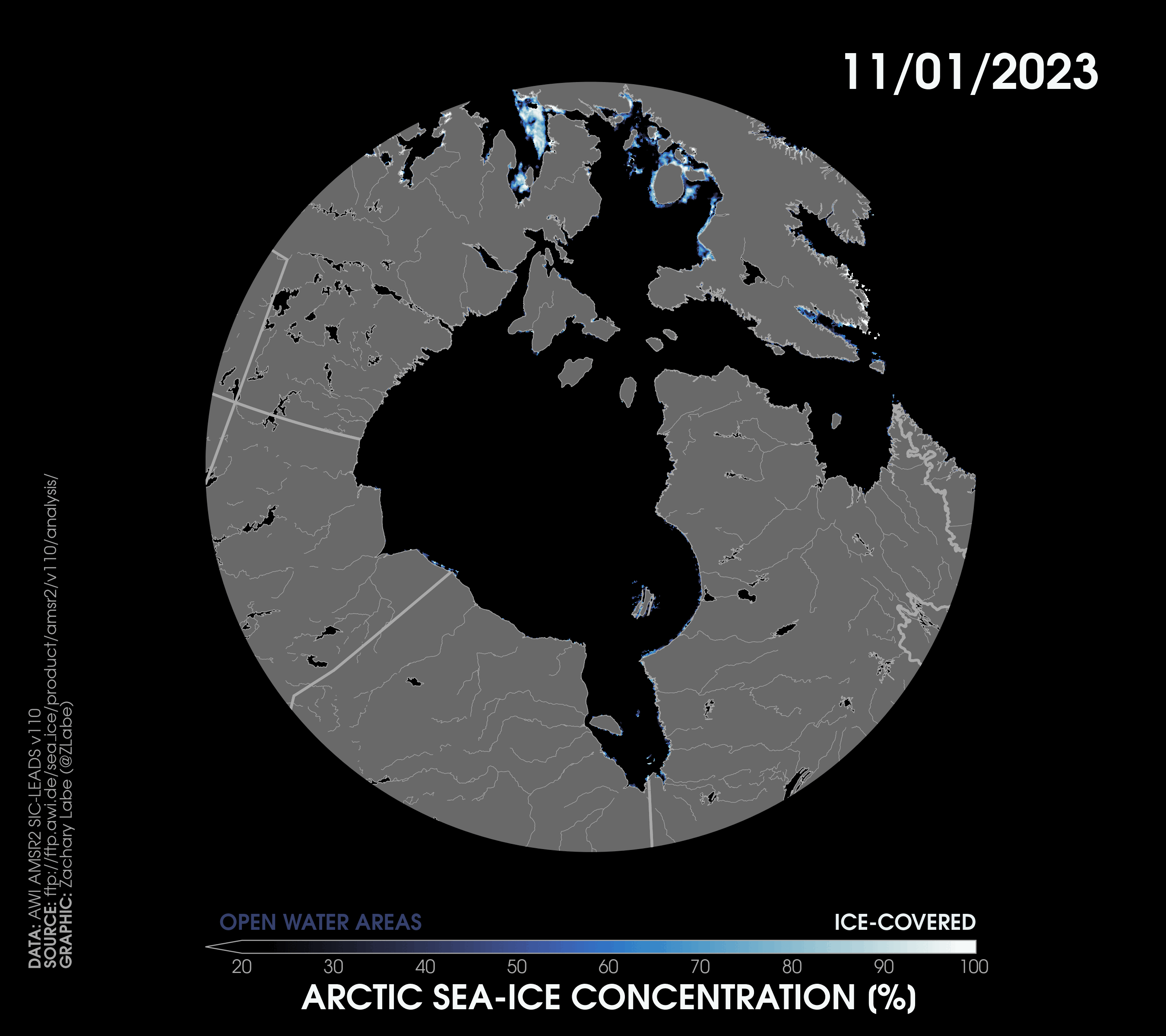
The next visualization for this month’s blog shows a daily animation of Arctic sea-ice concentration using the high-resolution (3 km) AMSR2 satellite instrument from November 1 to December 17. Note that there are some satellite-related artifacts along coastal regions that return false positive pixels of sea ice (you can mostly ignore these). From this animation, you can see the late start to the freeze-up that originates across the north and west before rapidly expanding eastward. For those tracking polar bears, you can see their eastward movement following this freeze-up progression too. Overall, ice concentration is missing or is at least well below average for this time of year across eastern areas extending up through the Hudson Strait and Davis Strait. See a clearer view of the spatial pattern of anomalies from Environment and Climate Change Canada.
Although there is significant interannual variability in ice conditions across northeastern Canada, climate models project a lengthening of the melt season for the Hudson Bay over the 21st century. If you are interested in understanding climate model’s simulation of Hudson Bay sea ice, such as some of their common biases, I recommend checking out this new study by Crawford et al. (2023). As documented in their study, variability in the mean large-scale circulation pattern (i.e., pattern of sea level pressure) is important for understanding yearly changes in Hudson Bay sea ice. These sea level pressure anomalies then project onto prevailing surface wind fields and thus warm/cold air advection. I want to emphasize that even though we do not expect every year will observe a longer melt season, the long-term trend is still generally clear.
Looking ahead, given that the freeze-up is finally underway, I expect that sea ice will continue to fill in across the Hudson Bay basin through the end of the year. However, the latest from numerical weather prediction models indicate that air temperatures will be well above average for at least the next week across nearly all of Canada. Not great for ice thickening!
Those who have been following me on social media for a long time know that I originally started my interest in science communication via weather blogging on Wunderground. My favorite blogs were of course those related to snow and winter weather. While I am certainly a bit rusty on weather forecasting compared to back in early college (when I was still interested in forecasting for the National Weather Service), I did want to point out here that I don’t really see any pattern change favorable for widespread Arctic blasts across the lower 48 United States for at least another 1-2 weeks or longer. The source region for any anomalous cold is just completely lacking across North America right now. This is also related to the extent of snow cover in North America, which is currently a record low for mid-December. I do not see this improving any time soon. Basically, snow cover is sorta missing across almost all of the northern United States right now…
In other Arctic-related news, the annual NOAA Arctic Report Card was released last week. You can find the full report at https://arctic.noaa.gov/report-card/report-card-2023/. I helped author the chapter on Arctic sea surface temperatures, where we document conditions around the end of each melt season. This year’s sea surface temperatures were unusually warm and consistent with the long-term trend, but no new records were set for the Arctic as a whole. The largest anomalies this year were found in the eastern Beaufort Sea around the Canadian Arctic and in the Kara Sea. If you are interested in some technical data details, we also documented some large differences found between two versions of OISST (v2 and v2.1), which actually impacts quantifying long-term trends in Arctic sea surface temperatures. In my opinion, more work is definitely needed on validating high-latitude sea surface temperatures. This also means for the Antarctic/Southern Ocean too.
Finally, while I have already briefly mentioned weather/climate conditions in the Canadian Arctic during November 2023, this warmth was not restricted to just there. Temperatures were more than 5°C above the 1981-2010 average for almost the entire land region surrounding the Arctic Ocean. The only location of colder anomalies was near the Greenland Sea and Fram Strait, which was unfortunately due to some ice export and relatively thicker/older ice precariously close to leaving the Arctic. Not good! There were some minor differences in rankings between geographic region and observational datasets, but overall temperatures were the 2nd warmest on record for the Arctic Circle in November (ERA5). The long-term November trend is quite striking in the graphic below. Sea-ice extent and sea-ice volume were less memorable, but still within the top 10 lowest on record since at least 1979. Like I have been pointing out for several months now, the ice thickness distribution continues to look unfavorable due to a large east-west dipole in anomalies with the (relative) thicker ice remaining near Cape Morris Jesup, Greenland and the Fram Strait. Hopefully, we see a build-up of thicker ice for western areas later this winter. Stay tuned.
October 2023
Hello! We are now well underway into the season with the maximum rate of Arctic amplification (i.e., the warming trend relative to the globally-averaged surface air temperature). This time of year also corresponds to the largest losses of Arctic sea-ice thickness. So this ‘climate viz of the month’ focuses on looking at the long-term variability and decline in average October to November sea-ice thickness from the PIOMAS-20C and PIOMAS datasets using a mosaic-style graphic.
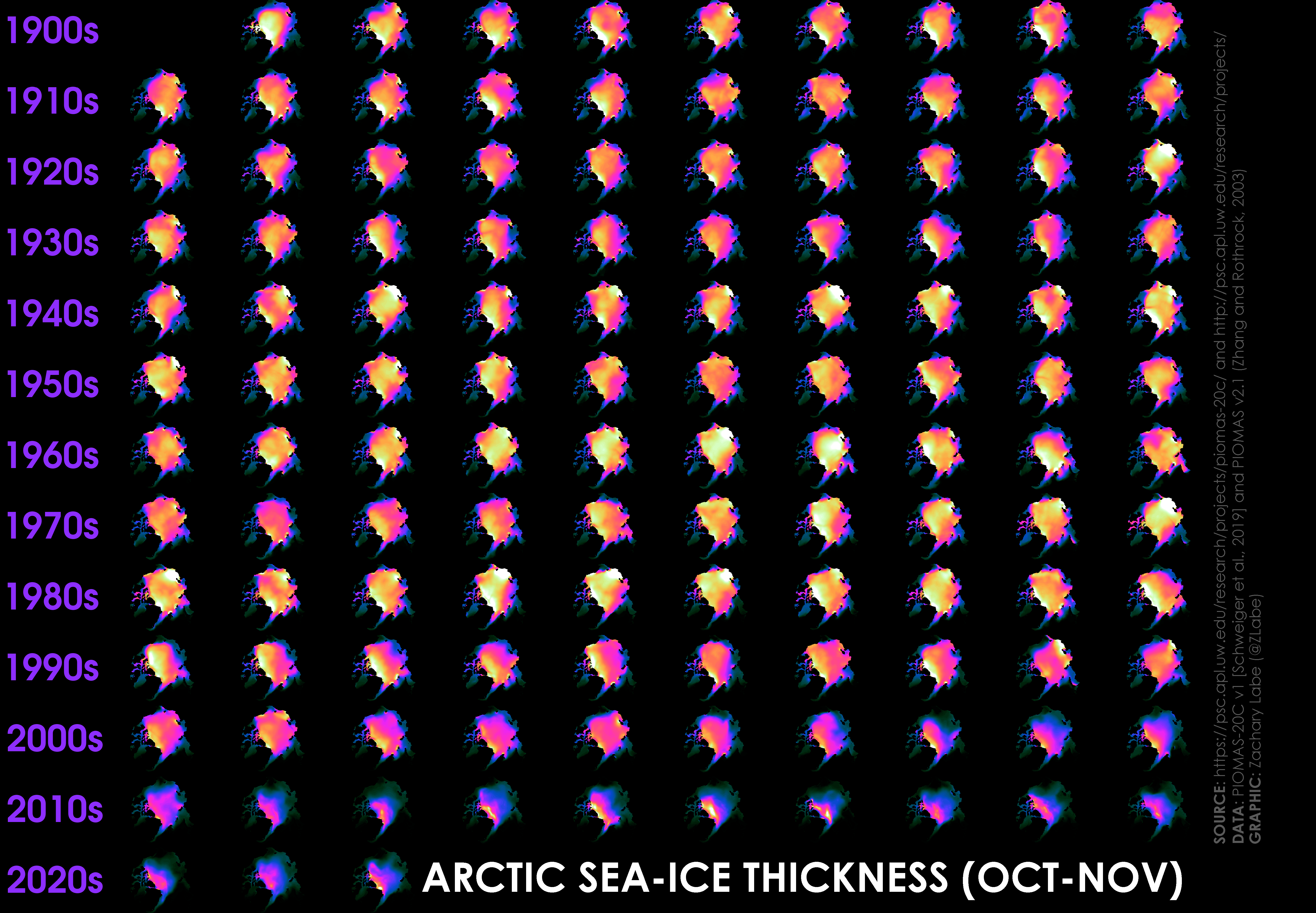
For this visualization, there are intentionally no units or labels, as I prefer to let color tell the main story. I definitely encourage you to click on the actual graphic, as the resolution will really improve. Each map is a polar stereographic view looking downward on the North Pole with Greenland and North America on the left-hand side. The prime meridian (0° longitude) is located at the bottom of each image. The colors show sea-ice thickness averaged over the months of October and November, and each one is scaled from 0 meters to a maximum of 3.5 meters (bright white shading; equivalent to about 11 feet). There are no anomalies here. It is just the raw data. Each row shows a decade from the 1900s to the 2020s. The first map (upper left corner) is for the year 1901, and the last map is for the year 2022. This dataset is assembled from PIOMAS-20C for the years from 1901 to 2010. PIOMAS (v2.1) dataset is then used for 2011-2022. This is not entirely ideal due to some very technical details (e.g., using ERA-20C to force PIOMAS-20C and NCEP-NCAR R1 to force PIOMAS which causes model mean state differences), but I won’t focus on those here. That is not the purpose of this blog theme. In the end, the takeaway points remain the same regardless – sea-ice thickness has observed multi-decadal variability over the last about 100 years, but there is a clear downward trend since the 1990s. This is due to mostly human-caused climate change. However, oceanic and atmospheric internal variability also have contributed to accelerating this decline prior to about 2012. In other words, internal climate variability can act to either accelerate or temporarily mask the long-term human-caused climate change trend. For example, we’ve observed little to no trend between around 2012 and present-day. The causes of this flattening of the sea-ice volume decline remain under investigation, but it likely relates to a winter thin ice growth feedback and, again, internal climate variability.
Another obvious feature of this graphic is the relatively lower ice thickness during the early 20th century (dark colors) compared to the mid 20th century (brighter colors). In particular, there was a period of remarkable Arctic warming during the 1930s (see https://zacklabe.com/arctic-temperatures/). I am planning to write an entire blog on this event in the next few months, so stay tuned. Although real-world observations are extremely limited during this early 20th century warming, I believe we can still learn a lot about future Arctic climate change by better understanding this causes of this other period of Arctic amplification. The documentation paper for PIOMAS-20C discusses this lower ice thickness period quite a bit too, and importantly notes that this was a relatively regional signal in comparison to something like the pan-Arctic thinning we see today. Note that the increases in ice thickness/volume then in the mid-20th century relate to sulphate aerosols and multi-decadal climate variability.
As some readers of my blog might have noticed, I tend to talk about this PIOMAS dataset quite a lot when referring to Arctic sea-ice thickness and volume. This might seem like a strange choice given that we now have multiple satellite-derived estimates of ice thickness (e.g., ICESat-2, CryoSat-2, SMOS). While these datasets continue to improve and lengthen in terms of their temporal record, they are still far too short to provide climate-scale information about long-term trends. This is especially an issue if we want to use a temporarily and spatially-consistent dataset. (Please note they have countless other highly important purposes, so be sure to continue their uninterrupted future support!!) And so, we are left with supplementing these satellite measurements with data from model products (reanalysis), like PIOMAS. Recently, I’ve written a summary of this dataset for the NCAR Climate Data Guide, so I highly recommend checking it out for some more information on its uncertainties, advantages, and limitations: https://climatedataguide.ucar.edu/climate-data/pan-arctic-ice-ocean-modeling-and-assimilation-system-piomas. Also, you can find monthly comparisons between PIOMAS and CryoSat-2 during the cold season at https://psc.apl.uw.edu/research/projects/arctic-sea-ice-volume-anomaly/. All in all, PIOMAS does quite well when resolving the spatial trends and variability that we have from a few submarine tracks, in situ measurements, and satellite estimates of ice thickness. Even higher uncertainties exist for the PIOMAS-20C reconstruction, but you can find this modeled product briefly evaluated in Schweiger et al. 2019.
In the end, my favorable data visualizations are almost always the ones that look like this. They really capture the essence of climate science and help us to uncover the signal and the noise of the Earth system. We see here that there is plenty of interannual to multi-decadal variability in Arctic sea-ice thickness, but clearly an unprecedented downward trend in the last few decades. To understand the consequences of future Arctic warming, we need to better understand this natural variability too. Lastly, I also like that these styles of visualizations (see a global temperature example by Dr. Ed Hawkins here) highlight that we don’t always need jargon and extensive labeling to communicate dense scientific information.
Simple colors alone can tell a powerful story.
There were no new ice or temperature records in the Arctic last month (October 2023). This was despite the fact that widespread warmth was observed across the entire Arctic Circle. Temperatures were even more than 5°C above the 1981-2010 average across large portions of the western Canadian Arctic Archipelago, Beaufort Sea, and central Siberia. The only temperatures that were below the 1981-2010 average in October were found across Scandinavia. Ice concentration was particularly low in the Beaufort and East Siberian Seas, which contributed to the anomalous warming. This relates to the transfer of heat from the warmer open ocean waters to the overlying colder atmosphere during the ice freeze-up process. Lastly, I continue to remain concerned about the thicker ice anomalies precariously close to the export region in the Fram Strait. Hints of this spatial pattern of anomalies are found in both PIOMAS and the CryoSat-SMOS Merged Sea Ice Thickness product (e.g., comparing 2023 to 2022). Though on a better note, total ice volume and mean thickness are not really that close to record low levels. As I have discussed before, large-scale synoptic variability (weather patterns) remains one of the largest drivers of sea ice anomalies in the Arctic. Heat transport can also be quite slow too. These are just a few of the reasons why we are not seeing the record climate anomalies in the Arctic despite the ones occurring in the global mean or in other geographic regions of our planet. I admit that I am a little biased, but I always recommend considering the current meteorological setup to understand ongoing conditions in the Arctic.
September 2023
Hi! It’s time for another ‘climate viz of the month’ blog, where we are going to be discussing Arctic warming. My graphic for this month is quite simple in design, but more challenging to interpret. I will try to walk you through it step-by-step. The subsequent line graph shows a simple index for Arctic amplification (AA; see Previdi et al. 2021 and Taylor et al. 2022), which is the basic concept that the Arctic is warming significantly faster than the global mean. Here, I am showing the effect of using different trend length periods when calculating a ratio for AA, which I am defining as the linear least squares trend of Arctic mean surface temperature divided by the linear least squares trend of global mean surface temperature. This is therefore a unitless ratio. As will be discussed more, I am focusing on only the months of October to December. I am also just showing data using Berkeley Earth from 1970-2022, so this index may be slightly different in other datasets due to larger temperature uncertainties in the Arctic.
The x-axis shows the starting year when calculating each trend period. For example, the dashed pink line shows the AA ratio when only considering 20-year periods, with the first value on the left representing the AA index over 1970-1989. The next data point is for the AA index from 1971-1990. The next point is for 1972-1991, and so forth… In contrast, the timeseries is too short to calculate many 50-year trend periods, so the last point on the solid bright red line is for the AA index over 1973-2022. The y-axis is the magnitude of the AA ratio itself.
As you probably noticed, the choice of the trend period can significantly affect the absolute magnitude of this AA index. There are countless ways to calculate an AA index. In this figure, the highest AA ratio can be found for a 20-year period starting in the mid-1990s, which reaches a peak of warming 9x faster than the globally-averaged trend. The longer 40- and 50-year periods are less sensitive to internal climate variability and hover around an AA value of 5 to 6. I experimented with 5-10 year length periods too, but the noise in the Arctic (i.e., climate variability) is just far too large for these values to be informative. I also recommend exploring data prior to 1970, as you will find another period of AA in the early/mid-19th century, but I will leave that blog for another day (see Hegerl et al. 2018).
All of this doesn’t even consider the sensitivity to the choice of dataset (e.g., ERA5 vs. HadCRUT5 vs …), regional domain (I am calculating the Arctic as ≥67°N), land vs. ocean averages, or the seasonality (showing annual, monthly, or seasonal means). I am pointing all of this out for a few reasons: 1) clearly, the Arctic is warming up really really fast, especially during boreal fall, 2) there is no set definition for AA in the climate literature, and 3) to be slightly provocative and suggest that the exact AA value is not very helpful (particularly due to internal climate variability). My definition is also less than ideal for purely statistical reasons, as it is well known that ordinary least-squares fitting is sensitive to outliers and the timeseries endpoints.
When reporting a statistic like “the Arctic is warming X times faster than the global average,” always pay attention to these data questions. This is why I never write a specific number when referring to AA, and I instead find it much more informative to write phrases like the Arctic is warming “more than three times faster.” In my view, this phrasing is much more consistent with our understanding of internal climate variability, which can temporarily act to accelerate or slow down the human-caused warming trend. See our work on this related to the early 2000s global temperature slowdown in Labe and Barnes (2022). There is a preprint that is particularly relevant for this topic about picking the highest/lowest AA statistic to report. It is an interesting new study (not yet peer-reviewed) which suggests that internal climate variability acted to amplify the recent AA ratio due to competing effects of enhanced Arctic warming while dampened overall global warming (see Sweeney et al. 2023). There are also several recent studies that suggest climate models project the AA ratio to decrease as we move forward into the 21st century (e.g., Davy and Griewank, 2023). If you are interested in this topic, I recommend checking out some of these other studies and reports (e.g., Jacobs et al. 2021; Chylek et al. 2022; Rantanen et al. 2022; Moon et al. 2023).
Note that the values of AA I am showing here are much higher than what is typically reported. This is because I am only showing the October to December seasonal mean, rather than the yearly average (annual mean). AA is largest during this season due to sea ice thermodynamics. In other words, as sea ice begins to reform during the freeze season, all the heat that was absorbed in the dark ocean during the summer months now begins to transfer into the overlying atmosphere. This is the basis for the ice-albedo feedback (sea-ice insulation effect). Though yes, the actual mechanisms behind AA are a bit more complicated. Actually, AA is even higher at the local and regional scale, with some parts of the Arctic in the Barents-Kara seas observing warming that is 10x faster than the global average during the month of October! You can find an example of this local AA ratio map in my October 2022 blog: https://zacklabe.com/blog-archive-2022/.
In summary, the Arctic is one of the fastest warming regions on Earth. The impacts of the warming are countless and far-reaching. This warming is even larger during the boreal fall season due to several positive climate feedbacks. Arctic amplification (or AA) refers to this accelerated regional warming relative to the global average, but its exact definition is highly sensitive to how the data is analyzed. Therefore, I believe that focusing on a very specific value of AA is somewhat frustrating and not overly informative. In fact, the AA ratio may have already peaked!
Thank you for reading! You can always find my older blogs from this year at https://zacklabe.com/blog-archive-2023/ and the associated climate data rankings at https://zacklabe.com/archive-2023/.
Now looking at last month – September 2023 was highly anomalous in the Arctic. Sea-ice extent and surface air temperatures were ranked in the top 5 lowest and warmest on record, respectively. Interestingly, there were some substantial differences across temperature datasets this month, as ERA5 recorded September 2023 as the warmest September on record. This small discrepancy is not too surprising, as data uncertainties are particularly high this time of year. This results from AA and the surface energy budget – how increases in turbulent fluxes as heat is exchanged into the atmosphere during the freeze-up are considered/computed in station-based versus atmospheric reanalysis datasets. As pointed out in my blog last month, the distribution of Arctic sea-ice thickness continues to remain very concerning; this is due to the relative thicker ice being located precariously close to being exported out into the Atlantic Ocean. But overall, the Arctic remains resilient (so far) compared to the historic amount of global warmth, especially over the northern half of the Atlantic Ocean. For instance, sea-ice volume estimates from PIOMAS data remains unremarkable with no trend over the last decade or two (see Zhang, 2021).
August 2023
Happy October! Yes, I am way late in writing last month’s blog (i.e., for August)… confusing, I know. Despite always talking about the heat and our warming climate, I despise hot temperatures, and I am extremely happy to be moving into my favorite seasons. Yay Halloween and soon snow! Anyways, the climate visualization for this month’s blog is a bit different than some in the past. Here I am showing a summary figure using six different maps that provide an overview of the average climate conditions over the Arctic during this past summer. All six maps are using data from ERA5 reanalysis, which again is just a weather model that assimilates observations to reconstruct past climate. The data is available in near real-time. I realize that the maps are quite small, so be sure to manually click on the static image, which will then enlarge it to the full resolution.
Starting with the first row: the maps show:
- (left) …the average June-July-August near-surface air temperature anomalies in 2023 (original units of degrees Celsius). Red shaded areas were warmer compared to a typical summer, and blue shaded areas were colder than a typical summer.
- (middle)… the average June-July-August sea-ice concentration anomalies in 2023 (original units of 0-100%). Sea-ice concentration refers to the fraction of ice cover for a given location. Red/black shading means there was less sea ice than normal, and blue shading shows areas of greater sea ice than normal.
- (right)… the average June-July-August total cloud cover anomalies in 2023 (original units of 0-100%). This variable takes into account the fraction of clouds at different vertical levels of the atmosphere (e.g., considering both high- and low-level clouds). Blue/green shading indicates more cloud cover than a typical summer, and red/brown shading indicates relatively fewer clouds.
Now for the second row, the maps show:
- (left) …the average June-July-August sea level pressure anomalies in 2023 (original units of hPa). Blue shading indicates lower pressure compared to normal, and red shading indicates higher pressure relative to normal. Generally, you can associate stormier conditions to be associated with the lower pressure anomalies and drier conditions to be associated with the higher pressure anomalies.
- (middle) …the average June-July-August geopotential height anomalies at 500 hPa (middle of the troposphere) during 2023 (original units of meters). Relative to a typical summer, red shading is associated with more upper-level ridging (often drier/warmer), and blue shading is associated with more upper-level troughing (often cooler/stormier). The black contour lines show the actual mean 500 hPa lines for June-July-August 2023 at a contour interval of 25 meters. This variable gives us a better idea of the air flow of the atmosphere, such as the strength and position of the jet stream.
- (right) …the average June-July-August vertical integral of the northward water vapor flux during 2023 (original units of kg m-1 s-1). The variable only considers the horizontal movement of water vapor at all levels between the bottom and top of the atmosphere. Blue/green shading indicates locations where there was a greater movement of water vapor from the south to the north (compared to average). Red/brown shading indicates areas with greater transport of water vapor from the north to the south relative to a typical summer. This is an important variable for Arctic climate change, as numerous studies have documented the importance of poleward moisture fluxes on the regional predictability and variability of sea ice anomalies.
Overall, given the unprecedented lack of sea ice in the Antarctic this year, there hasn’t been as much attention at the other pole. But ice conditions quickly started to decline in the Arctic by August, and the annual minimum extent of Arctic sea ice eventually dropped to the 6th lowest on record (approximately 4.23 million square kilometers on 19 September 2023). This was nearly 2 million square kilometers below the 1981-2010 average, which is about the areal size of Mexico in terms of the amount of missing sea ice. While there were not any particularly intense melt weeks, there was still a very steady decline through much of the summer. In terms of rankings, daily sea ice extent fluctuated between the 10th to 15th lowest on record in May, June, and July. However, later in the season, the rate of sea ice melt really ramped up, especially across the Canadian Arctic Archipelago and across the basin encompassed by the Beaufort, Chukchi, and East Siberian Seas. We can see this reflected in the orientation of the large-scale atmospheric circulation – my visualization for this month. A tight pressure gradient between ridging over northwestern Canada and lower heights over the Siberian coast contributed to strong transpolar drift. In other words, winds tended to push sea ice away from Alaska and toward northern Greenland and Svalbard. We can find this reflected in the movement of water vapor and spatial pattern of sea-ice concentration anomalies.
While we often discuss a measure called “sea-ice extent,” which counts all of the locations covered by at least 15% of ice cover, there is another statistic called “sea-ice area.” Sea-ice area can better account for whether the sea ice is broken up or is very compacted. Looking at sea-ice area this summer shows that we dropped to the 4th lowest on record on 12 September 2023 (just above the previous records of 2012, 2016, and 2020) (though this rank could very slightly depending on the sea-ice area dataset). This suggests that there are many areas of open water even within the main Arctic sea ice pack.
While not all of these statistics may sound that impressive, there were some particularly large regional extremes around the Arctic as mentioned earlier. This included a massive amount of open water on the Pacific side of the Arctic, which stretched from the Beaufort Sea to the East Siberian Sea. In fact, for this region, sea ice dropped to the 2nd lowest ever recorded in the satellite-era (with 2012 holding the record). The refreeze has been very slow in this region, and the current extent for this location is now tied for the lowest on record (with 2012) as of early October. Anecdotally, my colleague currently on a field cruise in the Arctic just reported no signs of any ice growth at 75°N latitude in the Beaufort Sea as of a few days ago. This is highly unusual. They also reported actual sea surface temperatures more than 6°C well north of Utqiagvik, Alaska earlier last month!
This generally means that much of the remaining sea ice is located in the eastern Arctic at the edge of the Atlantic Ocean. In my view, this is quite concerning, as some of the older and thicker ice is now located precariously at the edge of the Arctic. This is usually where sea ice goes to melt in the North Atlantic. Basically, sea ice tends to form along coastal Siberia and slowly moves toward Svalbard, where it eventually empties into the North Atlantic before melting. Thus, having thicker and older sea ice displaced in this region already can make the remaining sea ice more vulnerable to breaking up from storms and enhanced melting. According to data from PIOMAS (an ice-ocean model), sea ice export through the Fram Strait was quite high earlier this winter and spring. In any case, this will be something to keep an eye on, and we will have a better idea on the actual sea-ice thickness distribution with October’s data from CryoSat-2/SMOS.
Another region with particularly low sea ice at the end of this summer was within the Canadian Arctic. This was in response to a record-breaking upper-level ridge located over north-central Canada earlier this summer. Temperatures were well above average at the surface, which contributed to the early formation of melt ponds and the subsequent break-up of sea ice through the island channels. Based on high-resolution sea ice charts, the Northwest Passage did open this summer, especially for shipping tracks along the southern route. This is consistent with one of the major impacts we expect from climate change in that more shipping lanes will be accessible due to sea-ice loss. In total, sea-ice extent in the Canadian Arctic basin dropped to around the 3rd lowest seasonal minimum on record.
Finally, Greenland had a particularly ‘interesting’ summer. Looking at cloud cover and precipitation anomalies, it was a very snowy start to the summer with unusual increases in surface mass balance on top of the ice sheet. However, the large-scale circulation shifted later into July with strong melt conditions that eventually led to a top 3 highest cumulative melt area on record.
As for sea-ice thickness, we found that much of this summer’s ice was significantly thinner than average in the Beaufort Sea region (north of Alaska and the Canadian Arctic). Note that we are relying on PIOMAS again here. Strikingly, sea ice was more than 2 meters thinner than the 1981-2010 average in August across these areas. This continued into September with another substantial loss of the thickest sea ice in the eastern Beaufort Sea. Elsewhere sea ice was around 1 meter thinner than average across nearly the entire Arctic Ocean. The only areas of thicker ice were again precariously close to the region where ice is exported in the Atlantic and for a few locations near the Laptev Sea. Again, the slower ice melt in the Laptev region is a result of the stormier conditions (i.e., the lower sea level pressure anomalies in the visualization).
Although no new records were set this summer, we still find a radically different Arctic than was observed only two to three decades ago. This is due to human-caused climate change. Year-to-year changes in sea-ice levels are driven by variability in these local weather patterns or oceanic conditions, but the long-term trend in sea-ice area/thickness remains downward. This is the difference between weather and climate.
In summary, the weather pattern averaged over the Arctic for the boreal summer was dominated by higher pressure over northern Canada and lower pressure over Siberia. This dipole in sea level pressure anomalies helped to contribute to strong winds compacting sea ice on the Pacific side of the Arctic and moving it toward the Atlantic. This is why I always emphasize the importance of getting the large-scale atmospheric circulation right when thinking about the evolution of sea ice melt during a summer season. While people often look for some sort of direct forcing (e.g., changes in aerosols, a volcano, etc.) to understand the cause of an extreme event, it’s often meteorology that can provide the physical explanation. Air temperatures were also unusually warm across the Arctic this summer. The average air temperature over June-July-August was in the top 5 warmest on record across the Arctic Circle, with the warmest months being July and August. Moreover, both August and September were the warmest on record for the greater Arctic region. Nearly all land areas in the Arctic observed anomalous warmth by the end of the melt season, which certainly contributed to the late season’s rapid melt. Again, remember that there are smaller temperature anomalies over the Arctic Ocean itself due to the exchange of heat from thermodynamic melt processes. This year shattered the previous August record in NASA’s GISTEMPv4 dataset, which provides monthly data since January 1880. I did double check the robustness of this statistic and found that August 2023 was also the warmest August in ECMWF’s ERA5 reanalysis dataset for the Arctic region (along and north of the 67°N line of latitude). Most all land areas were warmer than average in August, but the largest departures were found across northern Greenland and over the Kara Sea region. These locations were both more than 5°C warmer than the 1981-2010 average, which is especially high for the summer season.
One of the most common questions that I have received this summer is how the record warm ocean temperatures in the North Atlantic (and ongoing El Niño) may affect Arctic sea ice. However, this linkage isn’t particularly clear. There are certainly influences from weather and climate variability in the tropical Pacific Ocean that eventually influences the Arctic, but this remains an active area of research. Further, oceanic heat transport from the Atlantic toward the Arctic can be quite a slow process. It remains unclear how the historically-warm sea surface temperatures may affect Arctic sea ice, if at all. In fact, sea surface temperatures around the Arctic Circle were unnotable this year and only ranked somewhere within the top 10 warmest on record in August and September. This regional variability is again all tied to how important it is to monitor large-scale weather patterns in the Arctic itself. However, given the extent of record-breaking warmth around the globe right now, I would expect that we will continue to see more extreme events in the Arctic over the next year.
In summary, we are observing unprecedented levels of Antarctic sea ice and continued declines in Arctic sea ice. This has contributed to total global sea-ice levels shattering new records for most of the last few months. In other words, we are currently witnessing the least amount of sea ice ever observed by satellites globally for this time of year.
It is particularly concerning to now see such low levels of sea ice emerge in the Antarctic now, and it will be critical to support future research efforts around the South Ocean to better understand the causes of this extreme anomaly. But keep in mind that only the Arctic is a climate change indicator so far.
Given the current distribution of sea ice that is now mostly located on the Atlantic side of the Arctic and considering the global extent of atmospheric and oceanic warmth, I suspect we are in for an “interesting” fall freeze season. This time of year also corresponds to the largest Arctic amplification. This is again related to the exchange of heat. In the simplest terms, heat is released into the overlying atmosphere as the Arctic Ocean waters begin refreezing. This includes a lot of the heat that was gained within the upper ocean, especially in regions that observed greater ice melt during summer. So, yikes…
Thank you for reading! Also, apologies for not posting on social media much last month. With so many trolling remarks, unconstructive critiques/complaints (from previously supportive followers), and people blatantly copying my work, science communication has felt much less rewarding than once before… Anyways, you can find older blogs from this year archived at https://zacklabe.com/blog-archive-2023/.
July 2023
Hi! This month’s climate visualization is certainly not my prettiest, but I think it provides a great example into how important it is to understand regional variability in climate science. Here I am using a dataset called ERA5, which is provided by the European Centre for Medium-Range Weather Forecasts (ECMWF). ERA5 is from the latest generation of atmospheric reanalysis, which is basically a climatological data assimilation method that incorporates real-world observations (like from satellites and weather stations) into a state-of-the-art weather model. This model is very similar to those used in weather forecasting, but in this case, the model is reprocessed (and then frozen) using past data. Therefore, we can also expect higher uncertainties in older years due to more sparse observations. The output from this atmospheric reanalysis model provides uniform coverage around the globe for dozens of different meteorological variables. The introduction of reanalysis back in the 1990s has truly revolutionized how we understand weather and climate, and I don’t know a single climate scientist that hasn’t worked with this type of data at least once in their research.
As I mentioned, this data isn’t perfect though, particularly for certain variables and locations. An entire subfield of climate science is devoted to validating reanalysis data, which also helps to improve it for newer model generations. I have already heard about plans for an upcoming ERA6!
For this short exercise (this is just a blog everyone), I am choosing to only use ERA5 because it provides data coverage of temperatures across the entire Arctic Circle and while using a high horizontal resolution. In other words, it can resolve finer spatial structures (albeit certainly not ideally), such as mountains or oceanic fronts, on a model grid of approximately 31 km (or about 0.25° latitude by 0.25° longitude). In total, there are 721 latitude points and 1440 longitude points (or 1,038,240 temperature values) for every global map. I first downloaded the monthly data from January 1940 to December 2022 and then calculated annual means. Next, to calculate the warmest year, I ranked each year’s mean temperature by looking at the time series for every separate grid point from 1940 to 2022 (i.e., iteratively looping through all latitude and longitude boxes). Looking at only the Arctic region (as defined by all areas along and north of the 67°N line of latitude), there are 133,920 temperature values per year (93 latitude points by 1440 longitude points).
So, what do we find? Well, without taking into account that Earth is a sphere and polar regions cover less area, we find that 2016 holds the record for the greatest number of grid points observing the warmest year (55,776) in the Arctic. The next highest for the Arctic region is 2020 with 21,947 grid points. This is actually consistent with the correct method of area-weighting to calculate the average Arctic mean annual temperature, which you can find displayed at https://zacklabe.com/arctic-temperatures/ for a variety of different types of datasets (i.e., there are many different reanalysis models and observational products).
However, if we look at my actual visualization, there are many more interesting features. If calculating the average temperature of the Arctic obscures a lot of information, imagine how much regional information is missing from the global mean temperature statistic we hear so much about?? (think information like land areas, where people live, are warming about twice as fast the oceans…)
Anyways, much of this regional Arctic information can be directly linked to extreme events in recent years. Notice how nearly all the Arctic has observed its warmest year after 2006. There are some small exceptions, especially just north of Greenland. However, this is likely an artifact of the ERA5 dataset, which has documented an issue with its simulation of sea ice in the 1980s that subsequently affects the local temperature trend. Note that other observational datasets do not display this temperature anomaly pattern near Greenland. But aside from that, most areas clearly reveal the effects of human-caused climate change via Arctic Amplification.
2007 is a particularly memorable year in the Arctic, which observed a new record low sea ice (at the time) and still holds the record for the warmest year across some portions of the Arctic Ocean. By the end of summer in 2007 (August/September), there was widespread open water across much of the western Arctic in the East Siberian Sea in response to record warmth from a large-scale atmospheric circulation pattern known as the Arctic Dipole. Since then, we have never returned to summer sea ice extent as high as any year prior to 2007. I think a very good argument can be made that 2007 was a more ‘important’ year than 2012 (that’s how I feel anyways) for considering the notion that we have shifted into a ‘new Arctic’ regime.
In contrast, for portions of the Bering and Chukchi Seas, the warmest years are 2018 and 2019. Those recent years may stand out to you, as they correspond to the historic loss of sea ice during those winters around Alaska which was related to warm ocean waters and an atmospheric pattern than favored an unusually strong southerly flow from the Pacific into the Arctic.
Looking across much of northern Canada and Greenland, their warmest year was in 2010, which observed the largest anomalies across the eastern Canadian Arctic Archipelago at over 5°C higher than the 1951-1980 average. On the hand, the central High Arctic extending all the way to the Atlantic sector observed its warmest year in 2016, which was especially related to an extremely warm winter. This was due to a high amplitude orientation of the jet stream that led to a nearly continuous flow of poleward heat and moisture transport from the remnants of extratropical cyclones in the North Atlantic. This was also one of the memorable winters for witnessing North Pole ‘heatwaves.’
Finally, one of the other most notable years on my map (which visibly extends below the Arctic Circle) is 2020. That year is particularly memorable for the persistent blob of heat across Siberia, which lasted for an incredible stretch of time. In addition to contributions from land surface feedbacks (lack of snow cover, dry soils, etc) and low sea ice along the coast, a persistent upper-level ridge parked itself right over Siberia through nearly all of 2020. It was also a historic summer for Siberian wildfires and extreme heat.
In summary, although we often focus on area-averaged metrics of different climate variables like temperature, there is a lot of important regional information that better captures the societal and ecological impacts from extreme events.
This visualization would become even noisier if I broke it down by season, such as by focusing on the warmest years only during boreal winter. Maybe I will do that in the future too!
My next ‘climate viz of the month’ blog will summarize this summer’s state of the climate in the Arctic. Conditions have been sneakily quiet even though there is a chance that Arctic sea ice levels could fall to within the top 5 lowest on record for September (though this depends on weather conditions over the next few weeks). This may be partially due to the (understandably) busy coverage of the Antarctic during the last few weeks. For July 2023, sea ice extent and volume were unremarkable compared to recent years (though they have further declined since then), but the month was quite warm across the Arctic. The largest warm anomalies in July were observed over Greenland and northwestern Canada. In fact, the regional temperature graph for my Pacific Arctic Sector revealed it was the warmest July on record in ERA5 since at least 1940. This warmth has contributed to near-record low sea ice levels in the Canadian Arctic Archipelago.
Again, more on this in next month’s blog! Thank you for reading!
June 2023
There have been many surprises (to me) since I have become actively involved with science communication over the last few years. One surprise is about using the words “I don’t know.” After the first month of graduate school, I’ve steadily realized how little I actually know about science. Imposter syndrome? Sure, absolutely an issue for me. But I have also better appreciated how comfortable I am in saying the phrase I don’t know. Again, perhaps I was just very naive, but I thought people would appreciate me saying I don’t know when I truly didn’t know the answer. This was very wrong. In fact, people seem to get extremely angry when I reply with this for any science questions. I’ve even received very threatening messages over this point! Unfortunately, another downside to this is when someone replies to my I don’t know tweet with a completely wrong theory/answer… And then the original person asking the question believes them! Yikes. The comments section on social media is a truly horrifying place much of the time – please always check the source/credibility of the information presented.
Anyways, where I am going with this is that Antarctic sea ice is experiencing a bit of an I don’t know situation. As I’ve talked about before, people like simple causes and effects. They want to know a single driver for every weather and climate extreme. For example, explanations like El Niño caused the North Atlantic marine heat wave or the stratospheric polar vortex caused the cold spell over Europe. I’m afraid the reality is that these simple explanations are rarely entirely true. Earth’s weather and climate system is incredibly complicated and intertwined. This makes communicating quite tricky, especially for using precise and jargon-free messaging about extreme events. I struggle with this balance in providing simple cause/effect explanations and the complexity of the actual situation. More on that for another day…
In case you are not aware, the extent of Antarctic sea ice is currently the lowest on record for this time of year. This is not just your typical new record, but it’s by more than 1.5 million square kilometers below the previous record. This is an absolutely massive outlier. Obviously, we want to understand why this climate anomaly is occurring. The reality is that scientists are not entirely sure. If you ask me why, I will respond I don’t know.
But, this doesn’t mean we don’t know a few things…
We know that understanding the evolution of Antarctic sea ice is very complicated. Attempts at reconstructing Antarctic sea ice show that its extent observes a very large variance and is likely sensitive to multi-decadal climate variability. This means that naturally we can observe decades with unusually high or low sea ice levels. This is primarily due to its tightly-coupled relationship between the El Niño-Southern Oscillation (ENSO and other forms of tropical climate variability) and the Southern Annular Mode (i.e., the state of sea level pressure differences between the middle and higher latitudes of the Southern Hemisphere). These patterns of climate variability modulate the transport of heat in the Southern Ocean, storm activity, and patterns of low-level surface winds – all of which significantly affect Antarctic sea ice (a lot more than air temperature does).
Moreover, unlike the Arctic, which is an ocean surrounded by land, the Antarctic is a massive land mass (covered by thick/high ice) that is surrounded by an ocean. The Southern Ocean itself is a very important basin, which helps to drive the entire global climate circulation. It’s also a region that is very sensitive to large internal climate variability (i.e., natural fluctuations/noise in weather and climate). Up until around 2016, there was a small long-term increasing trend in sea ice, which was accompanied by large year-to-year variability. In fact, Antarctic sea ice levels reached new record highs in 2013 and 2014. Understanding the source of why Antarctic sea ice was expanding has led to dozens of important research studies and thus a wide range in proposed causal factors (e.g., an indirect response to ozone trends and the subsequent atmospheric circulation, freshwater runoff from the Antarctic Ice Sheet, trends in the Southern Annular Mode, multi-decadal climate variability in the Southern Ocean, strengthening of the westerlies, etc.). In 2016, we then observed a dramatic shift in Antarctic sea ice extent with several years of record lows now being broken. 2022 set a record for the new lowest minimum extent, which was then broken again in 2023. Although sea ice is currently expanding around the Antarctic continent in association with the Austral winter, it is growing much, much slower than average. This has led to the largest sea ice anomaly on record in terms of the absolute magnitude (size) (greater than 2.5 million square kilometers below average). In other words, the difference between the average sea ice for mid-July compared to the mid-July level for 2023 was the greatest on record. That’s a lot of missing ice.
Okay, so we know that there is a lot of natural variability in the Antarctic, and this is confirmed by looking at sea ice reconstructions from before our short satellite record began in 1979. We also know that state-of-the-art climate models do generally simulate some polar amplification in the Antarctic (though often less than the Arctic) which leads to decreasing sea ice sometime in the 21st century due to human-caused climate change. So, the question remains if whether we are now starting to see the emergence of a climate change signal in the last few years of record low Antarctic sea ice. Or, is this just another case of multi-decadal climate variability? Or, is there something in our understanding of Southern Ocean dynamics that we are missing?
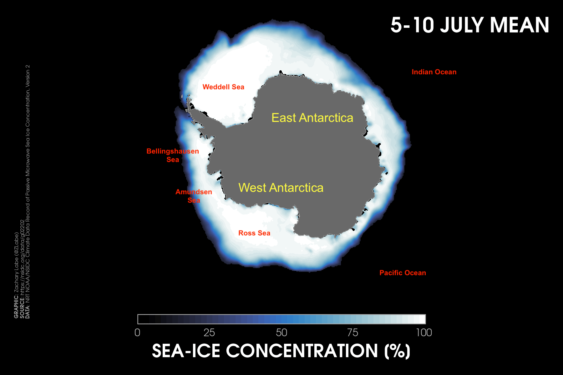
As you might have already figured out, my ‘climate viz of the month’ for June 2023 is an animation of Antarctic sea ice taken from mid-July when the anomaly was reaching its largest absolute magnitude. Sea-ice concentration here just means the fraction of ice cover for a particular region, and the anomaly in my graphic is referring to 5-10 July 2023 minus the 30-year mean of 5-10 July as calculated over the years of 1981-2010. The red shading shows that many areas are observing below average sea ice conditions. However, there is one area of positive sea ice anomalies in the Amundsen Sea. And next to this positive sea ice anomaly is a very large negative anomaly (in the Bellingshausen Sea). In fact, sea ice didn’t even reform in the Bellingshausen Sea nearest the Antarctic Peninsula until weeks later this usual this year. That was quite alarming.
The spatial pattern of the sea-ice anomalies provides us an important clue as to one of the physical drivers of this extreme event. It relates to an atmospheric factor called the Amundsen Sea Low, which is an prominent low-pressure system that sits off the coast of Western Antarctica. The strength and position of the Amundsen Sea Low can significantly affect the extent of sea ice due to changes in surface winds. Looking at atmospheric reanalysis data (think observations), we see that there were anomalous surface winds pushing away from the Antarctic continent in June/July 2023 over the Amundsen Sea (causing sea ice to expand outwards/equatorward) and anomalous winds blowing toward the Antarctic continent in the Bellingshausen Sea (poleward; limiting the ability for sea ice to form). The lack of ice also led to anomalous warmth via surface air temperatures and within the upper ocean. This is reflected again in our observational datasets over the last month or two, with sea surface temperatures several degrees above average. This acts like a small positive feedback for similarly preventing ice from reforming. We can also look at reanalysis data to understand the mean large-scale atmospheric circulation fields, which reveal an usually deep and displaced Amundsen Sea Low compared to its typical position. Moreover, we find anomalously high sea level pressure toward the Ross Sea. This sea level pressure dipole caused the anomalous surface wind pattern we just discussed, which contributed to whether sea ice expanded or retreated.
Okay, so it’s clear that the Amundsen Sea Low has been an important driver of the spatial pattern of sea ice anomalies for this extreme event. However, there are other locations of missing ice, such as in the Indian Ocean sector. So then, what remote forcing could be driving the local atmospheric circulation around Antarctica? In addition to the release of heat stored after the rare triple dip La Niña, convection in the equatorial Pacific has initiated hemispheric-wide Rossby wave trains. For example, the same high-amplitude wave pattern is contributing to the land and marine heatwaves in the Northern Hemisphere this summer. In the Southern Hemisphere, we saw a very active storm track (strong westerlies) across the Southern Ocean in response to this ENSO forcing and wave breaking. This storminess broke up a lot of the new sea ice that was trying to form due to all the high winds/waves. Though note that my preliminary analysis of the Southern Annular Mode (an index to characterize the state of the atmospheric circulation) shows that while it has been anomalously strong at times this season (like +4.5 in January 2023), it probably can’t completely explain the magnitude of this sea ice record.
We next have to consider whether the ocean itself is a major driver of the anomaly. Recent work from colleagues in my research lab (Zhang et al. 2022) have found that anomalous upper ocean heat has likely contributed to the recent declining sea ice trend since 2016. Thus, it is probable it is playing a role here too. Unfortunately, we do not have great real-time observations of deep ocean heat content in the Southern Ocean, and it will take some more time to understand its complete role here. It still remains unclear whether human-caused climate change is contributing to this anomalous upper ocean heat source or whether it is related to internal variability from modulating the magnitude of meridional heat transport. I suspect we will have a clearer answer on the role of climate change in the Antarctic over the next few years as more research and perturbation experiments using climate models with higher atmospheric and ocean horizontal resolutions are considered (to better resolve/parameterize mesoscale ocean eddies).
I apologize that this blog was a bit more dense than usual, filled with jargon, and very scatterbrained. It’s a place sometimes to help me organize my thoughts, and I had a very long week at work. The point here is that even though many scientists (including myself) are often responding with I don’t know for why Antarctic sea ice is so low right now, we do know quite a bit. It’s just that this is very complicated to disentangle so quickly, and there is no simple one-way causal factor to communicate. We have many clues, but scientists need more data and experiments to state their conclusions more confidently (“we” are cautious to avoid making sweeping conclusions by nature of training). Attributing the why is also very challenging in real-time, especially for understanding the role of climate change in the Antarctic. The normal scientific research process is so much longer than the media cycle. Studies just focusing on 2023’s Antarctic sea ice levels, for instance, will likely be published for at least the next five years or more.
In summary, the ongoing extreme sea ice event is likely due to a combination of atmospheric and oceanic drivers that are subject to local (changes within the Antarctic) and remote forcing (teleconnections from areas like the central Pacific). The factors are effectively constructively interfering together to produce such a large sea ice deviation/record at a single time. The key variables affecting the sea ice are anomalous winds from storms and upper ocean heat. As for what summer may look like in the Antarctic… Well, I don’t know. There is very low predictability for summertime sea ice conditions using only information from the previous winter. This is again due to the importance of regional weather conditions. If we see a dramatic change in the large-scale atmospheric circulation in the next few weeks/months, it is very possible that sea ice levels could return closer to average. This is good news, as it implies that we are not necessarily guaranteed to see another new minimum record at the end of next summer.
If you made it this far, thank you! I don’t have too much to report for June 2023 in the Arctic. It’s been a very quiet melt season compared to some recent years (think internal climate variability again). I don’t think a new September record is going to happen this year. This is supported by the last mean outlook from the Sea Ice Prediction Network. On a side note, I think it’s time we start to talk more about the sea ice trend from 2012 to present. Is it just internal variability or perhaps an unexpected response to forced circulation trends in the Northern Hemisphere? If anyone is ever interested in collaborating on this, feel free to reach out as I am happy to chat!
I guess I don’t know what my sea ice anomaly graph will look like a month from now. No one knows for sure. We will just have to wait and see. I don’t know if that is reassuring or not. My advice until then is to find reliable sources of information and avoid unnecessary hype. If you are interested in more discussions on the short and long-term consequences of this extreme sea event, check out some of my recent interviews listed at https://zacklabe.com/media-and-outreach/.
May 2023
I think my start into science communication can be traced back to the days of Wunderground blogs. I used to post there daily. For those who may not know, I am a huge weather nerd. And yes, despite always talking about our warming planet, I would much rather be talking about cold, cloudy, and snowy weather.
I consider myself incredibly fortunate to be able to find a passion in a life, especially from as young as I can remember. I was giving the weather forecast over the morning announcements as early as elementary school and sneaking in to check the 12z and 18z weather model updates in my high school computer lab. My love of the weather still continues, and I get equally as excited the night before a big snowstorm now as I did at age 13. For a long time, my goal was to become a forecaster at the National Weather Service. But as they always recommend in college, try new things.
I didn’t really know anything about climate change until college (not really a popular topic at the time in my small hometown in Central Pennsylvania). After some courses and wonderful undergraduate research opportunities at Cornell University into the world of large ensemble climate modeling, I realized that this path was for me. I could actually study how climate change influenced the weather.
Since then, I’ve also been incredibly lucky to work on a wide range of climate change and variability topics both through my own research and through wonderful collaborations. Although some people have given me the “advice” that this is a bad idea (ignore these people), I believe that working on so many different areas within climate science has made me a better scientist and constantly keeps me excited about my work. But just to note, I suppose the common thread for my research is disentangling the role of climate change versus natural climate variability in some way or another.
In the last few years, I’ve had the opportunity to expand my research even more through a collaboration with cognitive psychologists working on understanding how people perceive visualizations. While I share plenty of data visualizations every day on social media and my website, I claim zero expertise in this area. I often just design these graphics based on my own personal creative preferences, best practices for reducing jargon while improving accessibility, and feedback from my followers (if you share your own work on the internet, you will certainly get “feedback” for better or worse). One of our ongoing collaborative projects is to reassess a new visualization for communicating hurricane forecasts. Not only is this project exciting and unique (in my view), but it also gives me the chance to get experience working on scientific research related to data visualization and to revisit my passion for weather forecasting.
The graphic for this month’s ‘climate viz of the month’ is therefore a bit unique compared to my previous blogs. It is an animation adapted from one of our recent studies that shows an alternative visualization style for better communicating hurricane forecast risks. This animation, which we call “Animated Risk Trajectories” (or ARTs), is based on the fundamentals of the visual system for how people naturally perceive and use uncertainty information. This is expressed in the animation through the distribution of moving markers, which represent possible hurricane tracks approaching the United States. Unlike the current National Hurricane Center’s “Cone of Uncertainty,” there are no natural gradients or boundaries. For example, one issue with the Cone is that people perceive more or less threat just depending on whether they are within or outside the Cone’s boundaries. However, by definition, there is a 1/3 probability that a hurricane may track outside of the Cone. This issue is called the containment effect and is well documented in previous studies (e.g., Broad et al. 2007). This containment effect is not an issue for ARTs, and we find that people better perceive a gradual reduction in risk further from the center of the ARTs distribution.
In addition to better understanding hurricane risks beyond just being in the center of the forecast track distribution, the ARTs can also be annotated to show different storm threats (e.g., storm surge, flash flooding, high winds, storm strength) by changing the visual cues on the individual markers (e.g., flashing icons, symbols, colors). Again, the visual system can interpret this information without necessarily having to read more text or understand more scientific jargon. We found that people are very responsive to both the density of the ARTs and the width of their distribution. These modifications can be leveraged depending on the uncertainty of the forecast and/or the strength of the approaching tropical cyclone.
Currently, the distribution of ART icons is based on the same statistics as the Cone of Uncertainty, but this can be easily modified too. In our recent study, we showed that the ARTs can be adapted to different types of distributions depending on the specific weather forecast. As one example, we tested that the ARTs could simulate a bimodal distribution, such as the case if the tracks from the hurricane forecasts have separated clearly into two possible trajectories. Related to this point, the distribution of the ART icons can also be easily adapted to fit output from numerical weather models, such as hurricane tracks from spaghetti plots.
If you are interested in the details of this work, check out our two recent studies from the last few months where we dive into the details of our experiments and results:
Visualizing uncertainty in hurricane forecasts with animated risk trajectories Comparisons of perceptions of risk for visualizations using animated risk trajectories versus cones of uncertainty
To be clear, this is ongoing exploratory work, and I am sure the design of the ARTs will become more ‘graphically pretty’ over time. However, the fundamentals of this visualization are what is important here. To summarize, the ARTs provide an alternative way of communicating forecasts by improving people’s understanding of risk perception associated with tropical cyclones.
I know that I will have more to say about this work in the future, but I just want to end this blog with a short reflection. I have learned a lot more about research in the social sciences related to weather and climate, and I’ve especially gained a much better appreciation for the challenges in doing interdisciplinary research (ask me about this peer review process someday!!). I think this experience has made me a better scientist and communicator. Honestly, I think all researchers should have one experience related to doing work with a different field, such as collaborating with social scientists or vice versa with physical scientists. Effective interdisciplinary team science is very difficult, but so important, especially for tackling challenges like climate change.
Anyways, thank you for reading to the end of this blog! In other news, the Arctic observed a fairly quiet month (again) in terms of mean temperature and sea ice levels. In fact, it was the coldest May in quite a few years over the Arctic with the largest cold anomalies centered over the North Pole. Meanwhile, to the south, record warmth was reported across large portions of northern Canada. While sea ice seasonal forecasting is quite challenge, my guess is that the slow start to the melt season (i.e., very cloudy and lack of solar insolation for melt pond formation) will make it very unlikely we observe anywhere close to the 2012 record low of the September sea ice minimum. I’ve also been receiving a lot of questions related to the onset of El Niño, the ongoing marine North Atlantic marine heatwave, and what this means for the Arctic. However, these linkages are not actually clear. Like most things in the climate system, identifying casual relationships are very complicated and rarely a simple cause/effect (e.g., El Niño ≠ low sea ice). As an example, despite warming global ocean heat content and global mean surface temperatures since the 2010s, the lack of observed Arctic sea ice volume decline in recent years is instead related to the negative feedback of lower ice export and strong ice growth from the thinner ice cover (see Zhang, 2021). This is a good lesson in not fitting linear or polynomial fits to any sea ice data! So, in summary, the record warm global ocean currently doesn’t necessarily mean we will observe record loss of Arctic sea ice. I will have more on this soon.
April 2023
I’ll start off this blog with a simple and very obvious message: Our planet is warming due to humans. This a result of an increase in the emission of greenhouse gases from the burning of fossil fuels. Yet, the exact future evolution of global climate change and its consequences still remains uncertain, especially on regional scales. Decision makers and other community partners therefore are tasked with considering a wide range of possible future climate change pathways to address adaptation and mitigation planning (see Deser, 2020). One approach for evaluating future projections is by using data from global climate models. Unlike forecasting day-to-day changes in weather, climate models project the average of a variable over decadal to centennial and longer time-scales.
There are three key sources of uncertainty for assessing and communicating future climate change projections…
Of course, there are other uncertainties, such as climate sensitivity, the regional effective radiative forcing of anthropogenic aerosols, land cover/land use change, etc., but a discussion of those are better left for another day. 🙂
One source of uncertainty is due to the climate model itself; this is otherwise known as “model structural uncertainty.” In this particular visualization, we are using the SPEAR large ensemble (https://www.gfdl.noaa.gov/spear_large_ensembles/), which is based on GFDL’s CM4.0 physical climate model (https://www.gfdl.noaa.gov/coupled-physical-model-cm4/). Another form of uncertainty is associated with the level of future warming. This type of uncertainty is called “scenario uncertainty,” and it arises from the various socioeconomic and technological decisions that could evolve and consequently affect the amount of emitted greenhouse gases. In this visualization, we are evaluating a projection called SSP2-4.5 (i.e., moderate amount of future climate change emissions), which is a pathway closely aligned with our current trajectory.
However, for this month’s climate viz of the month, we are focused on the third big source of uncertainty, which is referred to as “internal climate variability.” You can think of internal climate variability as analogous to the butterfly effect, in which a tiny change in one place can lead to an unexpected change in another place. In other words, internal climate variability describes the chaotic (generally unpredictable) behavior of the atmosphere, which is an intrinsic property of the atmosphere in the absence of human-caused climate change. Recent studies have shown a better appreciation for considering the influence of internal climate variability, especially at regional spatial scales. Though it’s important to note that internal climate variability can even temporarily mask or accelerate short-term trends in the global mean surface temperature (see Medhaug et al. 2017). If you are interested in this effect, check out our new study on this effect for predicting slowdowns in the rate of decadal warming using machine learning: https://doi.org/10.1029/2022GL098173.
To better consider how internal variability impacts future climate change projections, international modeling centers often run experiments using the same climate model and future emissions scenario but vary the initial conditions of each simulation by a very very small round-off error. This type of experiment is called a “large ensemble,” where each ensemble member is run using the same climate model protocol but differ by a tiny change in those initial conditions. In large ensemble experiments, the spread in ensemble member outcomes represents the uncertainty due to internal climate variability, and the effect of human-caused climate change can then be revealed by averaging over all the ensemble members (i.e., getting rid of the noise). Check out a user guide on evaluating large ensembles in http://dx.doi.org/10.5065/h7c7-f961.
Internal climate variability is quite large in the Arctic, and for example, this is one reason that we have not observed a new record low in Arctic sea-ice extent since 2012. I’ve discussed this point in other monthly blogs – so now let’s turn to April’s visualization. We can see the differences between ensemble member #30 (i.e., one possible realization of our future) versus the average across ensemble members in GFDL SPEAR (i.e., the ensemble mean).
For those interested in the technical details, this large ensemble (NOAA GFDL SPEAR_MED) is fully-coupled (i.e., land, ocean, atmosphere, ice components), leverages CMIP6 forcing, and has an unusually high spatial resolution at approximately 50 km.
You can see the effect of internal climate variability on the left side, where there are much larger differences from year-to-year in the magnitude and location of the temperature anomalies. But on the right side, the long-term trend from only climate change results in a steady warming and little year-to-year variability (remember, by construction, the noise is averaged out in the ensemble mean).
Importantly, the left map is what we experience – a world with climate change and internal climate variability. If I showed an animation using ensemble member #29, you would see the same long-term trend, but different interannual variations. And if I showed an animation using ensemble member #28, you would again see the same long-term trend, but yet another realization of year-to-year variability. And so on…
I can’t stress enough how important it is to consider the influence of internal climate variability when thinking about climate change, especially for an area like the Arctic. In fact, I don’t think any future impact studies should be conducted without including this source of uncertainty. Though, maybe I am a tiny bit biased, because I think large ensemble are the coolest thing ever.
That’s all for now! Thanks for stopping by my blog! Feel free to reach out any time if you are interested in large ensembles and/or internal climate variability.
Otherwise, for the month of April 2023, it was fairly quiet in the Arctic. The largest absolute magnitude of temperature anomalies was found around Alaska, where unusually persistent cold weather occurred nearly all month long. Sea-ice extent and thickness levels are also pretty unremarkable, well compared to recent years anyways. But we are only at the very beginning of the melt season, so it’s far too early to make any conclusions or outlooks about this year’s September minimum. We will just have to wait and see. Stay tuned here!
March 2023
Hope you all are having a great start to spring – at least in the Northern Hemisphere anyways. My March ‘climate viz of the month’ is not the prettiest graph that I have shared, but I think it displays some cool information.
Each panel of this graphic shows the decadal temperature trends for bands of latitudes from the South Pole (90°S; y-axis minimum) to the North Pole (90°N; y-axis maximum) for four different seasonal periods. The temperature trends are calculated from 1990 to 2022. I chose this period, as it coincides with a greater acceleration of long-term warming compared to earlier in the 20th century. Note that this graphic uses data at a horizontal resolution of 1.9° of latitude by 2.5° of longitude (i.e., 96 by 144 gridpoints), and there is no scaling by latitudinal distance in the visualization of the y-axis (hint: Earth is a sphere). Using data from ERA5 reanalysis, I then calculate the zonal mean (averaging across all longitude points), which leaves the temperature data in dimensions of time by latitude (of which there are 96 latitude bands).
I am such a huge fan of zonal mean climate plots, as they are basically a short course on understanding climate dynamics. One area of my research has involved understanding linkages between Arctic sea ice and mid-latitude weather, and a favorite paper of mine that I first read in grad school is titled “The Role of Ocean–Atmosphere Coupling in the Zonal-Mean Atmospheric Response to Arctic Sea Ice Loss.” This paper is a great example of understanding various climate responses in a zonal mean sense. If you also like this style of visualization, check out some of my other zonal mean animations at https://zacklabe.com/arctic-climate-seasonality-and-variability/.
In summary, this visualization helps to show the evolution of seasonal temperature trends and reveals where the fastest rate of warming is occurring. Arctic amplification is extremely striking, particularly during the early winter period. This is due to that fact that sea ice begins refreezing by October and subsequently all the heat that was absorbed into the Arctic Ocean during summer is transferred back into the overlying atmosphere.
Nearly all latitude bands are warming during the four seasons, except for portions of the Southern Ocean and the South Pole during their austral winter. Remember that the Southern Ocean plays an important role in being a significant absorber of heat associated with anthropogenic climate change, and raw data observations are quite sparse in this region. Understanding temperature trends in the Antarctic also remains a very active area of research due to high uncertainties in different reanalysis and station-based observational datasets. In any case, in the annual mean, all latitude bands are warming during this time period.
Otherwise, March 2023 was fairly uneventful in the Arctic aside from some anomalous warmth in northern Greenland and stretching toward the Beaufort Sea. Both sea-ice extent and volume rankings for March were insignificant compared to other recent years. At this point in the year, though, we still don’t know how summer will unfold in the Arctic. There is very low sea-ice predictability right now, particularly related to forecasting the September sea ice minimum. As we get closer to June, we’ll have a much better idea for how much melt can be expected this year.
In other news, we have a new study out this month on using machine learning to understand regional climate change in a climate intervention experiment (called ARISE-SAI-1.5). Check it out at https://doi.org/10.1088/1748-9326/acc81a. I also wrote a blog which summarizes the study and a few of our other explainable artificial intelligence work for climate science at https://zacklabe.com/climate-signals-and-explainable-ai/. As usual, thanks for stopping by my blog, and feel free to reach out anytime if you have any questions on it.
February 2023
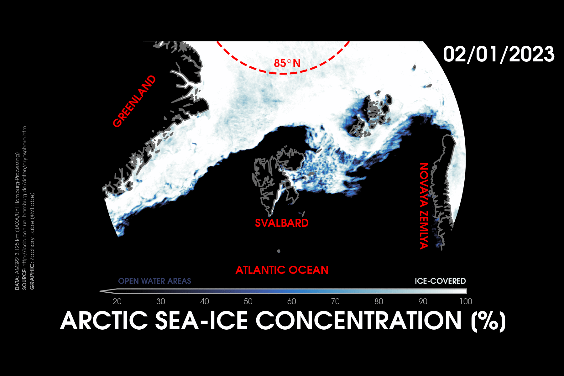
Happy start to the Arctic summer! Well, the official melt season anyways. According to the National Snow & Ice Data Center (NSIDC), the annual maximum Arctic sea-ice extent was set on 6 March 2023 at 14.62 million square kilometers (5.64 million square miles). This occurred about 6 days earlier than the 1981-2010 average. Since the maximum (read more here), Arctic sea ice has quickly declined due to recent weather conditions, and current levels are actually close to the lowest on record for the date. Yikes! While there is very low predictability (correlation) between the March sea ice maximum and the September sea ice minimum, it’s certainly a busy start to the melt season.
Anyways, more on that later. My next ‘climate viz of the month’ is an animation showing daily Arctic sea-ice concentration in February across the Atlantic side of the Arctic Ocean. This animation uses high-resolution data (approximately 3 kilometers) derived from an algorithm associated with the ASMR2 satellite instrument.
Long-term trends in winter are smaller than summer for sea ice in the Arctic. The entire Arctic Ocean is actually ice-covered in February, and therefore, the variability and long-term declines are found at the sea-ice edge. The Barents Sea has observed the largest declines in February, which are due to both atmospheric and oceanic processes. For this reason, I keep a close eye on weather conditions in the Barents Sea throughout much of the year.
The animation speed is intentionally sped up to highlight the large amount of daily variability in this part of the Arctic. A lot of this sea-ice variability is due to local weather conditions, especially as storms from the North Atlantic begin to move poleward. Although these storms usually start to weaken and fizzle out, they still are a source of warmth and moisture from the lower latitudes into the high Arctic. In addition to the warmth and precipitation, there is also plenty of wind and wave activity that can drive the movement of sea ice drift along the ice edge. This region is often referred to as the marginal ice zone. If that wasn’t enough, there’s also strong ocean currents to deal with in this region, which are an important source of heat transport/exchange at the boundary of the Arctic and Atlantic Oceans. Quantifying changes in the influx of deep ocean heat and salinity from the North Atlantic Current (e.g., Atlantification – warm and salty waters from the Atlantic to the Arctic) is a key research topic for understanding Arctic climate change. In other words, sea ice can melt from both above and below! All these processes and interactions result in a very turbulent region across the Greenland and Barents Seas, especially during winter.
This data visualization is particularly striking for highlighting the effects of a strong storm near Svalbard that coincided with southerly winds pushing sea ice well northward in the middle of winter. Watch closely as the ice pack moves back and forth over the course of a week, especially the opening near Franz Josef Land.
Notably, sea ice in the Barents Sea set a record for the lowest daily measurement in the entire month of February (since satellite records have been kept (from 1978/1979)) during this period. As a result of this southerly flow and the wide-open ocean waters (typically sea-ice covered), surface air temperatures were also more than 5°C above the 1981-2010 average around Svalbard for the monthly mean. This is concerning, but unsurprising, since long-term temperature trends near Svalbard are warming faster than anywhere else on Earth. It’s a striking regional example of Arctic amplification.
My advice to those monitoring climate change in the Arctic – keep a close eye on the Fram Strait and Barents Sea and always appreciate the importance of synoptic meteorology (i.e., the chaotic noise of our atmosphere).
Elsewhere, a strong dipole in temperature anomalies was evident in February. This included regions of anomalous warmth over western Siberia compared with brutally cold temperatures stretching from the Canadian Arctic to the Kamchatka Peninsula. Relative to recent months (and since 2021 to be honest), sea-ice extent was particularly low for its monthly ranking. With El Niño just around the corner (check out sea surface temperatures in the equatorial Pacific lately!!) after a rare triple La Niña, it will be ‘interesting’ to see how (quickly) the large-scale circulation responds in the Arctic and Northern Hemisphere. Stay tuned…
January 2023
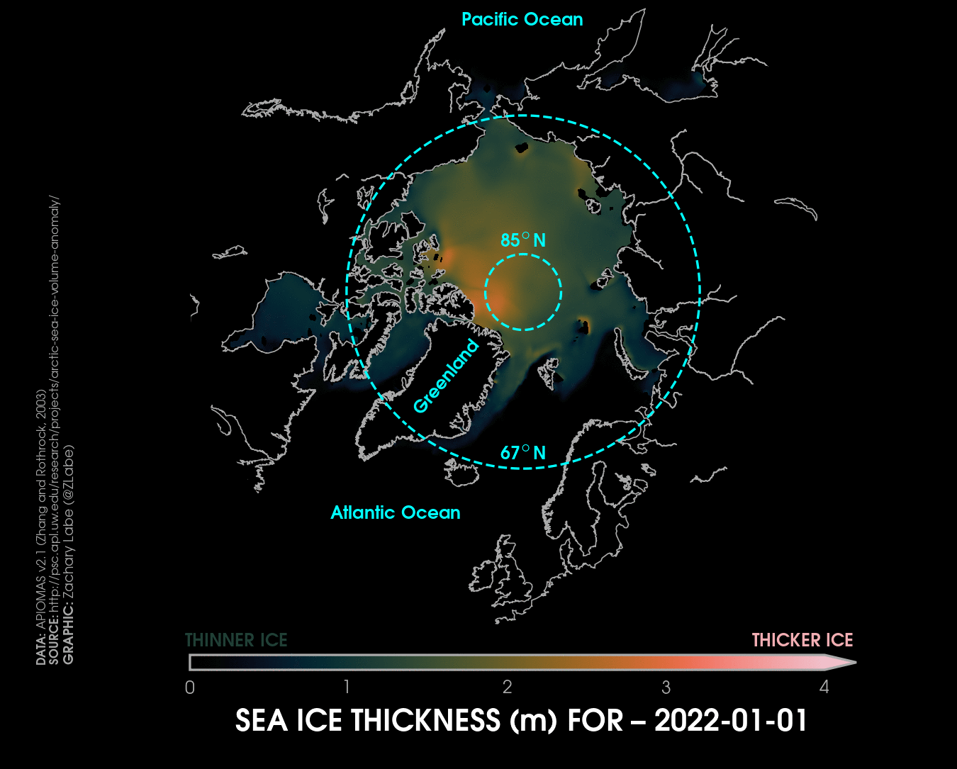
Hi! My next ‘climate viz of the month’ evaluates changes in daily Arctic sea-ice thickness during 2022. While I normally share lots of sea-ice thickness visualizations on weekly and monthly timescales, it is also informative to compare its daily evolution. It may take a few seconds for this GIF to load (on the left). You can also click on it to see a higher resolution animation.
Specifically, this visualization uses daily sea-ice thickness data from an ice-ocean model called the Pan-Arctic Ice Ocean Modeling and Assimilation System (PIOMAS; Version 2.1). This reanalysis-like dataset extends from 1979 to present day, which is generated through the assimilation of daily surface fields including: 2-m temperature, 10-m winds, specific humidity, precipitation, evaporation, radiative fluxes, sea-ice concentration, and sea surface temperature. In a previous study (Labe et al. 2018), we evaluated PIOMAS with observations from satellites (CryoSat-2 and ICESat) and submarine track data to understand patterns of Arctic sea-ice thickness. In summary, we found that PIOMAS compares remarkably well in reproducing the spatial distribution, variability, and long-term trends of Arctic sea-ice!
As you watch this animation, note the prominent seasonality of sea-ice thickness. The maximum mean pan-Arctic thickness is set in late May, and the minimum is set in early November. The thickest ice is almost always found north of Greenland and the Canadian Arctic Archipelago. This area is often known as the Last Ice Area (e.g., the Wandel Sea), and the spatial distribution is broadly due to the transpolar drift stream. In other words, surface winds, ocean currents, and cold temperatures act to move and compress the thickest and oldest (multi-year) sea ice along this region before slowly drifting toward the Fram Strait and out into the Atlantic Ocean. Understanding variability and long-term trends of sea ice in the Last Ice Area is particularly important for assessing Arctic climate change. Meanwhile, sea ice is much thinner at the outer edges of the Arctic, like in the Barents-Kara Seas or Chukchi Sea.
Another important consideration for evaluating daily sea-ice thickness is the large spead in regional mean thickness. Ice thickness ranges from 1-2 meters (3-7 feet) in most regions throughout the year with seasonal ice cover, but the thickest ice can be more than 4 meters (13 feet) thick north of Greenland and the Canadian Arctic Archipelago. Though, it’s important to note that this model’s horizontal resolution (nominal 22 km) cannot resolve finer details, such as the actual thickness of ridging on ice floes. And of course, some areas have observed a decrease in ice thickness by more than 50% since 1979. As climate scientists improve model simulations of Arctic sea ice, it will become increasingly important to capture this spatial distribution of ice thickness to make projections of future Arctic climate change.
That’s all for now! Thank you for taking the time to visit my website! You can find the associated monthly climate data rankings for 2023 at https://zacklabe.com/archive-2023/. Although January 2023 observed anomalously low Arctic sea-ice extent due to wide open ocean waters in the Barents Sea region, temperatures were unusually cold near Siberia, and the total ice volume was unremarkable compared to some recent years.
My visualizations:
The views presented here only reflect my own. These figures may be freely distributed (with credit). Information about the data can be found on my references page and methods page.