Methods and Open Software

Latest PIOMAS (Zhang and Rothrock, 2003) simulated sea ice volume (SIV) across the Arctic (updated through April 2023).

As a climate scientist working with climate model data and tools like machine learning, the majority of my day is spent on the computer. Thankfully, there are an amazing set of computational and visualization programs that are widely available. My primary tool is Python, which is a popular (and growing) programming language in atmospheric and climate sciences. A large reason for this is that Python is open source and developed by both careered software engineers and hobbyists all over the world. Nowadays it can take seconds (well sorta…) to create a publication-quality graphic!

However, in my opinion, we (as users in the scientific community) often take many of these tools for granted. In fact, some of these critical climate monitoring datasets and software packages are developed and supported by people just taking enormous amounts of free time out of their day. I think we can do a better job acknowledging all of their efforts while also advocating for improving accessibility in science and open software/data. (To be honest, I could rant about poor citation practices of data for hours.) Did you know that even NumPy has a publication reference (Harris et al. 2020)? Okay, but is it really necessary to cite this in every one of our papers? Regardless, I think we can better acknowledge all of their contributions and the importance of scientific workflows for career development in academic research spaces. Given the ever-growing need and production of big data and proposals to modify the traditional scientific publication system for the future, this is going to continue to be a relevant topic. I highly recommend exploring some proposed solutions to this, such as through The Journal of Open Source Software, version controlled systems on GitHub, archival repositories on Zenodo, communities like Pangeo, and preprint repositories such as arXiv, EarthArXiv, and ESSOAr.

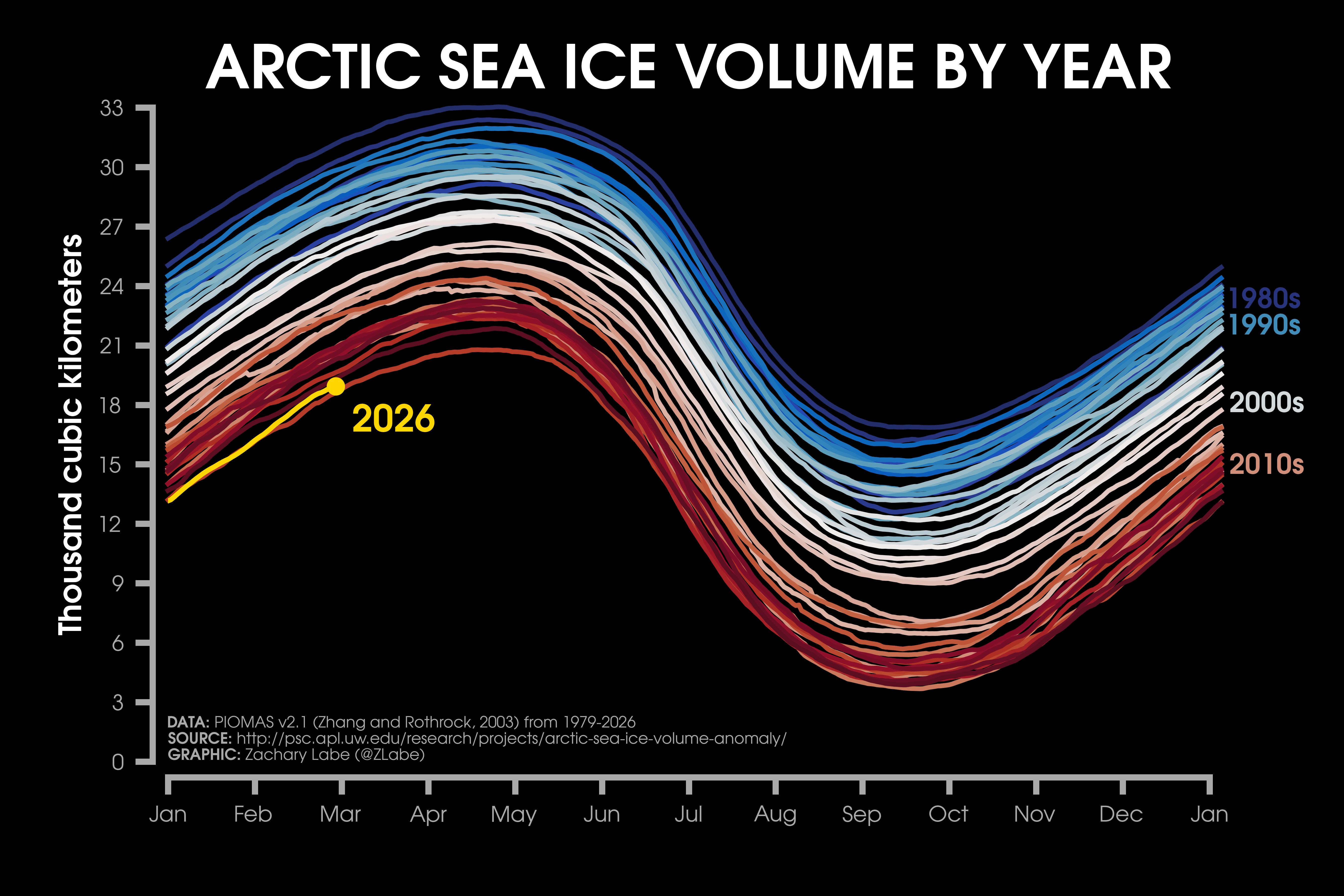
I have compiled a list of resources, peer-reviewed papers, and tools that I utilize in my daily workflow for both research and science communication-related data visualization. Be sure to check out some of their references – DOI included! All of my visualizations from Twitter and on this website utilize these Python packages, particularly through Matplotlib. Look here for information on my data sources. And as usual, feel free to reach out if you have any questions!

Getting started:

  • Anaconda [Getting Started] – I manage all of my Python packages through Conda and virtual environments for each scientific project. Anaconda is an open-source distribution of Python with a large user community. It includes 100s of Python packages upon installation, as well as other data tools and resources. For example, if you use Anaconda, you won’t have to install a number of the Python packages that I list below. It is totally overwhelming at first, but there are countless internet resources to help you get started! Anaconda is amazing, but it will be frustrating and painful at times. Trust me
  • Jupyter Notebook [Getting Started] – honestly, Jupyter Notebooks are pretty incredible. They are documents with interactive code and rich text, which make them excellent tools for teaching. An increasing number of people are using them as their primary workflow and including them as open code with published papers. However, I still prefer working with the Spyder IDE for my research projects. Maybe someday I will be convinced into using Jupyter for research, sigh. I highly recommend searching all of the available online tutorials and resources regarding this software, which comes pre-installed with the Anaconda distribution
  • Miniconda [Getting Started] – this is a much smaller installation for the Conda distribution of Python. Personally, I find it very useful for working on HPC systems (see notes)
  • Spyder [Getting Started] – everyone has their favorite IDE/GUI for working with Python. I have been using Spyder since I first learned Python in undergrad, and it’s continuously been my favorite after trying several other options. It comes pre-installed with the Anaconda distribution
  • Stack Overflow [Getting Started] – this is where you will be spending the majority of your time. Stack Overflow is an online forum where all of your answers on coding bugs and solutions can be found

    Standard python tools:

  • Matplotlib [Documentation][Installation][Reference] – my primary visualization tool for Python. It has a similar syntax as Matlab, and there are endless options for creativity
  • NumPy [Documentation][Installation][Reference] – primary package for working with mathematical functions and multi-dimensional arrays
  • pandas [Documentation][Installation][Reference] – another important package for working with large data, especially using data frames/structures
  • SciPy [Documentation][Installation][Reference] – statistical library that works closely with NumPy
  • Xarray [Documentation][Installation][Reference] – quickly becoming one of the most popular data/computational packages in the geosciences. I like to think of it as bridging NumPy and Pandas together

    Fun with statistics:

  • iNNvestigate [Documentation][Installation][Reference] – functions to implement a wide range of explainable artificial intelligence methods (XAI) with Tensor Flow
  • Keras [Documentation][Installation] – must-have library for working with deep learning models through Tensorflow. They also provide a remarkably thorough and helpful set of documentation tutorials
  • scikit-learn [Documentation][Installation][Reference] – a comprehensive set of machine learning tools (especially for getting started in AI/ML). Though I mostly work with Tensorflow/Keras
  • statsmodels [Documentation][Installation][Reference] – comprehensive and growing number of statistical tests and available analysis. In my opinion, it is becoming increasingly comparable to R
  • Tensorflow [Documentation][Installation][Reference] – important package for machine learning in Python

    Python for weather and climate science:

  • argopy [Documentation][Installation] – set of functions for reading and working with Argo data
  • cdsapi [Documentation][Installation] – efficient package for reading data from the ECMWF. It is a lifesaver!
  • CliMetLab [Documentation][Installation] – package to simplify weather and climate data access, especially for using Jupyter Notebooks
  • climpred [Documentation][Installation][Reference] – resource for analyzing dynamical forecast models of several timescales (such as seasonal-to-decadal) and calculating skill score metrics
  • eofs [Documentation][Installation][Reference] – helpful functions for calculating empirical orthogonal functions (EOFs), which is useful for evaluating modes of climate variability
  • GeoCAT [Documentation][Installation][Reference] – toolbox for creating visualizations of climate and meteorological data with a similar style as NCL
  • iris [Documentation][Installation] – another package for analyzing Earth science data, though I am not overly familiar with its details and capability
  • MetPy [Documentation][Installation][Reference] – a package with a rapidly growing community base for working with meteorological data. I highly recommend checking out their associated tutorials!
  • tcpyPI [Documentation][Installation][Reference] – algorithm for calculating Tropical Cyclone Potential Intensity calculations
  • Tropycal [Documentation][Installation][Reference] – excellent set of tools for analyzing tropical cyclone data, along with a number of unique visualizations in only a few lines of code or less
  • windspharm [Documentation][Installation][Reference] – set of functions for calculating quantities like divergence, vorticity, and velocity potential
  • xMIP [Documentation][Installation] – toolbox through Pangeo for reading and evaluating CMIP6 data

    Fun with colors:

  • cmasher [Documentation][Installation][Reference] – a new favorite of mine for unique sequential and diverging color schemes
  • cmocean [Documentation][Installation][Reference] – a favorite for colors related to data in weather and climate science
  • nclmaps [Documentation][Installation] – code to call NCL colormaps in Python
  • Palettable [Documentation][Installation] – color schemes from a number of sources including: CartoColors, cmocean, Colorbrewer2, Cubehelix, Light & Bartlein, matplotlib, MyCarta, Scientific, Tableau, Wes Anderson Palettes
  • seaborn [Documentation][Installation][Reference] – visualization package for publication-quality figures, which is based on matplotlib

    Creating maps of weather and climate data:

  • Basemap [Documentation][Installation] – old package for creating spatial map plots in Python. Although it has been deprecated/replaced with Cartopy, I still use it for legacy code, and (in my experience) it is more flexible for polar map projections
  • Cartopy [Documentation][Installation][Reference] – one of the most frequently used Python packages for creating geospatial plots in weather and climate science. I recommend starting here if new to Python!
  • PyNGL [Documentation][Installation] – package for creating NCL-style visualizations.

  • Other helpful toolboxes:

  • Climate Data Operator (CDO) [Documentation][Installation][Reference] – a powerful command line tool for processing and analyzing weather and climate data. It is a critical part of my daily workflow before reading data into Python.
  • LaTeX [Documentation][Installation] – I use TeXShop, which is a comprehensive distribution of TeX and useful for including mathematical expressions and other font changes in Python’s matplotlib
  • NCAR Command Language (NCL) [Documentation][Installation][Reference] – although NCL is being replaced in favor of Python, I still use it in my workflow for helpful functions/equations (especially for atmospheric dynamics) and interpolating gridded data
  • Ncview [Documentation][Installation] – extremely helpful GUI for quickly viewing netCDF files, which are a common data type in weather and climate science. Check out “ncvis” for additional features and color maps
  • netCDF Operator (NCO) [Documentation][Installation][Reference] – incredibly useful for processing large netCDF files. There is a lot of analysis this command line tool can do, but there is a bit of a learning curve.
  • Ocean Data Viewer (ODV) [Documentation][Installation] – an interactive visualization tool that is similar to Ncview/Panoply, but geared for oceanographic data
  • Panoply [Documentation][Installation] – this GUI is quite a bit more powerful than Ncview and is useful for creating high-quality visualizations of weather and climate data
  • Sphinx [Documentation][Installation] – software for generating HTML-ready documentation for Python code

    Awesome blogs for weather and climate visualizations:

  • Better Figures: https://betterfigures.org/
  • Climate[dot]gov: https://www.climate.gov/news-features/blogs
  • Climate Lab Notebook: https://www.climate-lab-book.ac.uk/
  • Climate Viz of the Month: https://zacklabe.com/climate-viz-of-the-month/ 😉
  • NASA Earth Observatory: https://earthobservatory.nasa.gov/images
  • NASA Scientific Visualization Studio: https://svs.gsfc.nasa.gov/
  • xkcd’s Earth Temperature Timeline: https://xkcd.com/1732/

    Is that it?

    Check out my other presentations on improving accessibility, creativity, and effectiveness of scientific visualizations at SlideShare. I also discuss resources to improve open software, open data, and science communication. I share most of my code on GitHub with two repositories particularly focused on science communication visualizations (Climate Python and IceVarFigs). Unfortunately, I admit that these repositories are highly disorganized, a bit dated, and poorly documented (too many local computer changes in the last few years). I am working on it – I promise! Though I would be very happy if even one person found a line of code useful.

    Hopefully someday in the future I will be out of the early career race to find a permanent scientific position, and I can give it the attention that it deserves to improve transparency, open science, and open software. In any case, feel free to reach out for more information and presentations! Here is one recent talk below:


    My research related to data visualization:

    [2] Witt, J.K., Z.M. Labe, A.C. Warden, and B.A. Clegg (2023). Visualizing uncertainty in hurricane forecasts with animated risk trajectories. Weather, Climate, and Society, DOI:10.1175/WCAS-D-21-0173.1
    [HTML][BibTeX][Code]
    [Plain Language Summary][CNN]

    [1] Witt, J.K., Z.M. Labe, and B.A. Clegg (2022). Comparisons of perceptions of risk for visualizations using animated risk trajectories versus cones of uncertainty. Proceedings of the Human Factors and Ergonomics Society Annual Meeting, DOI:10.1177/1071181322661308
    [HTML][BibTeX][Code]
    [Plain Language Summary][CNN]


    Awesome references for improving science (communication):

    Moser, S. C. (2010). Communicating climate change: history, challenges, process and future directions. Wiley Interdisciplinary Reviews: Climate Change, 1(1), 31-53. https://doi.org/10.1002/wcc.11

    Irving, D. (2016). A minimum standard for publishing computational results in the weather and climate sciences. Bulletin of the American Meteorological Society, 97(7), 1149-1158. https://doi.org/10.1175/BAMS-D-15-00010.1

    Irving, D. B. (2019). Python for atmosphere and ocean scientists. Journal of Open Source Education, 2(16), 37. https://doi.org/10.21105/jose.00037

    Pavlov, A. K., Meyer, A., Rösel, A., Cohen, L., King, J., Itkin, P., … & Granskog, M. A. (2018). Does your lab use social media?: Sharing three years of experience in science communication. Bulletin of the American Meteorological Society, 99(6), 1135-1146. https://doi.org/10.1175/BAMS-D-17-0195.1


    Awesome references for improving visualizations:

    Crameri, F. (2018). Geodynamic diagnostics, scientific visualisation and StagLab 3.0. Geoscientific Model Development, 11(6), 2541-2562. https://doi.org/10.5194/gmd-11-2541-2018

    Crameri, F., Shephard, G. E., & Heron, P. J. (2020). The misuse of colour in science communication. Nature communications, 11(1), 1-10. https://doi.org/10.1038/s41467-020-19160-7

    Daron, J., Lorenz, S., Taylor, A., & Dessai, S. (2021). Communicating future climate projections of precipitation change. Climatic Change, 166(1), 1-20. https://doi.org/10.1007/s10584-021-03118-9

    Hawkins, E. (2015). Scrap rainbow colour scales. Nature, 519(7543), 291-291. https://doi.org/10.1038/519291d

    Hawkins, E., Fæhn, T., & Fuglestvedt, J. (2019). The climate spiral demonstrates the power of sharing creative ideas. Bulletin of the American Meteorological Society, 100(5), 753-756. https://doi.org/10.1175/BAMS-D-18-0228.1

    Light, A., & Bartlein, P. J. (2004). The end of the rainbow? Color schemes for improved data graphics. Eos, Transactions American Geophysical Union, 85(40), 385-391. https://doi.org/10.1029/2004EO400002

    Schneider, B., & Nocke, T. (2018). The feeling of red and blue—A constructive critique of color mapping in visual climate change communication. In Handbook of Climate Change Communication: Vol. 2 (pp. 289-303). Springer, Cham. https://doi.org/10.1007/978-3-319-70066-3_19

    Stauffer, R., Mayr, G. J., Dabernig, M., & Zeileis, A. (2015). Somewhere over the rainbow: How to make effective use of colors in meteorological visualizations. Bulletin of the American Meteorological Society, 96(2), 203-216. https://doi.org/10.1175/BAMS-D-13-00155.1

    Stoelzle, M., & Stein, L. (2021). Rainbow color map distorts and misleads research in hydrology–guidance for better visualizations and science communication. Hydrology and Earth System Sciences, 25(8), 4549-4565. https://doi.org/10.5194/hess-25-4549-2021

    Thyng, K. M., Greene, C. A., Hetland, R. D., Zimmerle, H. M., & DiMarco, S. F. (2016). True colors of oceanography: Guidelines for effective and accurate colormap selection. Oceanography, 29(3), 9-13. https://doi.org/10.5670/oceanog.2016.66

    Warden, A. C., Witt, J. K., & Szafir, D. A. (2022). Visualizing temperature trends: Higher sensitivity to trend direction with single-hue palettes. Journal of Experimental Psychology: Applied. https://psycnet.apa.org/doi/10.1037/xap0000411

    Westaway, R. M. (2022). GC Insights: Rainbow colour maps remain widely used in the geosciences. Geoscience Communication, 5(1), 83-86. https://doi.org/10.5194/gc-5-83-2022


    More information:

  • Blog Archive (2022)
  • Ranking Archive (2022)
  • Frequently Asked Questions (FAQ)
  • Open Data and References
  • Open Software and Tools

  • My visualizations:

  • Arctic Climate Seasonality and Variability
  • Arctic Sea Ice Extent and Concentration
  • Arctic Sea Ice Volume and Thickness
  • Arctic Temperatures
  • Antarctic Sea Ice Extent and Concentration
  • Climate Change Indicators
  • Climate model projections compared to observations in the Arctic
  • Global Sea Ice Extent and Concentration
  • Polar Climate Change Figures
  • Climate Viz of the Month

  • The views presented here only reflect my own. These figures may be freely distributed (with credit). Information about the data can be found on my references page.