(Questions are listed in no particular order)
Are humans the cause of climate change?
Yes. We’ve moved on from still asking this question. The answer has been thoroughly addressed using numerous lines of evidence by thousands of experts around the world. As a starting point, I am just going to refer you to a few of these great articles:
But the Earth is billions of years old…
Yeah, I know.
I have a theory climate change isn’t affected by CO2. Will you read it?
No.
What are climate anomalies?
The word “anomaly” has a specific meaning in climate science. Climate anomalies refer to a deviation of a variable from a specific average. This average is usually calculated over a 30 year period, but it doesn’t have to be.
For example, a temperature anomaly for August 2022 could be calculated as: August 2022’s actual temperature minus the average of actual temperatures over 30 years of Augusts (such as from 1981 to 2010). If August 2022’s temperature anomaly is above 0, then it is consider warmer than average. If August 2022’s temperature anomaly is below 0, then it is considered colder than average. In my graphics, I usually show warmer temperature anomalies with a red shading and colder temperature anomalies with a blue shading.
We can calculate this information for any climate variable! But often the challenging part is how to decide which 30 year period to calculate as the average. I discuss this question a bit more below.
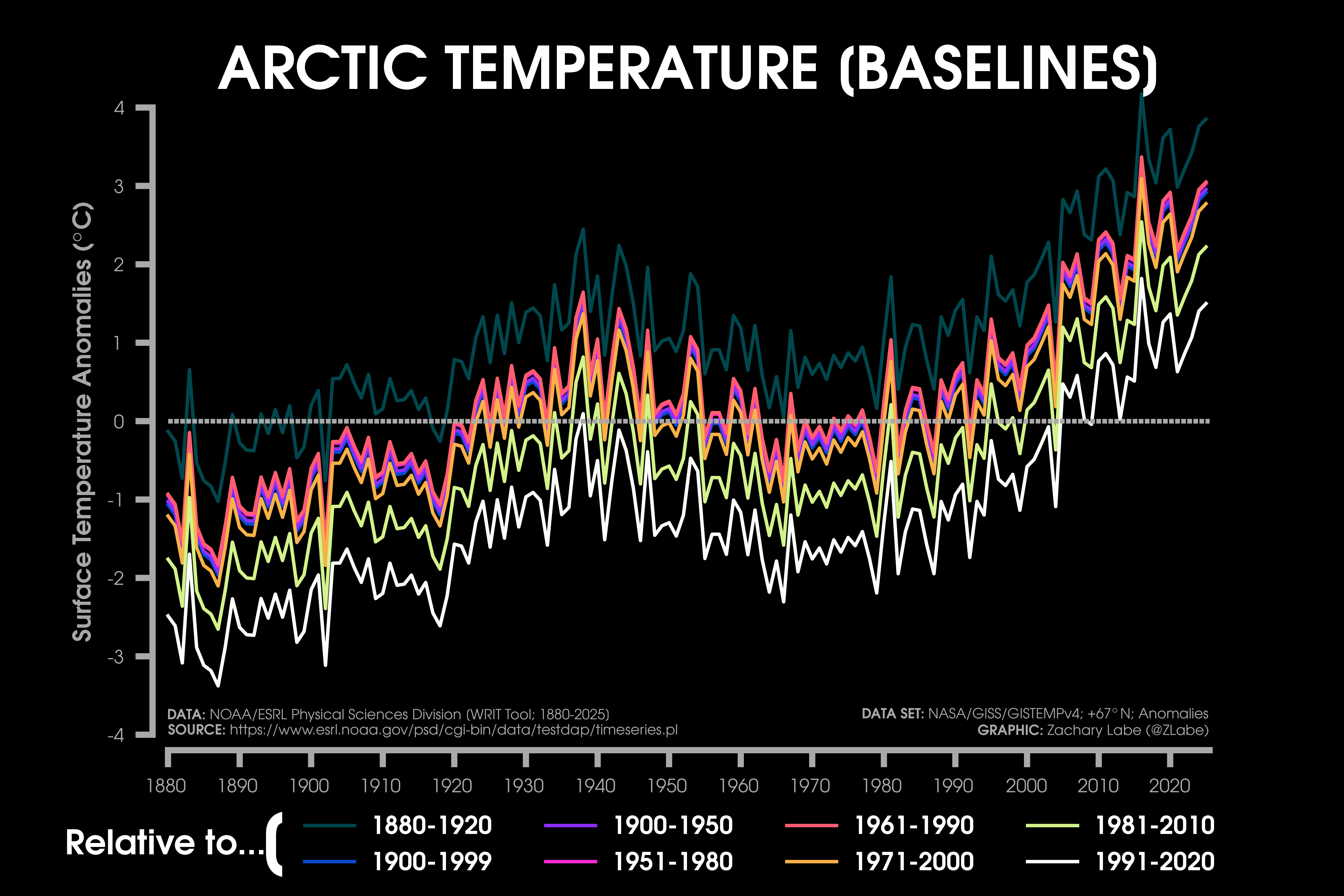
Why do your baselines/reference periods change?
I know – baselines are confusing and often misinterpreted. In fact, a day doesn’t go by without someone accusing me of being involved with a conspiracy due to my choice of climate baseline. My wish is that users would instead focus on the overall long-term trend that is displayed in each graphic, but I realize that is not a sufficient answer to the baseline issue. So here we go.
One reason is that datasets are available over different time periods. For example, NASA/GISS GISTEMPv4 is available from 1880 to present. That means this dataset literally doesn’t exist prior to 1880, and I can’t compare temperature anomalies with an earlier pre-industrial baseline (like 1850-1900). Another dataset I commonly use is ECMWF ERA5, which is available from 1979 (or sometimes 1940/1950 in its back extension form). This again means that I cannot compare these climate variables with earlier baselines, because the data is not available!
Another reason is that some scientific institutions stick with one set baseline for creating their data: NASA GISS GISTEMPv4 uses 1951-1980, Met Office HadCRUT5 uses 1961-1990, Berkeley Earth uses 1951-1980, NSIDC sea ice uses 1981-2010, and so on. In these cases, I usually stick with the convention for each dataset.
I also select baselines for addressing different science questions. If the data is readily available from 1850, sometimes it may be interesting to compare their anomalies with a pre-industrial baseline of 1850 to 1900. This pre-industrial baseline is consistent with the one used by the UNFCCC Paris Climate Agreement. In other cases, it may be interesting to use a more recent baseline. This is often used for discussing regional weather, where a more recent period (like 1991-2020) is more relatable for talking about colder or warmer daily weather conditions in local communities. The World Meteorological Organization describes this as one reason for updating reference periods:
“…World Meteorological Organization recommendation that the 30-year standard reference periods should be updated every decade in order to better reflect the the changing climate and its influence on our day-to-day weather experience.”
For every graphic, I always consider the choice of baseline – keeping in mind what years are actually available in every dataset. I try to consistently stick with two – 1951-1980 and 1981-2010. Personally, I think consistency is important for showing anomalies when discussing long-term climate change. I always make sure this baseline information is included somewhere on my graphics. In the end, baselines just move graphs up or down (see the example of Arctic temperatures above). It does not distract from the long-term climate change trend – please be patient and understanding 🙂
Why don’t your graphs always start at 0 on the y-axis?
For some reason, this is a very common critique when atmospheric scientists share data visualizations. However, outside of bar graphs, this rule doesn’t necessarily apply. For line graphs and other time series, the axis just needs to capture the range of variation that actually matters for the climate question being asked. For example, atmospheric carbon dioxide has risen from around 280 ppm in the pre-industrial period to over 430 ppm today. The story here is that there is sharp increase of about 150 ppm due to the emission of greenhouse gases. Anchoring the y-axis at zero would bury that signal at the top of the plot and make one of the most consequential trends in climate science look like a flat line, and further, zero ppm is also an unphysical quantity for representing greenhouse gas concentrations in our atmosphere. The relevant baseline is the one that reveals the physical or statistically meaningful signal of interest, not an arbitrary reference point.
What about pre-industrial data?
Surprisingly (to me), this is another controversial topic when I communicate climate change. It’s also a subject of scientific interest and debate (e.g., Hawkins et al. 2017). However, this is often a case of data availability. Some global temperature datasets are available from 1880, while others are available since 1850. Now there are valid methods for creating earlier pre-industrial baselines for some satellite-era datasets, but I do not prefer to make these adjustments for science communication purposes.
There is also a question of data quality. We have higher quality observations of climate variables dating back to pre-industrial periods in some regions more than others. For example, it doesn’t make sense for me to create visualizations of climate anomalies since 1850 in regions like the Arctic and Antarctic, where there is extremely limited spatially and temporally complete data prior to early early/mid 20th century.
Is the Earth cooling?
No.
Is Arctic sea ice recovering from the long-term trend?
No.
What about Greenland? Is the ice recovering?
No.
Why do your sea ice graphs usually start in 1979?
This is because satellites with passive microwave instruments began consistently observing the Arctic in October of 1978. There is no conspiracy here. While there are a few satellite observations prior to 1978, they are not consistent in time or space. To understand long-term trends and variability in Arctic sea ice, we need a spatially and temporally consistent dataset, which can be assembled from these satellite observations from January 1979 through present. You can learn more about this from the National Snow and Ice Data Center at: The modern sea ice satellite record turns 40.
To understand Arctic sea ice prior to this “satellite-era”, experts and community scientists have reconstructed its history using newspapers, paleoclimate records (e.g., soil cores, tree rings, ice cores, lake sediment), whaling logbooks, ship observations, submarine data, etc. They all come to the same conclusion: the current rate of sea ice decline is unprecedented in our records. Check out more about this fascinating research in a featured Reuters story: Icebound: The climate-change secrets of 19th century ship’s logs.
What about the volume of Arctic sea ice?
This is another question of data availability and uncertainties. We do not have consistent satellite-observations of Arctic sea-ice thickness and volume prior to the early 2000s. Since then, we now have multiple satellite instruments (e.g., CryoSat-2, ICESat-2, SMOS) deriving sea-ice thickness data. This satellite data is incredibly important for understanding Arctic climate dynamics, but in my view, the temporal record is still too short for evaluating long-term climate change trends. Therefore, we need to turn to reanalysis-like datasets, such as PIOMAS, which have been widely validated with available observations. I discuss these issues of data availability in the NCAR Climate Data Guide, and I share observations of Arctic sea-ice thickness/volume every month at https://zacklabe.com/arctic-sea-ice-volumethickness/.
Was the Arctic warmer in the early 20th century?
One of my primary research interests is better understanding internal variability in the climate system. One interesting event in the last ~100 years is in the early 20th century, where there is observational evidence of an unusually warm period in the Arctic coinciding with lower sea ice levels.
First, I want to be clear that all station-based, reanalysis, and reconstructed datasets show that the present warming in the Arctic and decreases in sea ice well exceed this early 20th century warming period. This is reflected in my graphics of reconstructed sea ice and Arctic temperatures. Nevertheless, understanding the drivers and dynamical mechanisms associated with this early 20th century period are extremely important for better understanding climate variability in the Arctic.
By definition, Arctic amplification generally refers to the faster rate of warming in the Arctic relative to the global mean surface temperature trend. Therefore, in my view, this early 20th century warming warming is also consistent with a period of relative Arctic amplification. Numerous theories have been proposed to explain this warming: including but not limited to, responses to atmospheric and oceanic internal variability, anthropogenic aerosols, solar forcing, volcanic forcing, etc. There is also recent research to suggest that this warming may not have actually been Arctic-wide, but instead regionally focused only on the Atlantic side of the Arctic Ocean.
As you can see, this is an active area of research, which I really hope to further explore in future work (open to collaborations haha). Of course, one of the challenges to better understand this period is a lack of spatially and temporally consistent climate data. Climate model large ensembles, which better account for internal variability in the climate system, remain an essential part of the solution to better understand this type of decadal variability.
Will this September set a new record low for Arctic sea ice?
Not sure! The challenge to predict the annual minimum extent of Arctic sea ice is vast and difficult. In recent years, the National Science Foundation (NSF) and the Arctic Research Consortium of the U.S (ARCUS) have organized a community project called the “Sea Ice Prediction Network” (SIPN) to investigate this issue. Scientific teams from around the world submit forecasts based on models ranging in complexity from linear regression to fully coupled Earth system models in order to predict the evolution of summertime Arctic sea ice. If you look closely, you can also found our September sea ice predictions in the August outlooks by the SIPN. There are also 100s of scientific studies on sea ice prediction (just a quick note, we have a review paper soon to be submitted on this, so stay tuned).
While there is a clear long-term decline in Arctic sea ice, there is also large year-to-year variability. This variability is often driven by often unpredictable regional weather conditions, which is one reason that sea ice prediction is so difficult, especially in early summer.
When will the Arctic become ice-free?
Also, not sure! There are many uncertainties in predicting the future evolution of Arctic sea ice. It’s important to first note that scientists usually refer to an “ice-free” Arctic when extent levels fall below 1 million square kilometers. This is expected to first occur during the end of summer, such as in August or September. While, by definition, this means there will still be a bit of ice remaining, it is expected to be confined to areas north of Greenland and the Canadian Arctic Archipelago. This is often called “the last ice area,” because it is home to the thickest and oldest sea ice.
One uncertainty for predicting when this will ocurr is the evolution of future greenhouse gas emissions. Numerous peer-reviewed scientific studies (e.g., Screen and Williamson, 2017; Jahn, 2018; Sigmond et al. 2018); show a substantially reduced probability of an ice-free Arctic if we limit future global warming levels to below 1.5-2°C. Another uncertainty is internal variability. In other words, this relates to the noise/chaos in the atmosphere and the large interannual variability we see in the sea ice record. This uncertainty can be as large as 10-20 years for Arctic sea ice extent and thickness future projections of an ice-free Arctic. Lastly, there are uncertainties related to potential biases in climate models, which is why we consider many different climate models from scientific institutions around the world.
Another question relates to whether we are discussing the probability of the first ice-free Arctic or if we are describing when the Arctic could consistently experience ice-free summers. We expect the first ice-free summer to occur much sooner than when they potentially occur back-to-back. Again, this relates to internal variability.
Overall, the latest state-of-the art climate models all project that the first ice-free Arctic summer will occur by the mid-21st century if we do not reduce greenhouse gas emissions. However, we still expect that at least a thin ice cover will reform every winter in all future greenhouse gas scenarios through the year 2100.
Finally, I want to stress that major impacts to the Arctic and beyond are already occurring from climate change. Climate models also clearly show that the sooner we reduce greenhouse gas emissions, the sooner we reduce the probability of an ice-free Arctic and impacts to the world. But due to uncertainties like greenhouse gas emissions, internal variability, and climate model biases, it is essentially impossible to answer this question of an ice-free Arctic with more precision than suggesting a large range projection of one to three decades. Sorry.
Can I share your visualizations?
Yes! Totally! You are welcome to freely share any of my graphics (see the CC-BY-4.0 license below). I love hearing about all of the different ways they are used, so please share if you would like. For more formal news stories/articles/videos/etc and scientific works, I would appreciate if you could include my name and affiliation as credit. This information can be found on my contact page.
Why do your graphics have a dark background?
Not sure! Honestly, I started creating my visualizations with this style as my eyes get strained from working on a computer all day (I know, I know – the dark mode might just be a placebo effect). I also just like how it looks! In any case, it’s probably become synonymous with the style of my graphics, so I am afraid it’s not going away anytime soon. 😉
Where can I learn more about this data?
I’ve added a page to share all of the datasets that I use in my graphics: Open Data and References. After accessing this data, I then use Python and other tools to design the visualizations. These methods can be found here too: Open Software and Tools.
Are the data freely available?
Yes! Absolutely! All of the datasets I use in my science communication graphics are freely available to the public. In fact, usually you can find their original software and code used to assemble these datasets. For example, the widely accessed global temperature dataset from NASA/GISS GISTEMPv4 documents all of their source code at https://data.giss.nasa.gov/gistemp/sources_v4/.
Where can I find your visualizations?
Do you have any more information?
Will you retweet me?
No, I’m sorry.
But I want to hear more about solutions?
Check out Professor Katharine Hayhoe’s starter packs on Bluesky and website on other solution resources. Also, be sure to watch the amazing series produced by Ginger Zee called: It’s Not Too Late. Finally, Project Drawdown has an excellent introduction to climate solutions and ways to get started. There are so many inspiring people working on climate solutions around the world, and I strongly recommend listening and hearing all of their voices.
The views presented here only reflect my own. These figures may be freely distributed (with credit). Information about the data can be found on my references page and methods page.