December 2022
Hi! Sorry, it’s been a while – I’ve been waiting for the final datasets to update through the end of 2022 to kick off my next round of climate visualizations. It looks like they are all pretty much ready now, including from the Berkeley Earth Surface Temperature Project, which I used to create my delayed December 2022 visualization.
For those aimlessly wandering through my website pages, I have finally updated nearly all my graphics through the end of 2022 or start of 2023. The only thing I have left to do is update some ERA5 Arctic temperature graphics (e.g., monthly heatmap rankings and climate model evaluation page), which will be done when the final data product is in for December 2022 (note: technically only the preliminary ERA5T data is currently available for that month).
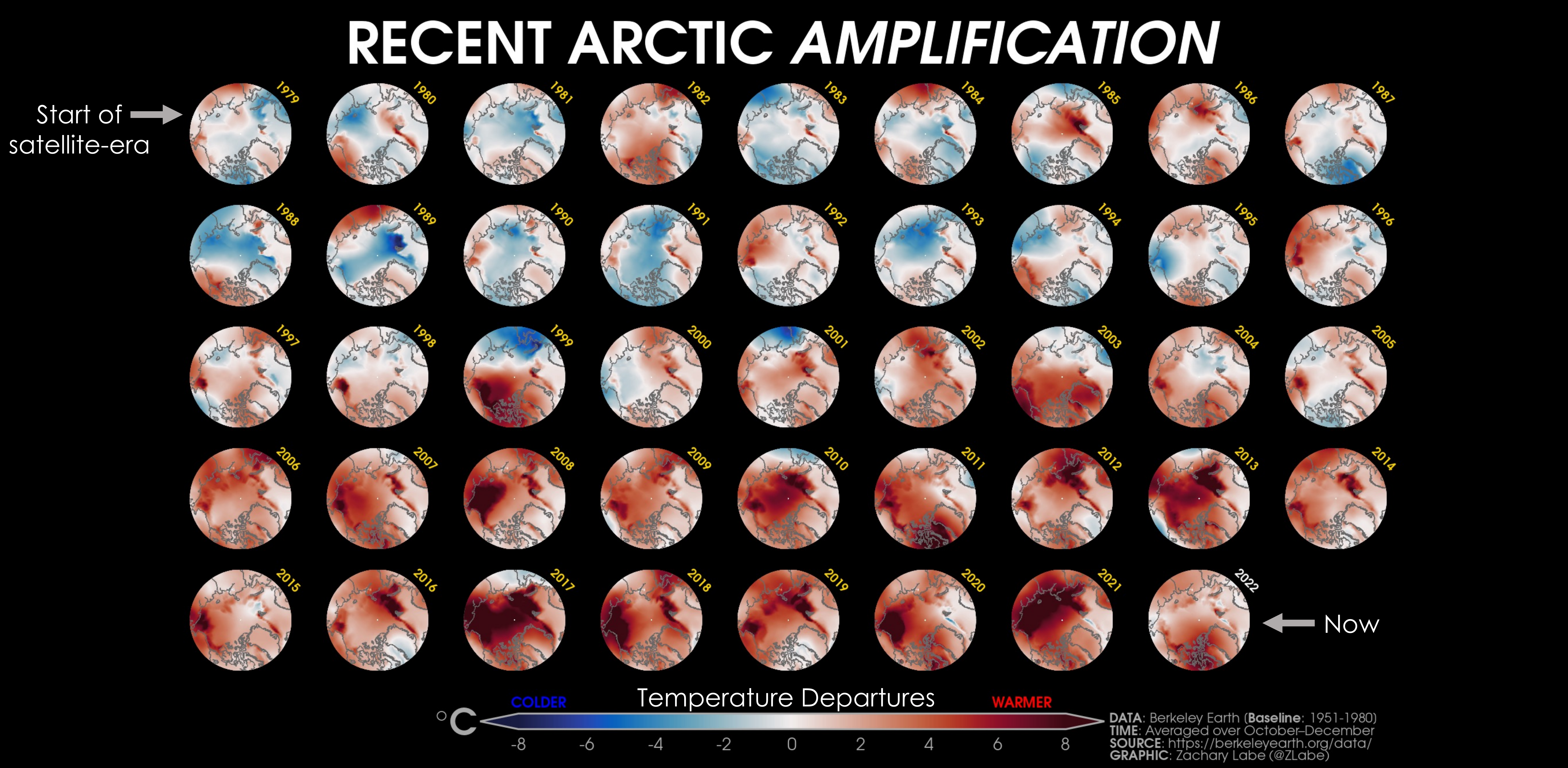
Anyways, my next ‘climate viz of the month’ is probably one of my favorite data visualizations (although never very popular when I share it on social media, ha!). It shows average October to December temperature anomalies across the Arctic from 1979 to present. Each circular temperature anomaly map indicates where that year was warmer (red shading) or colder (blue shading) than the 30-year average calculated over 1951 to 1980. This late fall and early winter period coincides with the largest Arctic amplification trends, since this is when sea ice begins to refreeze and all the newly accumulated heat (from the summer melt season) in the upper ocean is transferred into the overlying lower atmosphere (e.g., Screen and Simmonds, 2010; Hahn et al., 2022).
I particularly like to use this graphic for communicating the importance of spatial and temporal variability (i.e., natural climate variability) versus long-term trends (i.e., climate change). And at least for my eye, the blue-to-red color patterns are very striking even without the graph labels.
To be honest, I think I’ve used this graphic to introduce Arctic climate change and data visualization in all my polar climate presentations for at least the last 5 years. PS, speaking of presentations, I’m super excited about some new graphics I’ve created to show the influence of natural forcing vs. emission scenario pathways for future climate projections in the Arctic using our state-of-the-art climate model large ensemble at NOAA GFDL (SPEAR: Seamless System for Prediction and EArth System Research). So… if anyone is looking for talks on Arctic climate, don’t hesitate to reach out.
That’s all for now, and thanks for stopping by! I’ll have my January 2023 ‘climate viz of the month’ posted sometime in the next week or two. As a reminder, you can click on any of my visualizations to enlarge and/or download them at a higher quality resolution.
November 2022
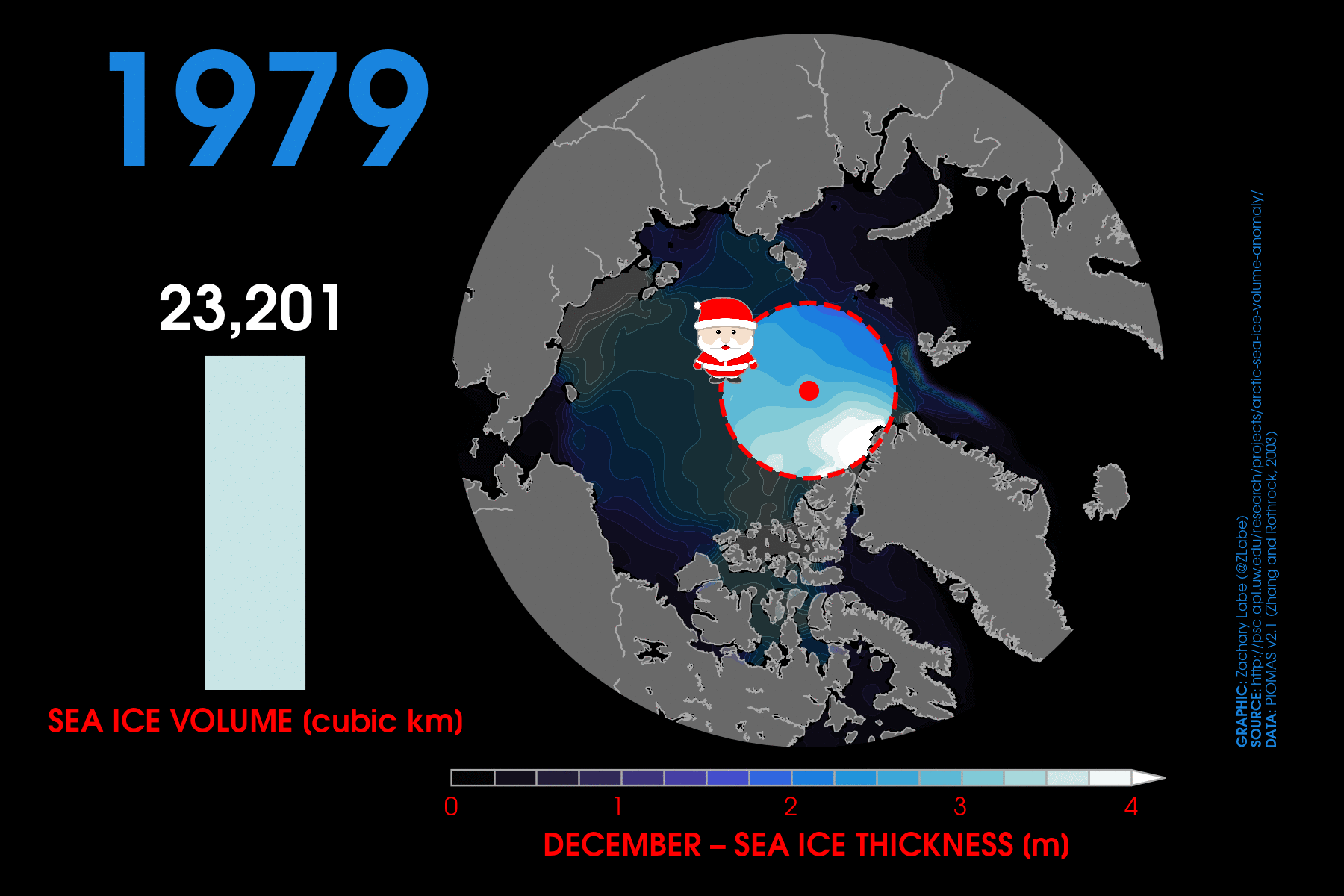
Hi! My November ‘climate viz of the month’ is instead a view of December in what has turned into a bit of a tradition. Along with my Halloween sea-ice extent graphic, I’ve now started creating a visualization for the December holiday season to reflect upon the loss of Arctic sea-ice thickness around Santa’s workshop.
This visualization uses data from an ice-ocean model called PIOMAS (version 2.1) to construct Arctic sea ice on daily to monthly timescales beginning in January 1979. In a previous study (Labe et al. 2018), we actually validated PIOMAS with satellite-derived and submarine observations of Arctic sea-ice thickness along with comparing it to projections from a climate model. In short, we find that this ice-ocean model does remarkably well in reproducing the spatial pattern, variability, and long-term trends of Arctic sea-ice thickness!
To show the effects of climate change and climate variability (e.g., year-to-year variations) around the North Pole, I am highlighting the actual ice thickness within the area north of 83°N latitude (red dashed line) and averaged for every December from 1979 to 2021. The other locations are slightly darkened out in the graphic. However, please note that the bar graph showing Arctic sea-ice volume is the total for the entire Arctic Ocean.
It’s clear that the ice is getting pretty thin around the North Pole, even in the middle of the long and dark Arctic winter. This is a reduction of nearly 2 meters (6.5 feet) in just a few decades! What might the legendary toy workshop look like by 2050? In the meantime, you can keep an eye on Santa’s sleigh on radar.
Thank you for taking the time to visit! Have a wonderful holiday season and start to the new year!
October 2022
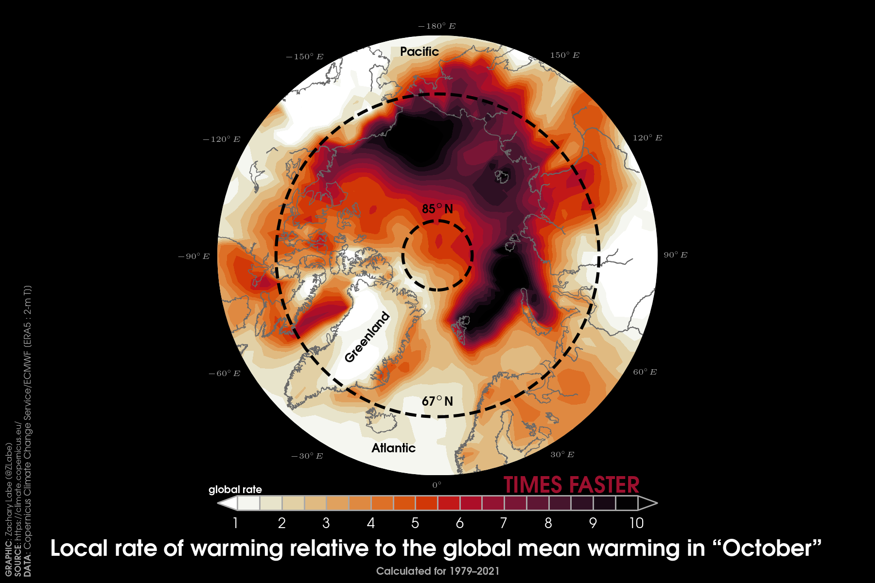
I am sure that most people reading this blog are aware that the Arctic is rapidly warming. In the annual mean, it is warming at a rate of 3 to 4 times faster than the global mean surface temperature trend. However, there is large seasonal and monthly variability in terms of this rate of warming.
This time of year, specifically October through December, is the fastest warming period in the Arctic. While there are a number of reasons for this accelerated warming in fall, it is generally related to a lack of sea ice. In the simplest terms, the mechanism (also referred to a positive feedback, but positive here does not mean good) is as follows: sea ice melts in summer – more open water is exposed due to this ice loss – rather than the ice reflecting incoming solar radiation, the dark open ocean waters now absorbs it as heat – sea ice begins to refreeze with the onset of colder temperatures in fall – the temperature difference/contrast between the ocean and overlying atmosphere begins to increase – more heat is then transferred into the atmosphere – this causes more warming and more ice loss. This cycle then repeats.
I thought it would be interesting to present this accelerated warming in terms of a local Arctic amplification factor, rather than showing long-term trends like I usually do. So, this latest ‘climate viz of the month’ shows the rate of warming at every point in the Arctic compared to the rate of warming for the overall global average during the month of October.
As you might notice, most of the Arctic is warming faster than the global average (in other words, it has a value greater than 1 on the map). More strikingly, some areas of the Arctic are warming more than 10x faster than the global average! This is usually found over areas associated with the largest long-term declines in Arctic sea-ice concentration and thickness, such as in the Chukchi, Kara, and Barents Seas regions. This includes the area surrounding Svalbard, where nearby it is warming up to 4°C per decade in fall. Clearly, this kind of warming is going to have impacts within the Arctic and beyond…
As my recent blogs have discussed though, not every month of year will break new temperature and sea ice records. In fact, October 2022 was “only” the 6th warmest October on record in the Arctic, and even sea-ice thickness levels are rather unremarkable compared to some recent years. But obviously, dramatic changes are occurring in the Arctic, even when compared more broadly to global climate change. Thanks for stopping by! You can always find my older blogs from this year at https://zacklabe.com/blog-archive-2022/ and the associated climate data rankings at https://zacklabe.com/archive-2022/.
September 2022
Finally, some good news. It was a pretty darn quiet summer in the Arctic. Of course, this is all relative. Current levels of Arctic sea ice extent are still more than 2.5 million square kilometers below what was common in the 1980s. Just to be very clear – sea ice is not recovering. We are only witnessing the (important) role of year-to-year variations in the climate system (i.e., internal climate variability).
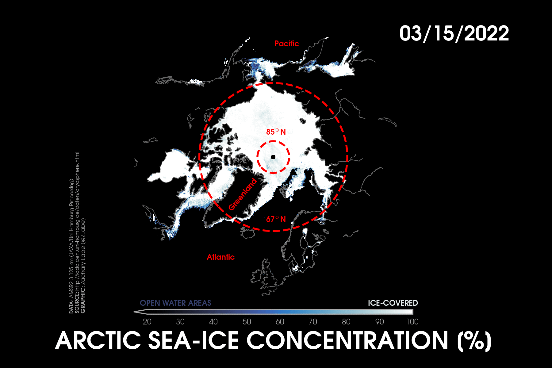
Through much of the summer, sea-ice extent remained close to the 2010s decadal average. The daily evolution of Arctic sea ice can be viewed in the latest ‘climate viz of the month’ using a high-resolution AMSR2 satellite-derived product. The annual minimum Arctic sea ice extent was then set on the 18th of September at 4.67 million square kilometers. This ranked as a statistical tie for the 10th lowest extent on record.
While this ranking may not sound very impressive at first, it’s important to note just how large changes have been in the Arctic over the last few decades. Compared to the 30-year average from 1981 to 2010, sea ice across the entire Arctic Ocean is effectively 1 to 2 meters thinner and little older, multi-year sea ice remains. Keep in mind that younger sea ice is usually more vulnerable to melting and breaking apart.
All of this evidence points to the importance of focusing on long-term trends for understanding Arctic climate change.
Variability in Arctic sea ice levels is also totally expected, as it often relates to current weather conditions. For example, this year observed stormier weather across the middle of the Arctic Ocean (low pressure), which helped to limit the amount of melt ponds from forming earlier in the summer. In other words, this weather pattern prevented some of the melting and sea ice contraction that might have otherwise occurred.
This year-to-year variability is well simulated by state-of-the-art climate model projections. We do not expect that every year will observe new records in Arctic temperatures or for sea-ice loss. But the long-term trends remain clear – the Arctic is rapidly warming, and sea-ice levels are declining. Am I surprised that this year was not, for instance, in the top 5 lowest extents on record? Nope, not at all. Internal variability is a large source of uncertainty regarding future projections of Arctic sea ice, such as the timing of the first ice-free summer. This remains a very active area of research.
There were still some notable anomalies though. This included the record warmth over the Canadian Arctic in early July, which helped to precondition sea ice to rapidly decline in the vicinity of the Northwest Passage. There were also large areas of open ocean water close to the North Pole, which may be related to storminess earlier in the summer and dynamical mechanisms associated with ice divergence. The Barents Sea also witnessed a near-record early melt-out in June and July, which led to more incoming solar radiation being absorbed into the open water. This then caused more ocean warming, allowing sea surface temperatures to rise to nearly 5°C above average. This is an example of a local positive climate feedback, which is one reason that temperatures are rising 3 to 4 times faster than the globally averaged mean temperature.
So now the freeze season is well underway – in fact, the largest average rate of daily sea ice extent increase occurs in mid-October. Also of note, the largest warming associated with Arctic Amplification occurs this time of year… more on that later. Thanks for stopping by! You can always find my older blogs from this year at https://zacklabe.com/blog-archive-2022/ and the associated climate data rankings at https://zacklabe.com/archive-2022/.
August 2022
Hi there! This is a busy time of year for followers of Arctic sea ice, as we are quickly approaching the annual minimum sea-ice extent. This year’s minimum will probably be set sometime in the next week or so, and I will touch more on it in my blog for next month.
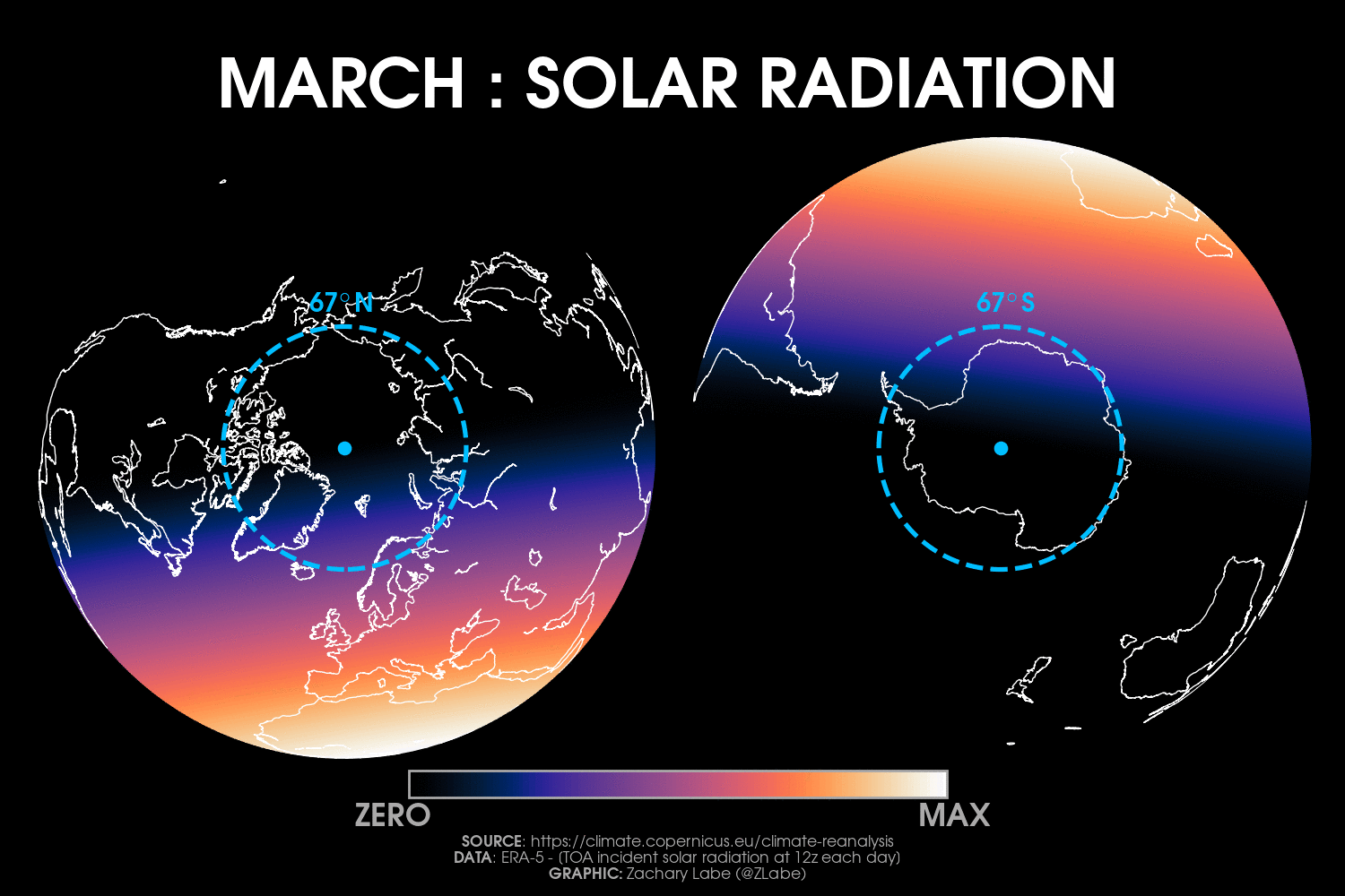
Instead, my blog for August’s ‘climate viz of the month’ will be short and highlight a comparison of the midnight sun in the Arctic and polar night in the Antarctic. Of course, this also relates to the importance of the seasonal cycle in polar regions, like for sea ice and the surface energy budget.
This particular animation is subtle, so watch closely – it shows a view of incoming solar radiation taken at the same time every day (12:00 UTC) from March 21 to September 21. You can clearly see the differences in sunlight for the opposite hemispheres. In fact, we will be approaching the annual maximum sea-ice extent in just a few weeks or less as the austral winter comes to an end. Although most of my graphics focus on extreme events or long-term climate trends, sometimes I think it’s equally as important to step back and just appreciate visualizations showing the seasonal cycles of climate variables. This always helps me better understand the interconnected nature of the Earth system.
While most of my research is related to computer programming – either through climate models, machine learning, or using other statistical tools – I did have the opportunity to visit the Arctic for a summer field school in graduate school. It was by far one of the best experiences of my life, and I will never forget the moment I saw Arctic sea ice for the first time on our icebreaker the R/V Lance. But I must admit, experiencing 24 hours of sunlight was one of the strangest things I’ve ever encountered. I suppose you eventually get used to it, and I am sure it didn’t help that my dorm room had bright red curtains (that were not darkening either) in Tromsø, Norway 🥴. But I can’t wait to go back.
That’s all for now! You can always find my older blogs from this year at https://zacklabe.com/blog-archive-2022/ and the associated climate data rankings at https://zacklabe.com/archive-2022/. Overall, August 2022 was another pretty quiet month in the Arctic compared to some extreme years in the last decade. The largest air temperature anomalies were in the vicinity of the Barents, Kara, and Laptev Seas region, which is likely related to the unusually early sea-ice decline that has become so common anymore in those areas. In fact, in preparing for this year’s Arctic Report Card (which will come out in December 2022), we observed near-record high sea surface temperatures in the Barents Sea this August. Unsurprisingly, the thickness of Arctic sea ice remained well below the 1981-2010 average according to PIOMAS. It will be interesting to extend the new CryoSat-2 summertime observations of sea-ice thickness for this summer. More on this very exciting new research and data product later!
July 2022
Describing Arctic sea ice can be quite tricky. Scientists have an alphabet soup of terms to describe similar, but different states of the ice. The most common term you are probably used to hearing is “sea-ice extent,” which is also what is displayed on most graphs. Arctic sea-ice extent describes a binary choice for sea-ice cover over a specific region. In other words, if the fraction of a defined box is covered by at least 15% of sea ice then it receives a [1]. This box is now considered completely ice-covered. But if the fraction of ice cover in this box is less than 15%, then it receives a [0]. This box is now considered open ocean water. The area of each [1] box is then counted up (usually in square kilometers) and the final sum is reported as the total Arctic sea-ice extent. While (by definition) this metric overestimates the actual area of Arctic sea-ice cover – since many boxes are not 100% covered by sea ice – it is a useful, consistent measure for monitoring long-term trends in Arctic sea ice and helps address uncertainties in data like Arctic sea-ice concentration. Some other sea ice terms could include sea-ice volume, sea-ice thickness, sea-ice ice draft, sea-ice area, sea-ice roughness, and sea-ice age, but those are blogs for another day.
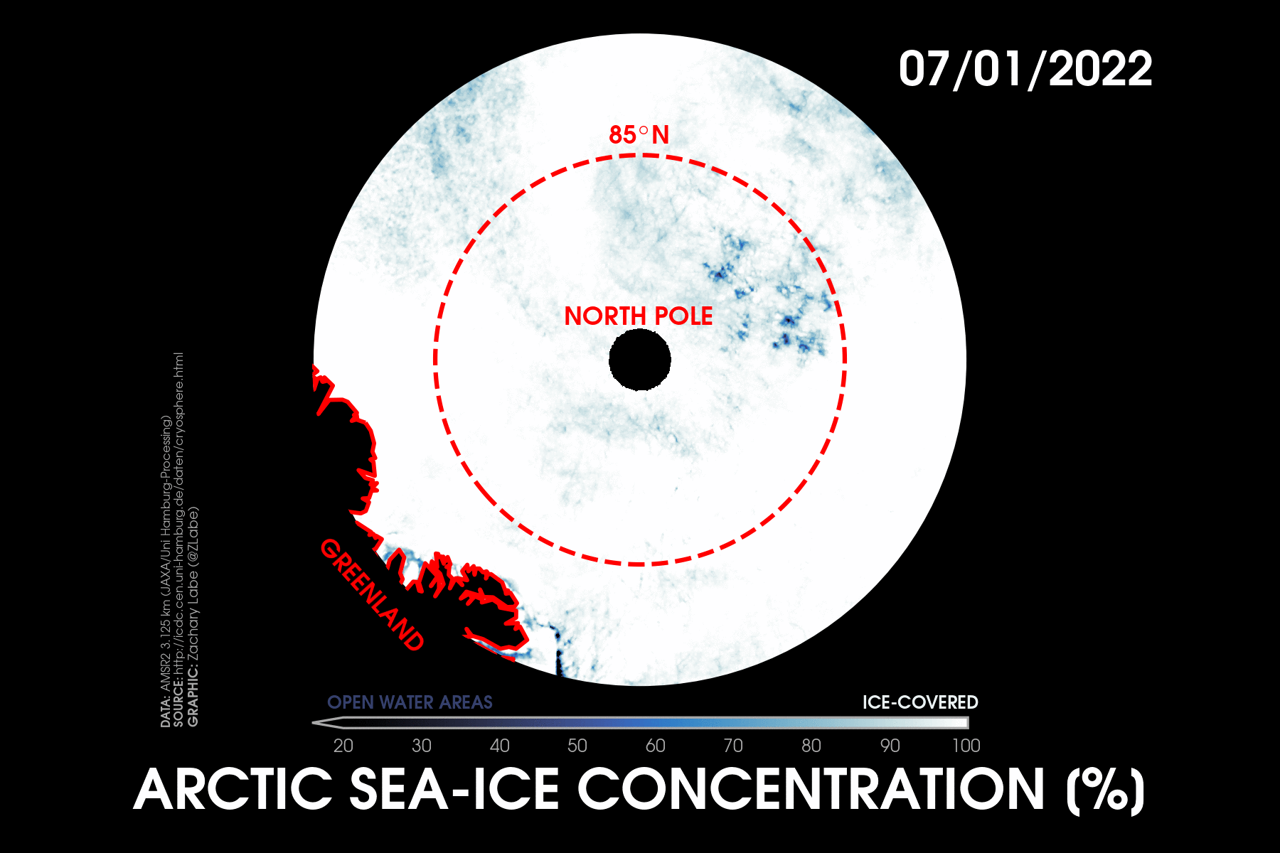
Okay, now Arctic sea-ice concentration is actually what I want to highlight for July’s “climate viz of the month.” Sea-ice concentration is that fractional value of ice cover at every grid box that I just described. So it’s totally unitless and usually reported as a percent.
Just as related side note – data derived from satellites are often provided on 2-dimensional spatial grids/maps, where the size of each grid box is dependent on the resolution of the satellite algorithm. Therefore, we can retrieve a fractional sea-ice concentration value at every gridbox (or point) on the map.
I am featuring July’s Arctic sea ice concentration because it provides a clear example on the importance of considering the relationship between local weather conditions and sea-ice variability. While many of us probably think of air temperature as the first thing responsible for changes in Arctic sea ice – warm up, melt down or cool down, freeze up – the mechanisms that affect the variability of Arctic sea ice are much more complicated.
Another side note – that melting could also be coming from the bottom (think warming ocean waters)… More on that later too.
The variability of Arctic sea ice is very much affected by the movement of ice across the Arctic Ocean. This motion can be influenced by large-scale processes, such as ocean currents, but it also can be influenced by storm systems that last only a few days. We often call these Arctic cyclones. In addition to their first order effects of wind, precipitation (rain and snow), and high waves, Arctic cyclones can also affect the surface energy budget through changes to cloud cover and humidity in the lower atmosphere. All these processes contribute as competing mechanisms response for causing sea ice to either melt, grow, expand, or contract. Understanding the role of changes to Arctic cyclones and their influences on Arctic sea ice remains a very active and important area of research. There is no clear consensus on this topic. That is unless you want me to become my nitpicky self and start listing all the uncertainties and methodological choices.
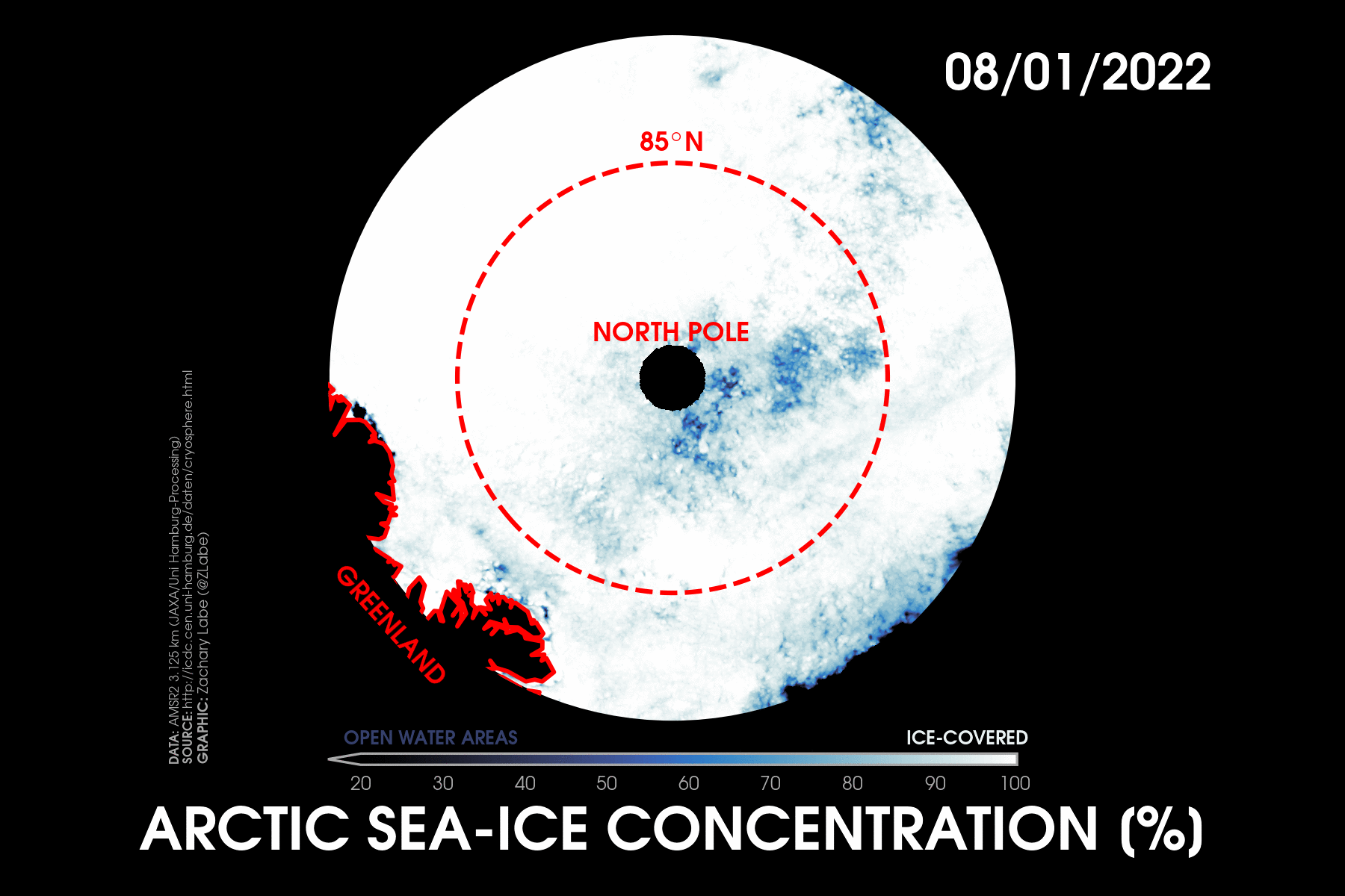
Anyways, now FINALLY getting back to July… Looking at the animation you can see that there is a lot going on in a month’s time (click on it to enlarge). Sea ice is clearly moving around. There are also “flashes” of sea-ice concentration. But these are usually data artifacts resulting from some of those satellite uncertainties I mentioned earlier. Basically, things like cloud cover and melt water on top of the sea ice can interfere with the passive microwave satellite instrument algorithms and subsequent estimates of sea-ice concentration. But the interesting area in July was a region of unusually low Arctic sea-ice concentration close to the North Pole. We can double check with imagery from NASA’S MODIS satellite instrument to verify that indeed there were many areas of open water close to the North Pole. This low sea-ice concentration likely resulted from a series of storm systems in that region that contributed to the ice spreading apart (aka sea ice divergence).
So why? How unusual is this? Well, this certainly isn’t the first time we’ve observed low sea-ice concentration near the North Pole. In fact, the amazing MOSAiC team described large areas of open water near the North Pole surrounded by mushy ice in August of 2020. And 2016 was another notable year of ridiculously low concentration in the northernmost portions of the Arctic. However, there is evidence that this is also becoming more common. Long-term trends reveal substantially thinner and younger sea ice across the entire Arctic Ocean. Sea ice that is thinner can often be more fragile and easily moved around by summer cyclones, like the ones we observed in July. This is shown in July’s visualization where the patches of low sea-ice concentration move around in circular-like motions near the North Pole. Notably, this string of stormy activity in July 2022 over the central Arctic did not result in a large loss of sea-ice extent. In fact, current levels of Arctic sea-ice extent are higher than many recent years (currently the 12th lowest on record as I type this blog). But to be very clear, the Arctic does not at all resemble what it would have looked like in the summertime just a few decades ago. The long-term changes are obvious, despite year-to-year variability.
I can’t help but wonder what this imagery may have looked like with a thicker sea-ice cover, like in the 1980s or 1990s? Would the recent stormy weather have had the same influence? This visualization demonstrates the importance of considering influences beyond temperature that result in changes to Arctic sea ice. Understanding changes in summertime Arctic sea ice is tough. We need to think about thermodynamic (like temperature) and dynamic (like its movement) contributions to understanding why some years experience more melt than others.
Yet I still can’t help but feel unease anytime I see larger areas of open water close to the North Pole.
Thanks for reading! You can find my older blogs from this year at https://zacklabe.com/blog-archive-2022/ and the associated climate data rankings at https://zacklabe.com/archive-2022/. Overall, July 2022 was a pretty unremarkable month for Arctic climate statistics, but there’s always something important if you look a bit more closely.
June 2022
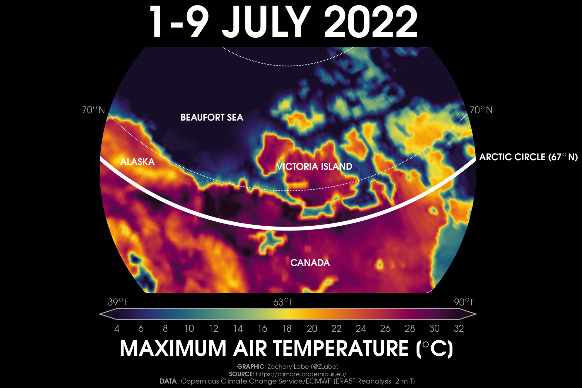
The first ‘climate viz of the month’ highlights the recent anomalous warmth over northwestern Canada and parts of the Canadian Arctic Archipelago, including Banks Island and Victoria Island. This visualization shows the highest temperature set for each location during the 1-9 July 2022 period.
An anomalous ridge of high pressure, abundant sunshine, and dry weather conditions contributed to surface temperatures rising to over 32°C (~90°F) for some locations just along the Beaufort Sea (Arctic Ocean). For the first time on record, Inuvik, Canada (Northwest Territories) reached over 30°C for three consecutive days in a row (2-4 July 2022). Numerous other locations also set high temperature records during this anomalous stretch of weather at well over 30°C. While the unusual warmth (at the surface) primarily stayed southeast of the Beaufort Sea, temperatures in the lower troposphere (850 hPa) reached near record high levels for this time of year. The low-level warmth and humidity has further contributed to an expanding number of melt ponds across the Beaufort Sea into the Northwest Passage, such as around Cambridge Bay. Although sea-ice extent remains near the 1981-2010 average in the Beaufort Sea, partly due to an arm of thicker, multi-year sea ice, it is likely these conditions have acted to precondition the sea ice for accelerated melting later this summer. Smoke from the extensive wildfires in Alaska and northwestern Canada has obscured some of the view of these melt ponds, but the blue shading to the ice is still visible on MODIS Terra.
Even though current levels of sea-ice extent and thickness are not as low as some recent years, regional extremes, including the wildfires and record warmth in the Canadian Arctic, continue to tell the story of a changing Arctic. I discuss the importance of understanding this interannual variability versus long-term trends in a new blog. Lastly, check out my new archive of monthly temperature and sea ice rankings for 2022 at https://zacklabe.com/archive-2022/.
My visualizations:
The views presented here only reflect my own. These figures may be freely distributed (with credit). Information about the data can be found on my references page and methods page.