May 2024
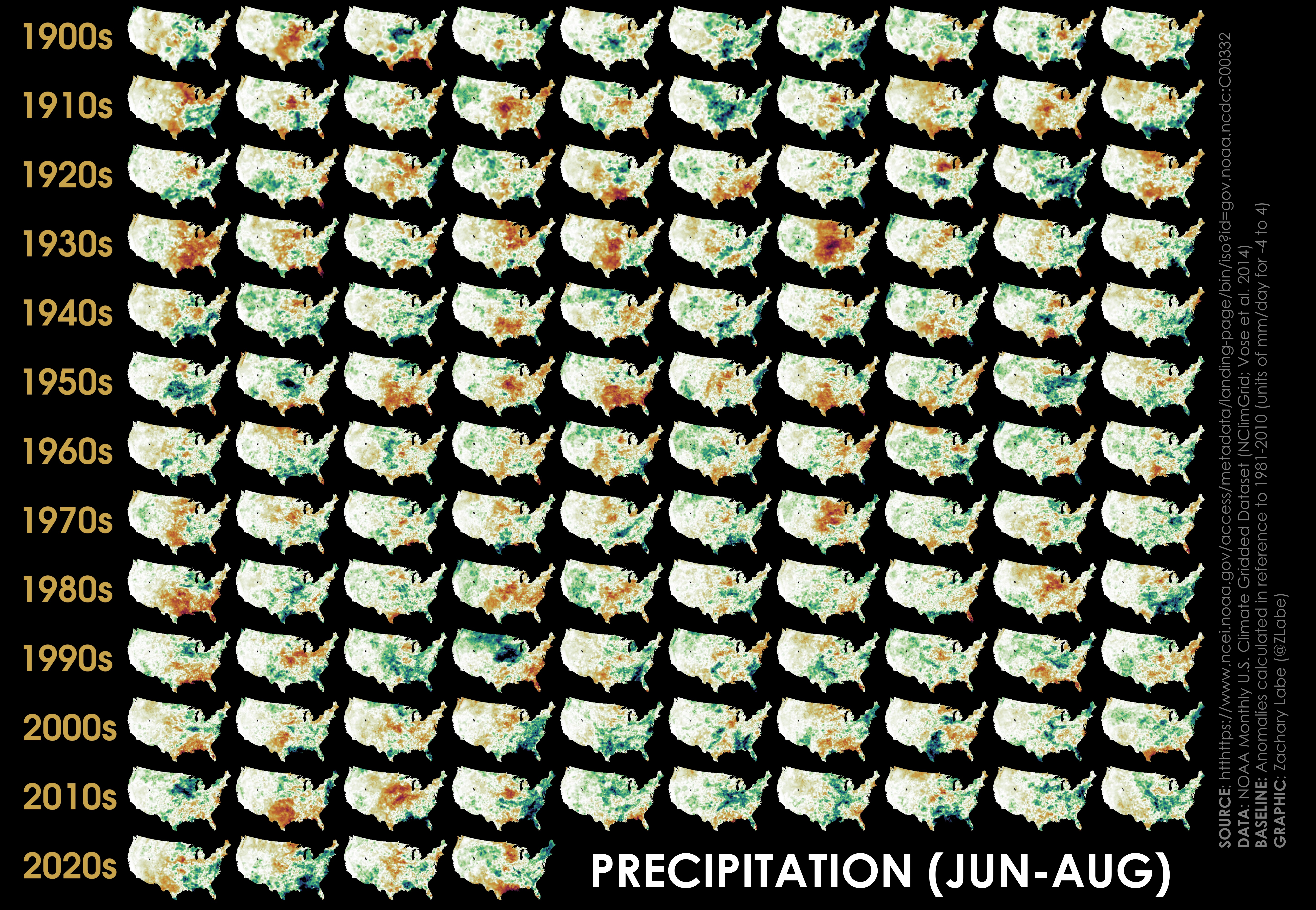
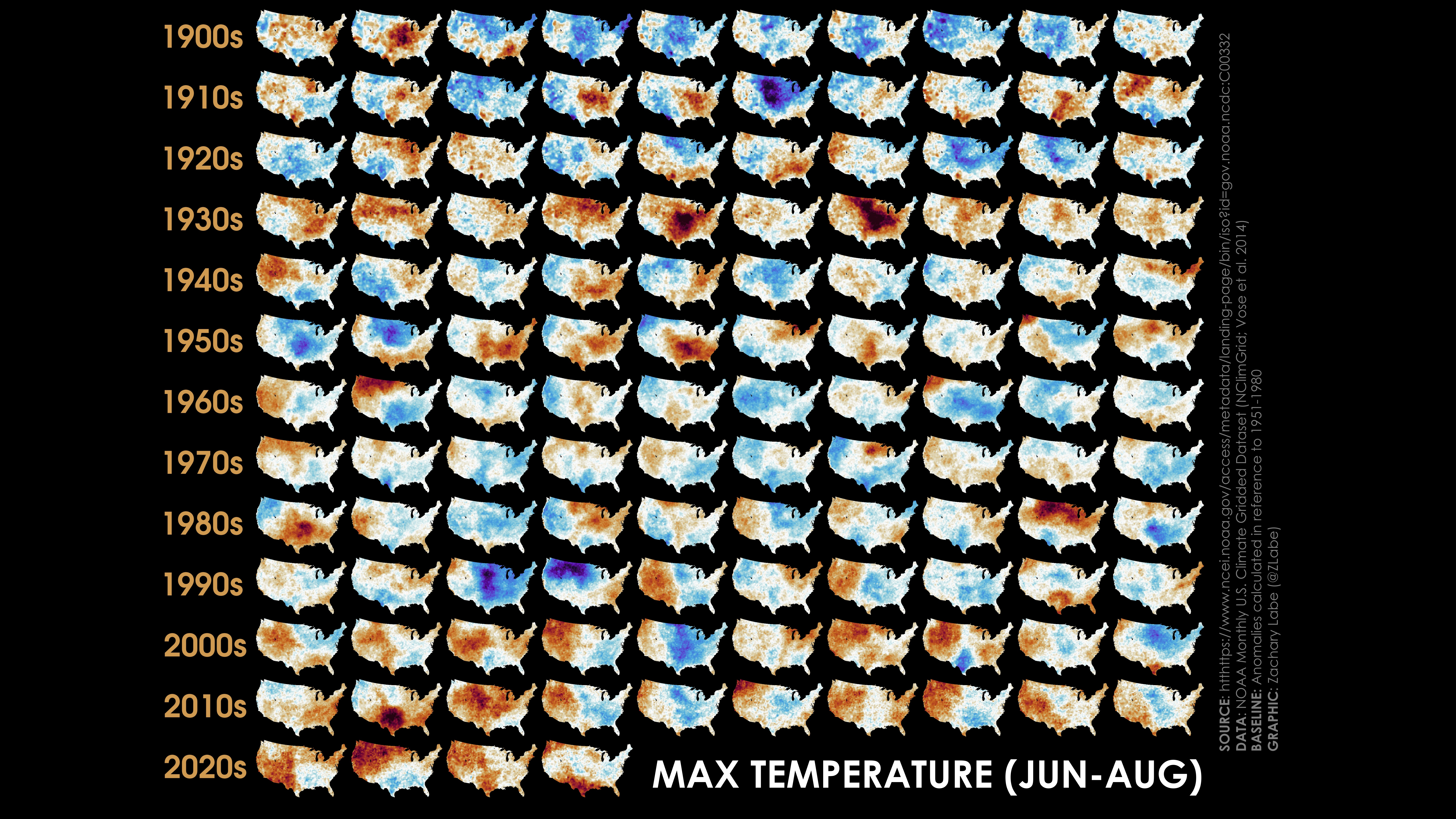
Happy weekend! With one of the first potentially record-breaking heatwaves to impact the Northeast this summer, I wanted to focus my next ‘climate viz of the month’ blog on summertime conditions across the United States. This graphic is also an extension of a blog I shared earlier this year (see February 2024) that discussed our recent study (Eischeid et al. 2023) using a visualization of maximum surface air temperature anomalies from 1900 to 2023. This complementary figure now shows the same postage stamp-style graphic, but instead highlights average June-July-August (JJA) precipitation across the contiguous United States (CONUS) from 1900 through 2023. The data is again coming from the high-resolution NOAA Monthly U.S. Climate Gridded Dataset (NClimGrid), which is available at a gridded spatial resolution of 5 km (latitude x longitude) using in situ weather station data with long-term records. Note that quality control and statistical interpolation is also included in this data product to account for inhomogeneities and areas of missing information. For more information, check out Vose et al. 2014.
Once again, I have intentionally provided no labeling. I want color to tell the story, so here I focus on hues of brown and green for precipitation anomalies which can be used to infer locations of drier or wetter regions, respectively. The colormap (“seasons”) I am using is from the open-access Python package called CMasher (van der Velden, 2020). I scale each map to have the same minimum and maximum anomalies for a fair comparison. This range is from -4 mm/day (dark brown) to +4 mm/day (dark green). The specific variable shown is the average precipitation rate anomaly, which is common way to express rainfall in climate science. This is also why there are units of time. Recall that in climate science the word anomaly means a departure from an average. The average for these maps is calculated over the 1981-2010 period. You can find more information on my choices in calculating climatological anomalies using 30-year periods on my “frequently asked questions” page.
As an example, the bottom row shows the mean JJA precipitation rate anomaly for each of the years from 2020 (bottom-left corner) to 2023 (third map to the right of 2020).
In addition to substantial regional variability from year-to-year and place-to-place, you may also notice that there is a lack of an obvious long-term trend by purely focusing on only the colors. Precipitation is a significantly noisier variable compared to temperature, and therefore, climate visualizations like this one aren’t always the most effective ways of evaluating long-term trends or multi-decadal variability. There are in fact areas of statistically significant long-term precipitation trends in summer. For instance, our warming hole study found that increases in precipitation over the central United States were linked to a lack of daytime warming during the summer months. This brings up a key point… Precipitation and heatwaves are tightly coupled through land-atmosphere interactions. For example, a lack of precipitation can contribute to soils drying out, which increases the probability for anomalous warmth through the surface energy budget (heat flux exchanges). We can see this reflected even just last year, where unusually low precipitation across Louisiana and Texas coincided with anomalous warmth over a similar region. We actually have a study in review on this particular heat event from our NOAA extreme event rapid attribution team, so more coming soon!
The 2011 heatwave across Texas/Oklahoma is another case study that is linked to areas of below average summertime precipitation. But of course, the most obvious example of this can be found in the row of maps for the 1930s, where drought conditions were in close proximity to the areas of historic warmth in the central portions of the United States (especially 1934 and 1936 of the Dust Bowl). To better visualize this, I recommend clicking the tabs back and forth between these two postage-stamp visualizations: temperature and precipitation. On the other hand, unusually wet conditions can also increase surface humidity (dew points) and thus can contribute to greater impacts from dangerous heat indices in some cases. The NOAA National Weather Service (NWS) defines the heat index as: “a measure of how hot it really feels when relative humidity is factored in with the actual air temperature.” More information on the heat index can be found at https://www.weather.gov/safety/heat-index.
Overall, it is clearly crucial to consider the effects of antecedent and concurrent precipitation anomalies when predicting anomalous temperatures and heat risk in the warm season. For many parts of the CONUS, a good/simple seasonal forecast rule of thumb is that dry winter-spring conditions (drought) increases the probability of experiencing heat extremes during the following summer. In a future blog, I will also do a comparison of daytime maximum temperatures versus nighttime minimum temperatures, which have unique climate drivers, variability, and long-term trends.
Turning back to the Arctic, the main story so far this melt season has been around the Hudson Bay where above average temperatures and unusually strong and persistent easterly winds contributed to its earliest sea ice decline on record. Widespread open water can already be found across the entire eastern two-thirds of the Hudson Bay, and total sea-ice extent in the basin remains the lowest on record in the satellite-era for today’s date. This large regional anomaly has also contributed to the total Arctic sea ice statistics becoming more extreme in terms of daily ice extent rankings (around 5th lowest on record for mid-June). This contrasts with last month, which was fairly quiet for sea-ice volume, thickness, and extent rankings across the Arctic Ocean. We should soon have more data related to the coverage of early melt ponding across the Arctic Ocean, and that will provide more insight on the potential for how low sea-ice area might fall toward the September annual minimum (Bushuk et al. 2024). While temperatures were mostly near average region-wide, there were some notable cold anomalies across the Greenland Ice Sheet that reached up to 5°C below the 1981-2010 average. This was accompanied by areas of heavy snowfall, which have kept the albedo of the ice sheet surface quite a bit higher than recent years. Note that this may limit the total amount of surface mass loss this summer. Otherwise, there was some unusual warmth in northern Canada and north-central Siberia, mostly in response to the orientation of the mean large-scale atmospheric circulation.
That is all for now, but I will have some very exciting personal news to share early this coming week! My other monthly blogs for 2024 are archived at https://zacklabe.com/blog-archive-2024/, and the associated climate data rankings are available from https://zacklabe.com/archive-2024/.
April 2024
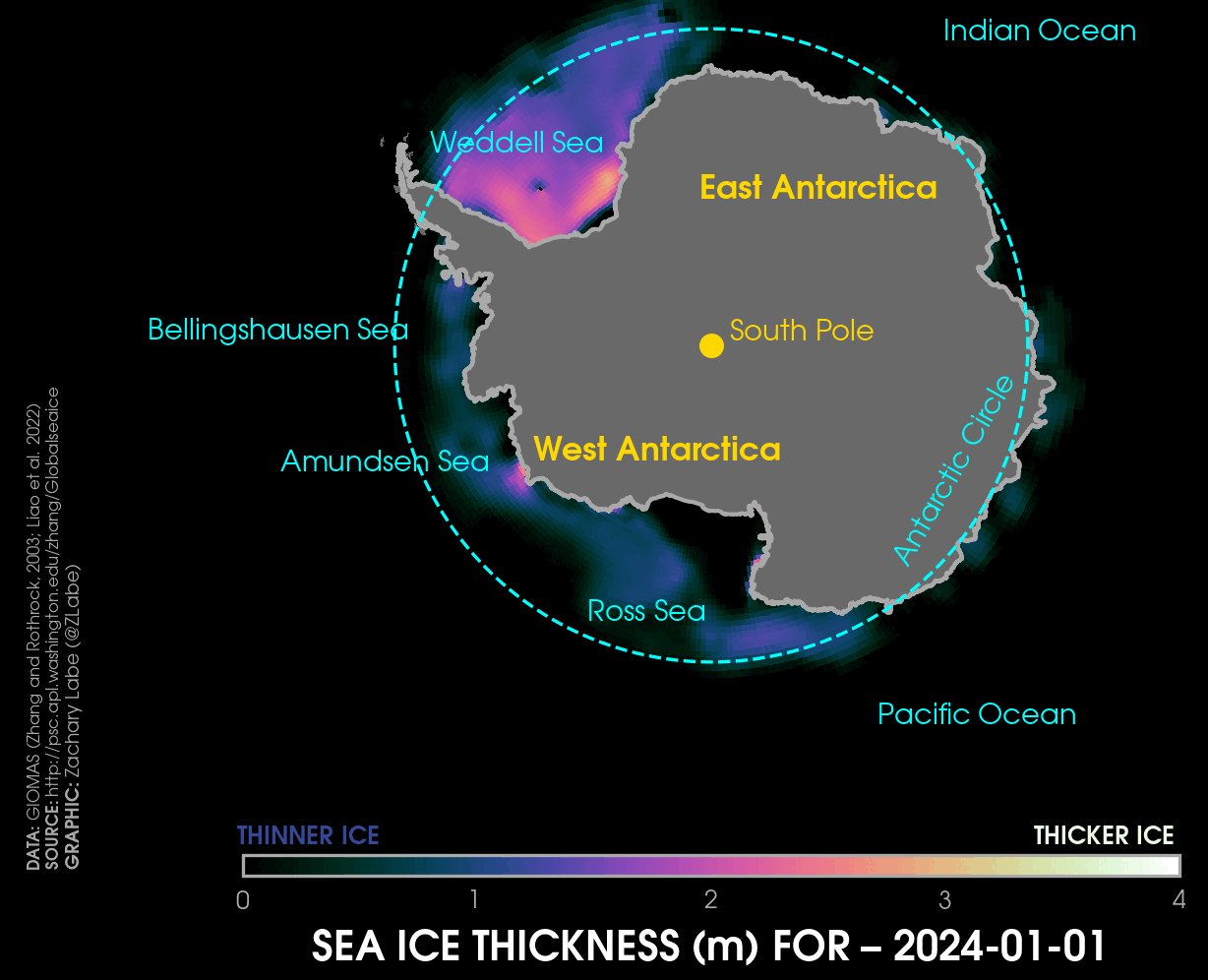
Hello! Time continues to fly by, so here is another ‘climate viz of the month’ blog. This month takes a closer look into Antarctic sea-ice thickness, which typically has been less frequently discussed due to a general lack of temporally- and spatially-complete data and the overall fact that Antarctic sea ice is mostly new, first-year ice (so less thick relative to the Arctic). Earlier this year, I wrote a blog that highlighted the seasonality of Antarctic sea-ice thickness using monthly data from a data product called GIOMAS. And now in this blog, I will show what the evolution of daily sea-ice thickness looks with a focus on 2024.
I’d first like to point out that there have already been quite a few peer-reviewed studies out this year attempting to disentangle the causes of the extreme sea ice conditions in 2023 (and more generally since 2016). Again, the picture remains complicated, as both atmosphere and ocean likely contributed to these extreme anomalies. Maybe later this year I will dive a bit more into these papers, but for now, you can check them out yourself in these links (let me know if I am missing any):
The next point worth noting is a reminder that 2024 has not observed record low sea ice conditions like last year (see more at https://zacklabe.com/antarctic-sea-ice-extentconcentration/). This includes for mean sea-ice extent, sea-ice concentration, sea-ice thickness, sea-ice volume, and sea-ice area. While this is not surprising at all, given the influence of internal climate variability and regional weather, it is a good reminder that sharing graphs with record low sea ice does not necessarily imply a tipping point or shift to a new permanent state. This type of messaging on social media is unhelpful for climate change communications and is not scientifically accurate, especially in instances when extrapolating current conditions to future conditions (find reliable, honest, and trustworthy sources to follow!). This is another reason climate scientists focus on placing extreme events within the context of longer-term trends, like 30-year periods or more.
Anyways, back to this month’s visualization. As a reminder, this dataset is from GIOMAS, which stands for Global Ice-Ocean Modeling and Assimilation System (Zhang and Rothrock, 2003). GIOMAS is a variation of PIOMAS, which I frequently discuss in my blogs and climate visualizations. Both products are open access and available through researchers at the Polar Science Center (PSC)/Applied Physics Laboratory (APL) at the University of Washington. If you are interested in the technical details, GIOMAS is an ice-ocean model with components from the thickness and enthalpy distribution (TED) and Parallel Ocean Program (POP), respectively. GIOMAS assimilates sea-ice concentration from passive microwave satellite observations through a nudging technique – basically the model “nudges” ice concentration produced by the model toward observations. GIOMAS uses a finite-difference grid with latitude/longitude dimensions of 360 by 276 based on a spherical coordinate system in the Southern Hemisphere. The model simulates sea ice globally, but my focus here is only on the Antarctic. Since GIOMAS has no atmospheric component, the model is driven by inputs from atmospheric reanalysis using NCEP/NCAR R1. In addition to sea-ice thickness, the model also produces daily and monthly outputs of other variables in binary format that include: sea-ice velocity (zonal and meridional components), sea ice growth rate (meters per second), sea ice melt tendency due to ocean heat flux (meters per second), snow depth water equivalent, ocean surface temperature (2.5 meters depth), ocean surface salinity (2.5 meters depth) and ocean surface velocity (zonal and meridional components at 2.5 meters depth). More details and model source code can be found at https://psc.apl.washington.edu/zhang/Global_seaice/index.html, and a recent evaluation of GIOMAS relative to observational estimates derived from satellite altimetry can be found in Liao et al. (2022).
Most all weather/climate models (and scientific models more broadly) have advantages and disadvantages (e.g., biases). When interpreting my GIOMAS graphics, do keep in mind that this does not represent ground truth. However, this data can still provide us with valuable information for understanding the regional evolution of Antarctic sea-ice thickness variability and trends. The focus of this visualization is therefore not on the exact details of 2024’s sea-ice thickness melt and growth rates at each little point on the map, but rather it is to demonstrate an example of the truly dynamic nature of daily sea ice movement and development. I know this might sound like an easy way out, but “it’s complicated” is always a useful and accurate answer in polar science.
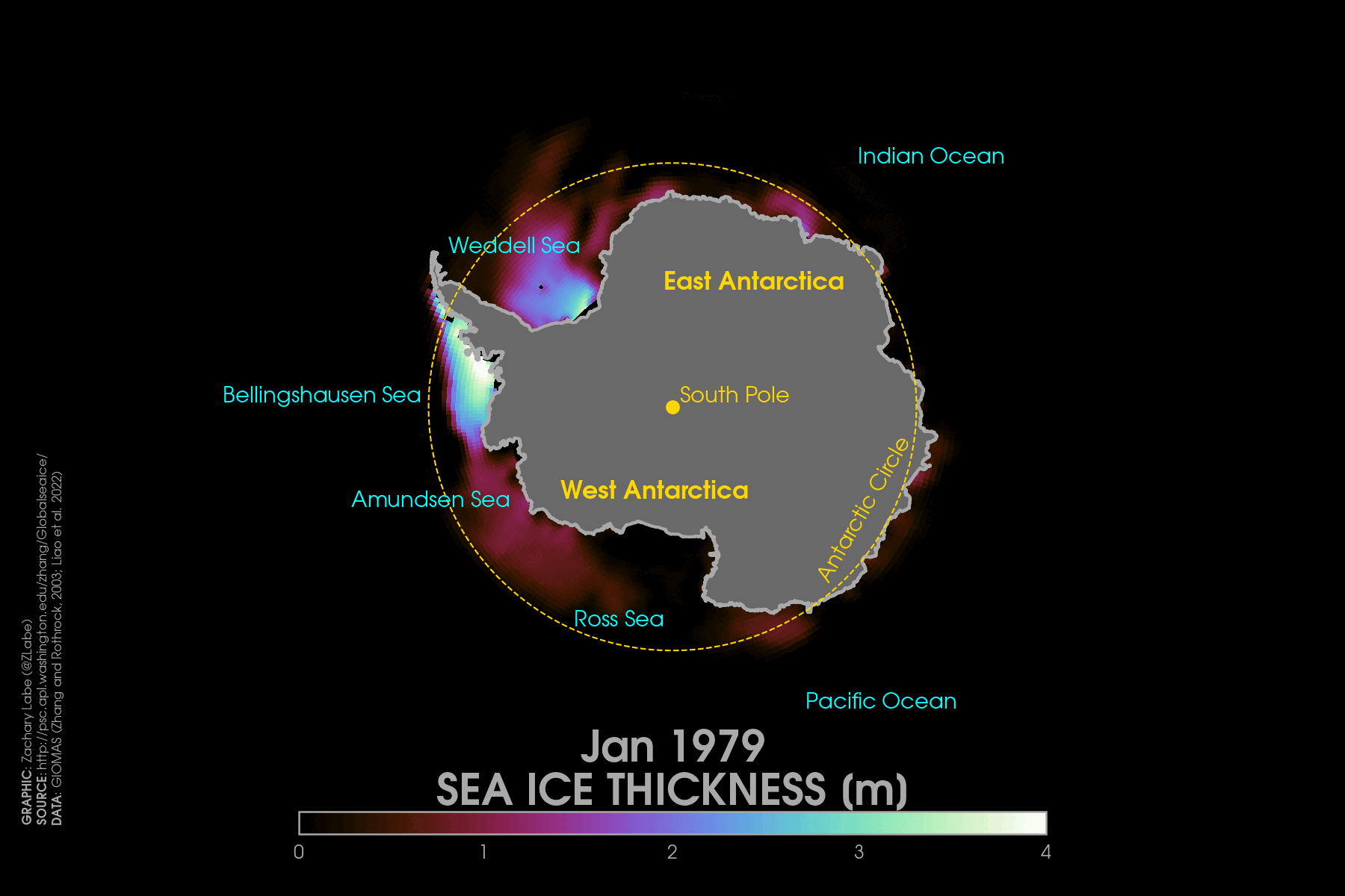
This visualization shows daily sea-ice thickness from GIOMAS from 1 January 2024 to 15 May 2024 (latest available data as of writing this blog). This temporal evolution includes the end of the melt season, which lasts until about mid-March before reversing as sea ice expands with the onset of the Austral winter season. The Weddell Sea is home to some of the thickest sea ice in the Antarctic region, whereas most other regions are first-year ice that is much thinner. This distribution of ice is due to the movement ocean currents, the position of climatological high/low pressures (large-scale atmospheric circulation), and the distribution of land/land ice/ocean from the Antarctic Peninsula, Ronne–Filchner Ice Shelf, and Southern Ocean. You might also see this odd feature in the Weddell Sea that sea ice moves and thickens around (almost looks like an island or iceberg), but I am honestly not sure what this is… maybe just a model artifact? Anyone else know?
As air (and subsequently ocean) temperatures started to rapidly cool in April and May 2024, sea ice then expanded outward from the Antarctic continent, which is normal. This ice is only a meter or less thick, although sea ice ridging along land/ice features in coastal regions can lead to local thickening as it piles up with enhanced growth rates. This ice will continue to rapidly expand equatorward over the next few months. Antarctic sea ice has one of the largest annual seasonal cycles of any weather and climate phenomenon. As we try to understand what the evolution of Antarctic sea ice looks like in a warming world – due to human-caused climate change – it will be crucial to understand the regional differences in ice thickness and how it is influenced by the ocean, atmosphere, and land ice (like freshwater input). You can freely download this same data from https://pscfiles.apl.uw.edu/zhang/Global_seaice/; let us know what you find!
Thanks for reading this month’s visualization blog! Looking back at the Arctic in April of this year reveals a pretty quiet month in terms of sea ice and air temperatures. The warmest near-surface air temperature anomalies were found in western Greenland and the Baffin Bay region, while other regions witnessed greater variability in the pattern of anomalies. Something interesting to note though for April is that there were fairly large differences between ERA5 and GISTEMPv4 datasets. For example, using equivalent 1981-2010 baselines, there were much cooler anomalies over the North Pole and Chukchi Sea regions in ERA5 compared to NASA/GISS GISTEMPv4. I haven’t had time to explore why this happened, but this seems to be a very unusual divergence.
Sea-ice extent continues to remain relatively high compared to recent years (April 2024 was the 16th lowest), but ice volume is much lower according to PIOMAS (4th lowest in April 2024). I still think this large contrast between thickness and extent this year is partially due to a substantial loss of multi-year ice through the Fram Strat this winter (ice export), but more analysis is needed.
The summer melt season is now underway, and pretty soon we should be getting early estimates on how extensive melt ponds have started to form. In my view, this is always a fairly good predictor of September sea ice. If you are interested in this topic, be sure to check out our new review open-access paper on predicting September sea ice: Bushuk et al. 2024, BAMS.
Thanks for reading! You can find my blogs from earlier this year https://zacklabe.com/blog-archive-2024/ and the associated climate data rankings at https://zacklabe.com/archive-2024/.
March 2024
Hi! Another winter in the Arctic has passed, and it’s now time to review the conditions over the course of the freeze season and briefly share our new research study. This winter is especially of high interest given that another season has passed without any new daily, monthly, or climatological (maximum) record lows. This includes for all of the key sea ice metrics: ice extent, ice concentration, ice thickness, ice age, and ice volume. While the exact details of the causal drivers are much more complicated, the broad answer as to why Arctic sea ice is relatively high compared to other recent years is pretty simple: thank the “weather.”
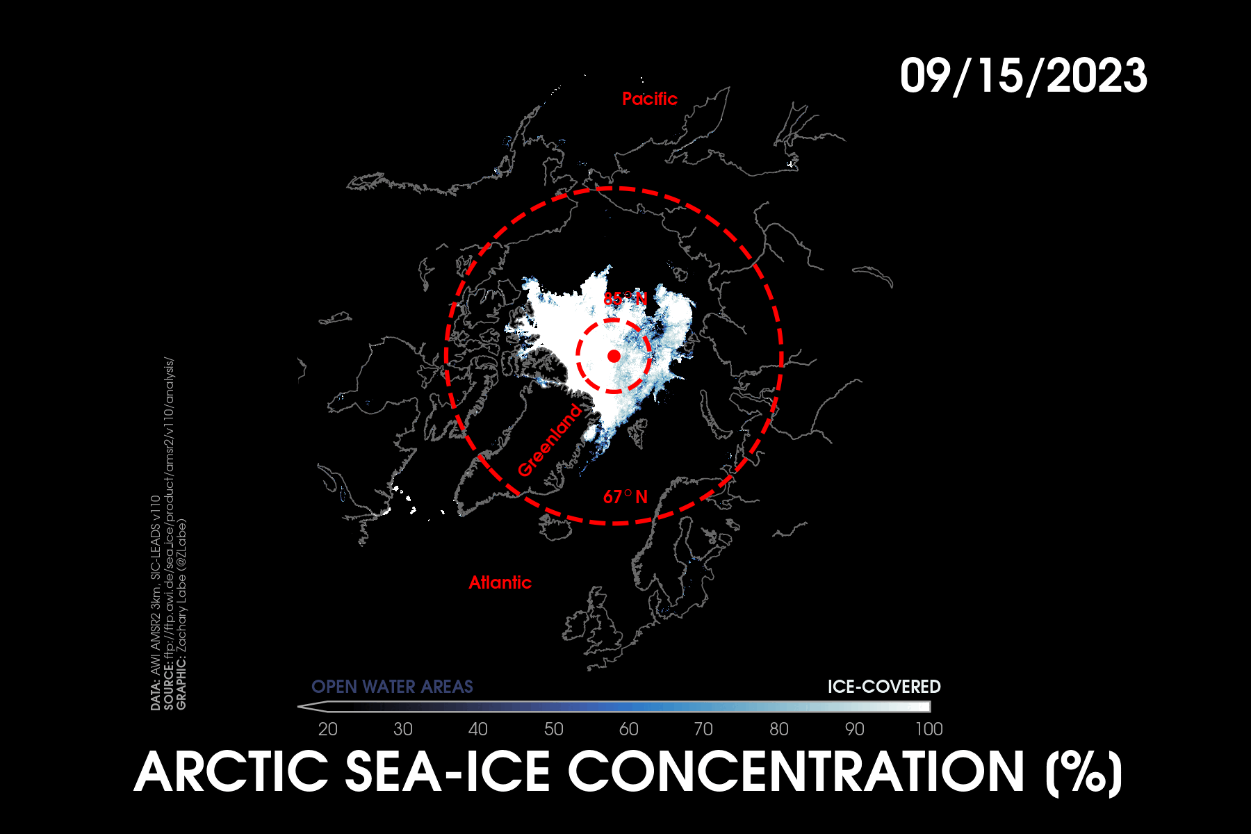
My special visualization for this month’s blog shows changes in daily Arctic sea-ice concentration from 15 September 2023 (near the annual minimum) to 25 April 2024 (melt season underway) using the high-resolution (approximately 3 km horizontal grid) AMSR2 satellite instrument algorithm. There are some satellite-related artifacts along coastal regions that return false positive pixels of sea ice, but you can mostly ignore these. The very fast rate of the GIF animation (it may take a moment to load) is designed to help show the type of ice growth and variability that is typical of an Arctic winter.
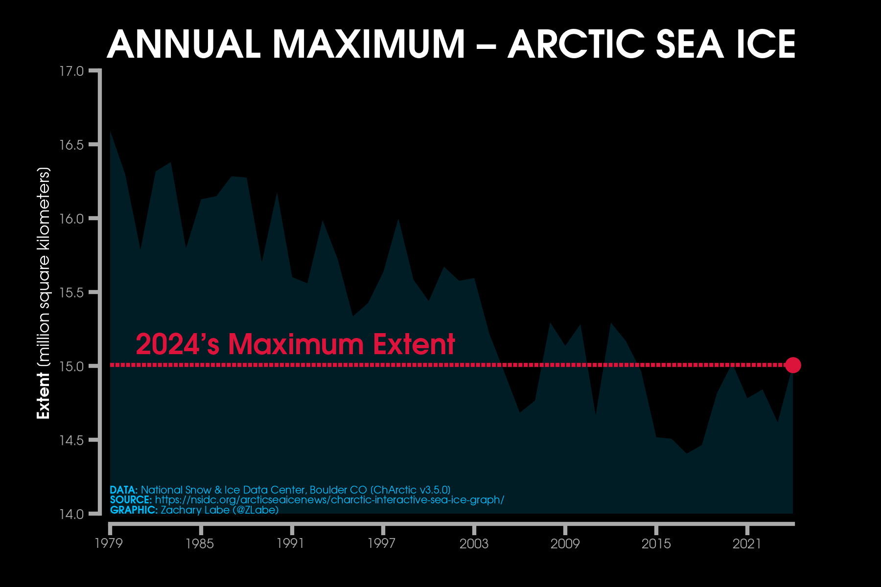
This year’s annual maximum Arctic sea-ice extent was the overall 14th lowest on record and set on 14 March 2024 at 15.01 million square kilometers (5.80 million square miles) (NSIDC’s Sea Ice Index v3). This was very close to the average date of the sea-ice maximum, which is March 12 over the 1981-2010 climatological period. Keep in mind that all of these records begin in 1979 with the start of the temporarily- and spatially-consistent passive microwave satellite observations. By the way, we won’t know the annual maximum Arctic sea-ice volume from the Pan-Arctic Ice Ocean Modeling and Assimilation System (PIOMAS) for another week or two, which is set around a month after the typical extent maximum. This is because air temperatures remain extremely cold in the far northern latitudes of the Arctic Ocean, allowing ice to continue to thicken. The area-averaged mean Arctic sea-ice thickness maximum is sometimes reached as late as mid May! Anyways, the relatively higher maximum extent in 2023-2024 was in response to favorable conditions for sea ice to expand outward along the marginal ice zone edge in both the Atlantic and Pacific sides of the Arctic Ocean. I will discuss this more throughout the rest of the blog. You can also find a map of the different regions at: https://zacklabe.com/arctic-climate-seasonality-and-variability/.
Keep in mind while reading this blog that it still gets extremely cold during winter across the Arctic Circle, even after considering recent climate change. The entire Arctic Ocean therefore still experiences ice cover given that air temperatures are well below the freezing point. This overall contributes to a much smaller long-term trend in the loss of sea-ice area and volume in winter compared to the summer melt season. In fact, recent studies (Zhang, 2021) have also found that winter ice growth may actually increase due to a negative feedback from thinner ice. This suggests that some Earth system feedbacks could also be a contributing factor to the recent slowdown in Arctic sea ice decline, rather than always contributing to an acceleration (i.e., a positive feedback). Even in the highest future emission scenarios from climate model projections, we still find sea ice reforming during the winter months across the Arctic Ocean.
Arctic sea ice typically reaches its lowest point in the year in early to mid-September, which corresponds to when all of the heat that has finally accumulated during the summer months. This is also right before the air temperatures begin to fall with the dwindling amount of solar insolation. Sea ice begins to reform shortly thereafter, especially in the northernmost latitudes where very thin ice begins to form in sea ice leads (gaps in the ice cover) thus contributing to first a greater mean sea-ice concentration across the ice pack. This past year’s freeze season kicked off with unusually widespread open water across the Pacific side of the Arctic after the September 2023 minimum, which was the 5th lowest in the satellite-era record. There was a really striking amount of open ocean water completely void of ice north of Alaska during this time period. One of my colleagues who was on an icebreaker at the time in the Beaufort Sea reported only seeing any signs of ice crystal formation at 79°N as of early October and actual sea surface temperatures of greater than +6°C were found about 100 nm north of Utqiaġvik, Alaska.
This contributed to well above average near-surface air temperatures in this region of the Arctic during late fall and early winter, as all this heat stored in the upper ocean is then lost to the overlying atmosphere through turbulent heat flux exchanges. Only then can sea ice finally begin to reform. This is one of the key reasons that the largest Arctic amplification factor is observed during late fall.
I also want to point out another key area that observed unusual sea ice conditions in early winter. This was found across the Hudson Bay, which is located in northern Canada. Atmospheric conditions of southerly winds and widespread warmth associated with an upper-level ridge of high pressure contributed to an ice freeze-up that was nearly 20 days later than average. Once the sea ice finally began to return to the Hudson Bay, the overall amount of Arctic sea-ice extent quickly rose in late December with daily rankings at only about the 20th lowest on record. This was quite remarkable considering how low sea ice has been in recent years. For a period in early January, daily Arctic sea-ice extent even rose above the 2000s decadal average for a few days (for that time of year), which was the first time this has happened in over 10 years in the JAXA-derived dataset. Keep in mind that all of this occurred in the background of global air temperatures setting new record highs, and sea surface temperatures in the North Atlantic completely shattering new daily and monthly records. Accordingly, understanding changes in the Arctic cryosphere is complicated. There are many Earth system interactions happening at the same time, and consequently it is not overly informative to make comments that record global warmth automatically means record low sea ice. Clearly this is not the case despite what is frequently shared on social media and gets all of the retweets (it’s also misinformation to use this winter as an example of sea ice recovering to normal by the way). Of course, all of this doesn’t mean that human-caused global warming isn’t real, and it doesn’t mean that the Arctic isn’t undergoing rapid change. It absolutely is and continues to warm (in the long-term) at a rate of more than three times faster than the global average. But we know that there is a lot of variability at these shorter timescales, like in the subseasonal to interannual range.
Now despite the relatively higher levels of sea-ice extent, it remained quite a warm winter compared to average over the Arctic Ocean. This counterintuitive statistic is due to the orientation of the large-scale atmospheric circulation, which favored higher sea level pressure on the Eurasian and Canadian Archipelago sides of the Arctic and lower sea level pressure in the North Atlantic and North Pacific. But remember, for most all areas the air temperature is still well below freezing, even if considering that it was nearly 20°C above average near the North Pole for a few days in early February.
This dynamically-driven circulation pattern creates a sea level pressure gradient which at times causes warmer, humid air to blow toward the North Pole, while on the other side it can enhance northerly winds. As example of this occurred in December of this winter when the position of a deep Aleutian trough caused a relatively rapid ice freeze-up in the Bering and Chukchi Seas. The westward retrograde of this trough then shifted the offshore flow to feature more prominently over the Sea of Okhotsk region. In fact, by March 2024, colder temperatures and favorable winds contributed to ice expanding to ice area that were much more like the 1980s levels for the Sea of Okhotsk. These regional northerly winds actually contributed to an equatorward expansion of ice in both the Atlantic and Pacific sides of the Arctic this winter. A similar situation occurred in the Greenland Sea with a favorable offshore/northerly flow allowing ice to expand away from the Greenland coast, including to nearly the island of Jan Mayen, which has been a rare occurrence in recent decades. In summary, there were several regions of the Arctic that simultaneously witnessed an unusual amount of sea ice compared to recent decades thanks to ideal weather conditions creating a cold offshore flow.
Despite the overall smaller loss of ice extent around the time of the annual maximum in 2024, it’s important to point out that the remaining ice cover has significantly thinned compared to just a few decades ago. Satellite-derived observations and simulated (PIOMAS) ice thickness products from this past winter support this fact and continued to reveal that sea ice was nearly 2 meters (about 6.5 feet) thinner than the 1981-2010 average north of Greenland and the Canadian Arctic Archipelago. This is also reflected in the latest ice age maps, which show little (if any) 4-5+ multi-year ice remining. And yes, this thinner and younger ice cover from the long-term trend is directly linked to human-caused climate change.
Compared to the higher extent “rankings” this winter, Arctic sea-ice volume remained on the lower side of things according to the PIOMAS dataset. February 2024 actually ended up as the 3rd lowest on record for the month due to the widespread coverage of thinner ice anomalies. The only areas of thicker than average ice were found toward the Siberian side of the Arctic by late winter. For this reason, it wouldn’t surprise me if this contributes to a later melt-out and cooler sea surface temperatures in this region during spring.
Now I have talked quite a bit about how favorable weather conditions contributed to widespread ice growth this year, but unfortunately this does not mean the news is all good for the state of Arctic sea ice. A particularly strong pressure gradient, most evident in March, likely contributed to strong ice export in the Fram Strait region of the Greenland Sea. In other words, this strong transpolar drift flow likely resulted in a substantial amount of thicker and older sea ice leaving the Arctic and eventually melting out in the subpolar north Atlantic Ocean. Previous studies (e.g., Lindsay and Zhang, 2005) have shown how this type of strong ice export can precondition the sea ice for extensive melting during the warmer months of the year. This will definitely be something to monitor this summer, especially if we see a corresponding Arctic Dipole pattern (e.g., Overland and Wang, 2016) forming with an anomalous high pressure system.
Now looking at the bigger picture, it is also obvious that we have not set a new record sea-ice minimum since September 2012. This is quite a long time, and the short-term September sea ice trend between 2012 and 2023 is nearly flat. Is this pause/hiatus/slowdown a surprise? NO. When we look across climate model large ensembles (i.e., tools for simulating the range of internal variability in the climate system relative to anthropogenic change; see Phillips et al. 2020), we see that there are periods of short-term (e.g., lasting 10-15 years) accelerations or slowdowns in the rate of the longer ice loss trend (e.g., Swart et al. 2015). The period in the early 2000s until 2012 is an example of one of those accelerated periods, and we now know that this does not necessarily mean that sea ice is declining faster than climate model projections (we have a much better understanding of internal variability using these large ensembles than we did 10-20 years ago).
It is therefore crucial that we continue to understand and communicate the influences of natural/internal climate variability for Arctic climate change. Not every month or year is going to be a new record. As I have mentioned countless times before, this is one of the key reasons that we cannot narrow down the timing for the first ice-free summer. Moving forward, we also should spend time to better understand the predictability of both the atmospheric and oceanic drivers that result in these decadal slowdowns in ice extent, especially for how long it may continue into the future. Now of course my background is in meteorology/atmospheric science, so I admit that my bias for the importance of the weather is outsized… so I will also point out that changes in ocean heat transport via the far northern Atlantic Ocean and Bering strait can also contribute to these temporary ice slowdowns and accelerations (e.g., very rapid ice loss events and bottom melt). We need to understand both the atmosphere (e.g., Francis and Wu, 2020) and ocean (e.g., Polyakov et al. 2023), and climate models remain our tools to conduct these types of causal sensitivity experiments.
A final question for this blog is whether this higher annual maximum ice extent compared to recent years is any indicator for the melt season ahead. The answer is no, probably not. There is little if any predictive value in comparing ice conditions in winter to subsequent annual minimum in September. This is also probably a good time to point out our new community-driven study that was just published last week, which reviews our understanding of predicting Arctic sea ice using statistical and dynamical models. Be sure to check it out below (it’s open access)!
Bushuk, M., S. Ali, D. Bailey, Q. Bao, L. Batte, U.S. Bhatt, E. Blanchard-Wrigglesworth, E. Blockley, G. Cawley, J. Chi, F. Counillon, P. Goulet Coulombe, R. Cullather, F.X. Diebold, A. Dirkson, E. Exarchou, M. Gobel, W. Gregory, V. Guemas, L. Hamilton, B. He, S. Horvath, M. Ionita, J. E. Kay, E. Kim, N. Kimura, D. Kondrashov, Z.M. Labe, W. Lee, Y.J. Lee, C. Li, X. Li, Y. Lin, Y. Liu, W. Maslowski, F. Massonnet, W.N. Meier, W.J. Merryfield, H. Myint, J.C. Acosta Navarro, A. Petty, F. Qiao, D. Schroder, A. Schweiger, Q. Shu, M. Sigmond, M. Steele, J. Stroeve, N. Sun, S. Tietsche, M. Tsamados, K. Wang, J. Wang, W. Wang, Y. Wang, Y. Wang, J. Williams, Q. Yang, X. Yuan, J. Zhang, and Y. Zhang (2024). Predicting September Arctic sea ice: A multi-model seasonal skill comparison. Bulletin of the American Meteorological Society, DOI:10.1175/BAMS-D-23-0163.1
In any case, this year is another reminder that monitoring local weather patterns can still bring surprises, despite rapid Arctic amplification and the dramatic transformation of the landscape at the top of our planet. If you want to understand changes in sea ice, you must follow local weather conditions and take into account natural variability. As of my writing of this blog, neither pole (Arctic or Antarctic) is currently observing record low sea ice levels despite the record warmth globally in the atmosphere and ocean. I guess we will soon see what (unpredictable) Arctic weather extremes are in store for us this summer…
Thanks for reading! March 2024 was fairly quiet again in the Arctic with relatively high levels of Arctic sea-ice extent continuing (13th lowest on record) and mostly near average air temperatures, aside from anomalous warmth over Greenland (thanks to a negative North Atlantic Oscillation circulation). However, total Arctic sea-ice volume continued to be unusually low and was the 4th lowest on record for the month of March. You can find my other monthly blogs for 2024 at https://zacklabe.com/blog-archive-2024/, and the Arctic climate data rankings for 2024 are described for the mean air temperature, sea-ice extent, and sea-ice volume at https://zacklabe.com/archive-2024/. My monthly visualization blogs are lagged by one month in the title. Okay, all done, goodbye for now!
February 2024
Welcome! My next ‘climate viz of the month’ moves away from the cold and snow of the high latitudes and instead reveals a climate pattern where there is actually little trend. I decided to design this graphic given the publication of our two recent studies on summertime temperatures in the United States, as it provided a great opportunity to chat more about this work…
Eischeid, J.K., M.P. Hoerling, X.-W. Quan, A. Kumar, J. Barsugli, Z.M. Labe, K.E. Kunkel, C.J. Schreck III, D.R. Easterling, T. Zhang, J. Uehling, and X. Zhang (Oct 2023). Why has the summertime central U.S. warming hole not disappeared? Journal of Climate, DOI:10.1175/JCLI-D-22-0716.1
Labe, Z.M., N.C. Johnson, and T.L. Delworth (Jan 2024), Changes in United States summer temperatures revealed by explainable neural networks. Earth’s Future, DOI:10.1029/2023EF003981
This postage stamp-style climate visualization shows a map of maximum surface air temperature anomalies across the contiguous United States (lower 48 states) for every average June-July-August (JJA) from 1900 through 2023. I am using a high-resolution dataset called the NOAA Monthly U.S. Climate Gridded Dataset (NClimGrid), which is based on a 5km latitude by 5km longitude grid and quality controls to account for inhomogeneities and biases in long-term weather station records (documented in Vose et al. 2014).
There is intentionally no labeling, as I want the patterns of color to tell the story. Though to provide a frame of reference, I will note that every map is scaled to fit data between -5°C in dark purple (colder than average) to +5°C in dark red (warmer than average). The white shading is centered around the 0°C anomaly (near normal/average). In climate science, the word anomaly means a departure from average, and you can find more discussion on the issues and choices that need to be made to calculate anomalies on my “frequently asked questions” page. For each map here, I take that year’s average JJA daily maximum temperature and then subtract the average JJA daily maximum temperature over the 30-year period from 1951 to 1980. As an example, the first row shows the mean JJA temperature for each of the years from 1900 (upper-left corner) to 1909 (upper-right corner) compared to the average of 1951-1980.
Okay, now let’s point out a few example years. First, check out the 1930s row. This period was a decade of record-breaking heatwaves during the Dustbowl, focused across the central portions of the country. 1934 and 1936 particularly stand out with maximum temperature anomalies well exceeding +5°C across central areas. Many of the all-time temperature records set in July 1936 remain to this day. And no, the physical mechanisms that result in the buzzword of “heat domes” are not a new phenomenon at all. In fact, July 1936 experienced a persistent continental-wide upper-level ridge and blocking pattern (i.e., heat dome) that centered its local peak across the middle of the United States. Both this anomalous high pressure zone combined with land surface-atmosphere feedbacks (e.g., dry soil, reduced evapotranspiration, and greater sensible heat fluxes) contributed and reinforced these record-breaking heatwaves.
Now 2011 is a more recent hot summer worth pointing out, where we can see a saturation of red shading (i.e., temperature anomalies greater than +5°C relative to 1951-1980) across areas like Texas and Oklahoma. Just a side note that the summers of 2022 and 2023 were also quite hot across Texas, and this will be the topic of an upcoming study from our NOAA extreme event rapid attribution team that I am a part of. Anyways, check out 2021 too, where we can see a distinctly contrasting pattern of temperature departures across the United States with anomalous warmth across the Pacific Northwest (remember the historic heatwaves in Canada, Washington, and Oregon) while cooler conditions were observed near the Southeast. Interestingly, some of the coldest daytime maximum temperatures in JJA were observed in the early 1990s, which may have been influenced by the temporary global-scale cooling following the eruption of Mount Pinatubo in June 1991.
There is one notable climate feature absent in this visualization… an obvious long-term warming trend. You have probably found some of my other mosaic-style graphics showing Arctic sea-ice thickness or Arctic air temperatures, which for instance show a clear warming trend with more blue shading in older years and more red shading in recent years. But here, this color visual isn’t so obvious. We can confirm this by quickly plotting a time series of maximum temperature from NOAA NCEI’s “Climate at a Glance” tool, which reveals only a small positive trend from 1900 to 2023 (+0.1°F/decade), and this doesn’t even take into account any statistical significance testing. We can also see that there has not been a summer with average maximum JJA temperature that has ever exceeded the 1930s (either in 1934 or 1936). Now in contrast, there has been a more obvious warming trend in average minimum JJA temperatures across the United States at +0.18°F/decade. So, what does this mean? Well, summertime temperature lows at night are warming much faster than daytime high temperatures. These warmer nights have exceeded the 1930s in most years from the last two decades for JJA mean minimum temperature.
This all brings up an important point for climate science and communicating the subfield of climate change and variability to non-specialists… We know that the Earth is warming due to human-caused climate change, and this will contribute to an increasing probability and frequency of extreme heatwaves over at least the next several decades. However, the rate of warming is not spatially uniform, and some land areas are warming faster than others. This warming is also not necessarily consistent in time either. And it is also not exponential like some misinterpretations of data shared on Twitter, but that is a blog for another day. In reality, some years will still observe cooler summers, and this is due to (mostly) unpredictable chaos/noise in our atmosphere – otherwise simply known as “weather.” In other instances, patterns of ocean temperatures (modes of internal features to the climate system) or changes in natural forcings, like volcanoes, can also contribute to more extended periods of relatively cool summers back-to-back. Now don’t get me wrong, I like memes as much as the next millennial, but all of this means that the popular climate meme from the Simpsons (“This is the hottest summer of my life.” – “This is the coldest summer of the rest of your life”) is technically not correct… sorry!
The United States just happens to be one of these regions that is notably not warming as fast, especially in terms of these daily high temperatures during JJA. One of the main takeaways for me from making this month’s visualization of the miniature temperature maps is seeing just how much variability in anomalies there are from year-to-year and place-to-place over the last 100+ years. Naturally, we want to understand why and what this might mean going forward into the future as the effects from human-caused climate change continue to amplify. We set out to investigate this recently, and I think posed the question quite obviously in the title of the paper: “Why has the summertime central U.S. warming hole not disappeared?”
In this new study, we again used observational data from NClimGrid (temperature and precipitation) and collections of state-of-the-art climate models (like large ensembles) to understand where this lack of warming is most prominently located and why hasn’t it gone away. This topic has definitely been an active area of research in climate science, but a consensus on the warming hole’s causes has yet to be reached. Previous work has shown the agricultural intensification and the expansion of irrigated lands over the Central United States have been linked to this relative daytime cooling in JJA specifically through crop-induced land-use change (greater evapotranspiration -> more water vapor and cloud cover -> suppressed daytime heating -> cooler afternoon temperatures). While our reassessment of the warming hole absolutely does not preclude an important role of land change in reducing daytime temperatures, we found that the areal extent of the cooler anomalies cannot be fully explained by trends in primary production (agriculture). This means that there must be at least another contributing factor to the lack of warming.
To keep this blog from getting too long, I will just quickly summarize: we evaluate a variety of climate model experiments and find that increases in JJA precipitation over the warming hole region are linked to a trend toward lower pressure/troughing over this region (a large-scale atmospheric circulation anomaly). This inhibits the full potential of daytime heating, while also potentially inducing cold air advection. This persistent tendency for lower pressure over the Central United States can arise from internal climate variability, but we find that there may also be a contribution from forcing over the recent La Niña-like trend of sea surface temperatures in the equatorial Pacific. The cause of this sea surface temperature cooling trend is an active area of scientific debate, as it may or may not be linked to anthropogenic climate change… Our results actually suggest that this might be the case, and therefore a takeaway message from this study is that the lack of daytime warming in JJA may at least be partially human-caused (including via land-use/land-cover change).
This is a good point to stop and reflect on the point that the effects of climate change may not always be intuitive at first. How long this warming hole then continues to persist is still an open question, but we found that climate models do project an increasing probability of heat extremes equivalent to the level of the 1930s Dust Bowl by the middle of the 21st century. Though there is some larger uncertainty here, and one could write an entire blog on the importance of this central Pacific cooling in observations compared to climate model simulations, as it might substantially impact future projections of extreme events and large-scale climate dynamics in North America.
Given the lack of strong warming trend in JJA maximum temperature, we then set out to investigate whether we could find any timing of emergence in summertime temperature signals in the United States. The ‘timing of emergence’ is a useful metric for societal and environmental planning, as it quantifies when changes in weather and climate have exceeded the historical range of natural variability for different regions of our planet. This can be informative for both adaptation and mitigation planning. In other words, the aim of this other new study was to more closely evaluate whether summer temperature signals associated with human-caused climate change have emerged anywhere across the contiguous United States. We turned to a new machine learning approach that uses neural networks to leverage regional patterns of temperature for identifying this timing of emergence of mean summer minimum, maximum, and average temperatures. We found the clearest signal in the average United States minimum temperature, which has already emerged in observational records. This is consistent with the stronger trend in the time series that we discussed earlier in this blog. We also found that the neural network can identify temperature signals during a climate model’s historical simulation of the 20th century. This is surprising given the greater influence of natural climate variability during this period that continues until around 1980 when the human-caused climate change signal begins to emerge more clearly. We then link this surprising result to how well the climate model resolves historical land-use/land-change, which shows an example of how machine learning can also reveal helpful insights for key differences and biases between climate models and observations.
I realize that this was a long blog, so some takeaways:
(1) understanding and simulating land-atmosphere interactions are very important for heat extremes in summer, and (2) natural climate variability and regional weather patterns will continue to remain a key player in understanding climate change. It is very important to keep this in mind when accurately communicating future climate change impacts – of course, human-caused climate change will tilt the scale toward more dangerous heatwaves in the future, but there is still a lot of variability from year-to-year to consider in our predictions and projections.
And finally, back to the Arctic… note that my next climate visualization blog will provide a broader overview of winter 2023-2024 in the Arctic with a focus on why sea-ice extent and thickness remain relatively high compared to recent years. This blog will be posted a bit later in April, as I will be traveling to the EGU annual meeting earlier in the month to present some of our new results in using machine learning to attribute different climate change and mitigation scenario projections.
As for February 2024, temperatures were near record warm across the Arctic Ocean, especially near the North Pole. This was partially due to anomalous poleward heat and moisture transport originating from the Atlantic Ocean side of the Arctic. Despite this warmth, Arctic sea-ice extent and sea-ice thickness/volume rankings were not quite as striking. Remember, it is still extremely cold in the Arctic during winter, even when temperatures are well above average. Surface winds/waves are often more important drivers of regional sea-ice anomalies during this time of year. One area that has observed particularly extensive sea ice this winter is the Sea of Okhotsk, which is counted in the mean Arctic sea-ice extent timeseries, but it melts out each summer and thus has very little influence on inferring any sea-ice annual minimum predictions later in September.
If you made it this far, thank you for reading! If you are interested in more details about these two research studies that I discussed, both papers should be freely open access. Reach out if you have any questions. We also have a few more papers in the pipeline to better understand this variability and predictability of JJA temperatures across the United States, which I look forward to sharing soon. As always, my other blogs for 2024 will be archived at https://zacklabe.com/blog-archive-2024/, and all the Arctic climate data rankings for 2024 will be documented for air temperature, sea-ice extent, and sea-ice volume at https://zacklabe.com/archive-2024/. My monthly visualization blogs have a one-month lag in the title. Bye for now!
January 2024
Hi! My first ‘climate viz of the month’ blog for 2024 highlights the seasonality and variability of Antarctic sea-ice thickness. In this animation, I am showing maps of monthly mean sea-ice thickness from January 1979 to December 2023 using a model-based product called the Global Ice-Ocean Modeling and Assimilation System (GIOMAS). This dataset is similar to a product that I refer to often for Arctic sea-ice thickness and volume called PIOMAS, which you can read more about at https://climatedataguide.ucar.edu/climate-data/pan-arctic-ice-ocean-modeling-and-assimilation-system-piomas. Although we do not have a long record of space-based observations of Antarctic sea-ice thickness, it is continuing to improve in quality thanks to the development and support of ICESat-2, CryoSat-2, SMOS, and other missions. Prior to this satellite altimetry record, there are a few in situ observations of Antarctic sea-ice thickness along with some upward-looking sonars (submarine) and ship-based observations, but again this data is limited in spatial coverage and generally inconsistent from year-to-year. While this ground-truth data (which has uncertainties too) can provide some validation data for comparing with simulations like GIOMAS, it cannot provide a complete record to assess the ‘long-term’ (climate-scale) mean, variability, and trends in the Antarctic sea-ice thickness distribution. GIOMAS is like a reanalysis dataset; in other words, it assimilates passive microwave satellite observations of sea-ice concentration and is forced using historical atmospheric variables (e.g., temperature, precipitation, radiation) from NCEP-NCAR Reanalysis 1. I won’t get into the other technical details for the purposes of this blog, but if you are interested in the accuracy of GIOMAS, I recommend checking out this recent study from Liao et al. (2022).
One of the reasons that I am showing this visualization to kick off the new year is that I am always asked about Antarctic sea-ice volume/thickness. The actual thickness of ice is quite important for understanding the local energy budget and other Earth system interactions. We also know that in the Arctic there is a long-term decline in sea-ice extent, concentration, thickness, and therefore volume due to anthropogenic climate change.
However, in the Antarctic, the dynamics and trends of sea ice are not as straightforward. This is primarily due to geography. The Antarctic is comprised of a large and tall land mass (ice sheet) that is surrounded by the Southern Ocean, which causes the sea ice to extend out equatorward. Sea ice in the Arctic Ocean is hence more protected as it is surrounded by land. Sea ice in the Antarctic is especially exposed to changes in ocean warmth (convection), such as in the subsurface due to heat fluxes from variability in Circumpolar Deep Water. Antarctic sea ice is also driven by changes in (near-)surface winds, especially the westerlies that are described by the Southern Annular Mode (SAM). This mode of climate variability (the SAM) describes differences in the strength of sea level pressure between the Antarctic and mid-latitudes and has observed multi-decadal variability and long-term trends (such as related to the ozone hole) during the satellite record (1979-present). Stronger westerly winds can aid in extending sea ice further equatorward around the Antarctic Ice Sheet. So, even if air temperatures are well above average, sea ice can grow anomalously large. Very strong katabatic winds off the Antarctic Ice Sheet can also contribute to local changes in sea-ice concentration and thickness. Other large-scale atmospheric players have a role in driving where regional sea-ice anomalies are found, such as the strength and position of the Amundsen Sea Low, which likely contributed to the record lows observed in 2023. Understanding subseasonal to interannual variability in Antarctic sea ice requires having a good assessment of changes in winds around the continent, and some of this forecast skill is related to atmospheric teleconnections between the tropics and Antarctic (e.g., El Niño/La Niña/Madden Julian Oscillation).
Another very interesting difference in ice characteristics between the two hemispheres is related to snow. Sea ice in the Antarctic can be exposed to much deeper depths due to strong storms and greater poleward moisture transport from atmospheric rivers. While snow of course also falls in the Arctic, many of these far northern locations (like the North Pole) are more desert-like in their mean climatology. This deep snow in the Antarctic can also make it particularly tricky for resolving altimetry-based satellite products of ice freeboard/thickness due to the design of the instruments and processing algorithms.
Antarctic sea ice also features a larger seasonal cycle with ice extending well beyond the limit of the Antarctic Circle (~67°S) during Austral winter and then shrinking to nearly open water for many locations during the Austral summer. There’s been some really great work in understanding the fundamentals of this asymmetric seasonal cycle of Antarctic sea ice in the last few years, and I highly recommend checking out these papers (e.g., Eayrs et al. 2019; Roach et al. 2022; Goosse et al. 2023). The combination of the atmospheric and oceanic influences, along with the large seasonal cycle, contribute to a predominately first-year ice pack that is quite thin for much of the Antarctic sea-ice cover. This is unlike the Arctic, which (used to) observe a multi-year/thick sea ice cover. In contrast, the only areas that observe sea ice that reliably survives from one melt season to the next in the Antarctic is around the Weddell Sea and near the boundary of the Amundsen and Ross Sea sectors.
While understanding the long-term trends in Antarctic sea-ice thickness (and therefore volume) is important, it is not quite as informative as the Arctic for understanding climate change impacts. With that being said, a thinner ice cover in the Antarctic can still have significant implications for local ecosystems (algal growth and the food chain), turbulent heat flux exchanges between the atmosphere and ocean, and overall changes in interactions with ice shelves and subsurface ocean warmth (i.e., thinner ice can allow more warm water to reach the ice sheet).
I do show a few graphs of Antarctic sea-ice thickness and volume from GIOMAS that update each month on my page at https://zacklabe.com/antarctic-sea-ice-extentconcentration/, but you may notice that there are not any clear long-term trends. Although we are in a period of lower ice volume, it has not set any new records in this dataset, especially compared to the unprecedented reductions in Antarctic sea-ice extent set last year. Admittedly, I am not sure offhand what is the cause of the low sea-ice volume in the early part of this record around 1980… This is definitely worth exploring, although there are particularly large uncertainties with this reanalysis data that we must acknowledge too.
Okay, so back to my original animation. The purpose of this monthly visualization is not to interpret any long-term climate change trends, but rather to show that the distribution and mean ice thickness of the Antarctic is quite different (than the Arctic). Antarctic sea ice is mostly thin (under 2 meters) and nearly becomes ice-free for many locations every melt season. Thickness and volume in this hemisphere are not as predictive of a measure for long-term Antarctic sea ice variability and growth/decline. Though, moving forward, I stress that we need to continue supporting observations of the Antarctic sea-ice thickness distribution year-round, especially given all of the new research showing the importance of Antarctic sea ice for limiting deep water intrusions of heat that could affect Antarctic ice mass balance and thus sea level rise (Kusahara et al. 2023).
Supporting our observational network of climate data is critical for understanding future climate change, and I hope that foundational support for this type of basic research, operation, and development is not forgotten.
For my monthly summary of the Arctic, conditions were mostly quiet and forgettable in the Arctic. There were no new records in mean Arctic temperature, sea-ice extent, sea-ice thickness, or sea-ice volume. In fact, the only notable statistic was that Arctic sea-ice extent rose about the 2000s decadal average for a day or two in early January. This was the first time that daily sea ice crossed this average in the JAXA dataset in over 10 years, which is really a testament to how much things have changed in the Arctic due to global warming. While this recent anomaly is just related to weather variability (wind-driven), it is still quite remarkable given recent climate change in the Arctic. I’ll summarize more about why sea ice is not currently a record low (or even close at all) compared to the record warmth globally in the atmosphere and oceans at the end of this freeze season… so expect a blog about this topic sometime in mid/late April. As for near-surface air temperatures in January 2024, the largest warm anomalies were found around the Hudson Bay and from the North Slope of Alaska stretching northward over the Chukchi Sea region. In fact, temperatures were more than 8°C above the 1981-2010 average in parts of far northern Canada! Outside of this relative warmth, the persistent brutal cold continued across Scandinavia. Lastly, in case you missed it, my daily temperature graphs are updating again at https://zacklabe.com/arctic-temperatures/. Let me know if you see any issues! Thanks for reading!
My visualizations:
The views presented here only reflect my own. These figures may be freely distributed (with credit). Information about the data can be found on my references page and methods page.