December 2025
Hi everyone. I am just getting back from the annual meeting of the American Meteorological Society, so this blog is a bit delayed. As someone who loves snow and cold, I was excited to experience one of the largest snowstorms in a few years across central Pennsylvania. Unfortunately, that also made travel to Houston more complicated than expected, with 3 cancellations, 2 delays, a broken baggage claim, and a 3:15 AM arrival. What a time. Nevertheless, it was great to catch up with friends and colleagues and spend time engaging more deeply with both the science and how we communicate our work. I also shared some of our recent research on applying climate projections to improve building infrastructure resilience given changes in extreme weather. Feel free to reach out if you are interested. At the same time, I left the meeting feeling even more concerned about what is happening in the field of climate science, particularly the long-term implications for rising students and early career scientists. More on that soon.
This month’s ‘climate viz of the month’ will be brief and focuses simply on annual mean statistics for Arctic and Antarctic sea ice. January is always a busy time of year for me since it involves manually updating many of my graphics to account for the new year. Because most of my visualizations are customized, the transition is not automatic and requires quite a bit of work. I have made good progress though. Many of the figures on my website now include 2025 data, such as updates to my U.S. climate indicators page, so feel free to take a look. If you notice any issues, please let me know! Once the final ERA5 data are available through December 2025, I will finish updating the remaining graphics and share an update on social media when everything is complete. If you have ideas or requests for new visualizations this year, I am always happy to consider them as I continue expanding the collection of near-real time graphics on my site. I am especially motivated to do so given recent federal cuts affecting several climate change data dashboards. I hope these resources are helpful, and if they are, I always love hearing about examples.
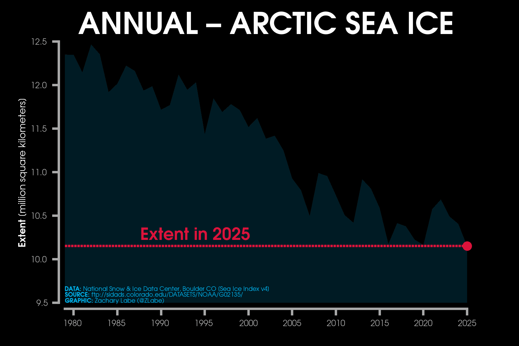
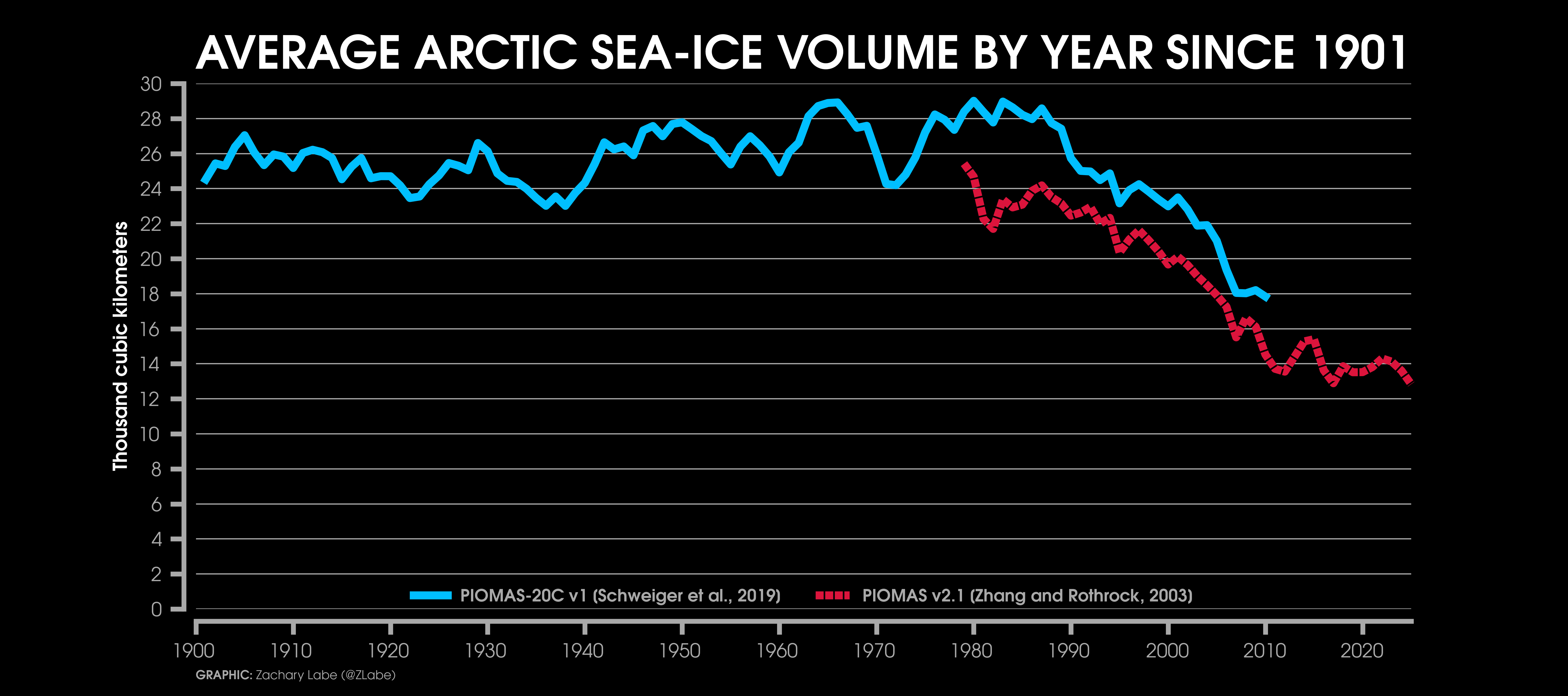
Now for the stats. Annual mean Arctic sea-ice extent in 2025 was the lowest on record, though it’s probably a statistical tie with 2020 and 2016 (rankings can vary depending on the dataset). Similarly, annual mean Arctic sea-ice volume was the lowest (very close to 2017). Despite these technical nuances, the main point is clear: the overall state of Arctic sea ice in 2025 was likely the worst in our satellite-era record. Am I surprised? No. This aligns with climate model projections for a rapidly warming Arctic, and you can explore these model-observation comparisons on my website. Real-world temperature data tracks pretty closely with the model means too. Looking at the PIOMAS-20C reconstruction dataset, 2025 likely had the lowest yearly mean sea-ice volume since at least 1901. This is alarming and has major implications for both our environment and society, and things will get worse without a reduction in human-driven greenhouse gas emissions.
There has been a lot of talk about a slowdown in Arctic sea-ice loss over the past 10-15 years. That’s true, and I’ve written about it before, but it is more noticeable around the September minimum than in the annual averages. Interestingly, annual mean Arctic sea-ice extent still shows a pretty steady decline. Note that 2012 doesn’t look unusually low in the yearly average because sea ice that winter was relatively high before the rapid summer melt, so it balances out. Sea-ice concentration and extent are declining in every month of the year (see trends here), and recall that 2025 also set a record for the lowest annual maximum. Overall, despite less media attention than I think it deserved, 2025 was a really alarming year for the Arctic. Honestly I think many people don’t realize that both average volume and extent set new records…
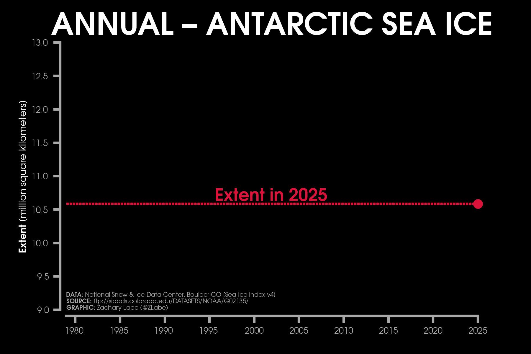
For the Antarctic, sea ice continued the recent trend of unusually low conditions, which has been the story since around 2016. The annual mean Antarctic sea-ice extent ranked as the 3rd lowest on record, and the annual mean volume was the 5th lowest. These statistics go back to 1979, the start of the satellite era. For this blog, I also included a visualization showing daily Antarctic sea-ice thickness from January through December 2025. This comes from GIOMAS (Global Ice-Ocean Modeling and Assimilation System), a model similar to PIOMAS that I frequently use in my blogs and visualizations. GIOMAS assimilates satellite sea-ice concentration to produce daily and monthly estimates of sea-ice thickness, velocity, growth, melt, snow depth, and surface ocean conditions. It’s a model, so it’s not perfect, but it gives useful insight into Antarctic sea-ice variability and trends. The animation highlights the regional variability of Antarctic sea ice, including its melt, growth, and movement, which are strongly influenced by storms and waves across the Southern Ocean. While many questions remain, like the role of internal variability, it’s becoming increasingly likely that an anthropogenic signal is emerging in the recent Antarctic sea-ice decline.
Finally, looking at both poles together, global sea-ice extent in 2025 was the 3rd lowest on record, while global sea-ice volume hit a new all-time low. Yikes. By the way, some people prefer my combined Arctic and Antarctic graph, so I have decided to permanently offer it here (updated yearly).
December 2025 was among the top 10 warmest Decembers on record across the Arctic, although the exact ranking depends on how the Arctic region is defined. The highest latitudes (north of 80°N) were near-record warmth for December and continued the recent pattern of large positive temperature departures there. Around the North Pole, anomalies were more than 5°C above the 1981-2010 average. Warmer-than-average temperatures also appeared over the Barents Sea and from Baffin Bay toward Greenland, coinciding with unusually low nearby sea-ice concentrations. At this time of year, it can be difficult to separate causality, since low sea ice can reinforce synoptically-driven warm anomalies by increasing turbulent heat flux exchange from the relatively warm ocean to the colder air above.
The broader temperature pattern featured a clear “warm Arctic, cold continents” structure. Northern Canada and most of Alaska were well below their 1981-2010 averages in December, as was much of central Siberia. In these areas, monthly mean temperatures were more than 5°C colder than average. The persistent cold across Alaska was associated with a large upper-level ridge over the Bering Sea that tends to draw cold polar air into western Canada while pushing warmer air northward over eastern Siberia.
Through the early part of this cold season, the accumulated freezing degree day departure (i.e., simple proxy for overall cold and ice growth) ranks as the 3rd warmest on record. This aligns with the long-term trend of reduced cold season severity in the Arctic. Sea ice in December remained well below average, with new monthly records for both the lowest Arctic sea-ice volume and lowest December sea-ice extent. The previous record low December extent had only just been set last year, which shows how steep the decline has become for this month of the year. Nearly the entire edge of the Arctic Ocean showed less ice than the 1981-2010 average, with the largest negative departures in the Barents Sea, Baffin Bay, Labrador Sea, and Hudson Bay (map of regions). Daily record low extents have also been set frequently since last fall. As I often emphasize, it remains challenging to forecast what the current winter state means for the summer minimum, given the strong influence of short-term weather conditions on sea ice. We still have more than a month before the typical annual maximum, and a lot can change between now and then. So, no predictions from me here.
November 2025
Hi! I am happy to share the first of (hopefully) some new graphics in this ‘climate viz of the month’ blog. For quite a few years now, I’ve been procrastinating on figuring out an efficient way to calculate regional Arctic sea-ice thickness using the PIOMAS dataset (a modeled “reanalysis” product). Part of the delay was technical. The latitude-longitude grid used by PIOMAS, both in how the data are computed and displayed, is unusual. I won’t get into the details here, but it is not exactly straightforward to work with.
Overnight we had some heavy sleet and freezing rain here, which meant I was definitely stuck at home today. So, I finally decided it was time to tackle this problem. As it turns out, it was much easier than I expected. Going forward, I would like to start including one or two graphics showing monthly changes in Arctic sea-ice thickness across different regions and marginal seas (e.g., the Laptev Sea vs. the Beaufort Sea). If that would be useful or interesting, please let me know!
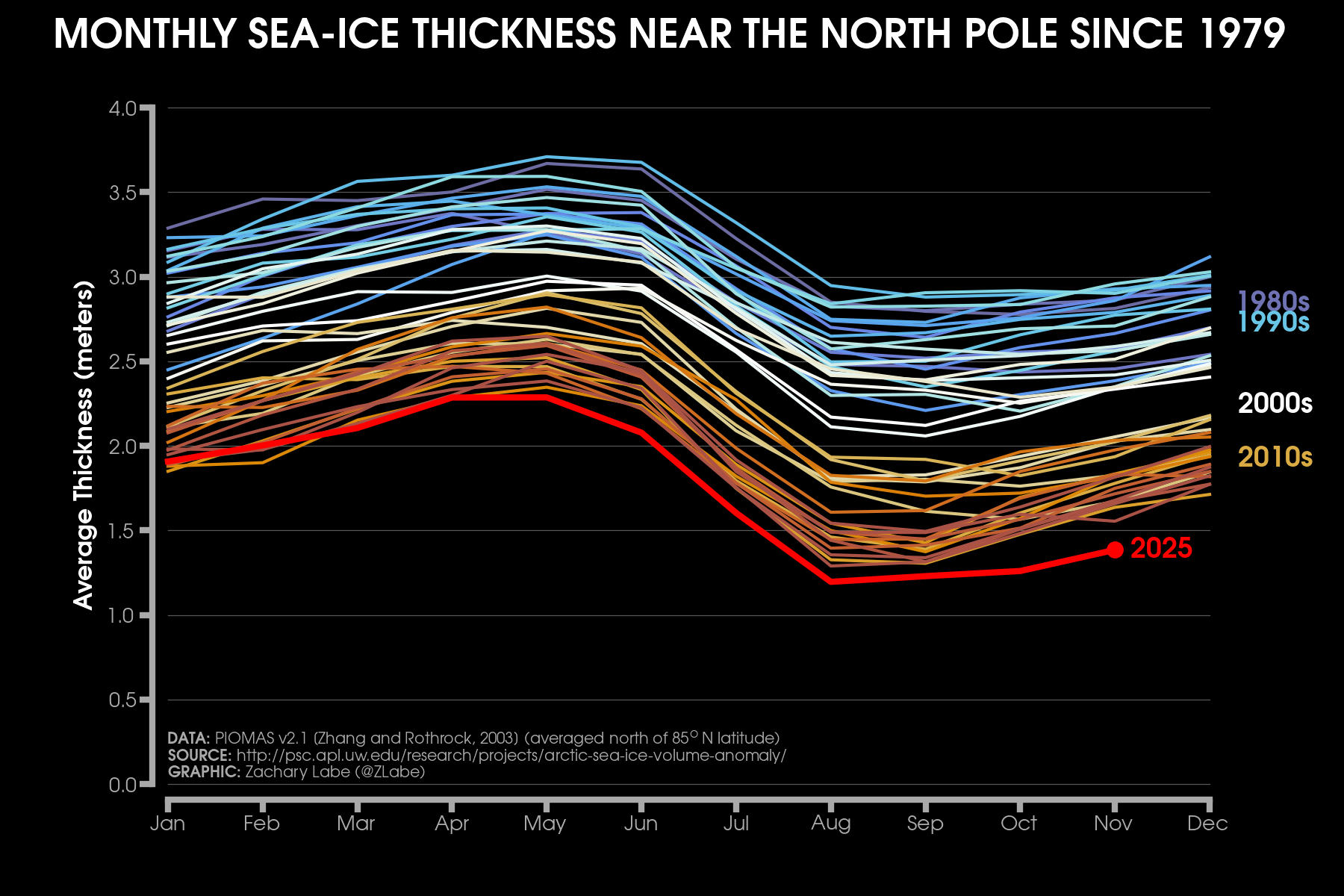
This first graphic shows monthly averaged sea-ice thickness for the region around the North Pole, including all locations north of 85°N. Each line represents one year of data from January through December, shown left to right. Older years are shaded in blue, transitioning to red for more recent years, with 2025 highlighted in bright red. This color progression is meant to emphasize the long-term trend. A clear seasonal cycle is also present. On average, sea ice around the North Pole is thickest in early spring and thinnest in late summer or early fall. The melt season is relatively short this far north, but some seasonality is expected and entirely normal. What is not normal is the long-term decline in sea-ice thickness due to human-caused climate change. To help illustrate this, I have annotated approximate decadal averages from the 1980s through the 2010s. Their placement on the figure reflects the mean thickness for each decade and again highlights the steady thinning of Arctic sea ice over time.
This data is simulated from the Pan-Arctic Ice Ocean Modeling and Assimilation System (PIOMAS). Regular readers of this blog and my science communication work have probably noticed that I refer to the PIOMAS dataset quite often when discussing Arctic sea-ice thickness and volume. That may seem like an odd choice, given that we now have several satellite-derived estimates of ice thickness from missions such as ICESat-2, CryoSat-2, and SMOS. While these satellite datasets continue to improve and extend their records, they are still too short to provide robust, climate-scale information on long-term trends. This limitation is especially important if we want a dataset that is temporally and spatially consistent over multiple decades. (To be clear, these satellite missions serve many other critical purposes and continued support for them is essential.) So, as a result, I still rely on model-based reanalysis products, such as PIOMAS, to supplement satellite observations. Note that I recently wrote a summary of PIOMAS for the NCAR Climate Data Guide, which provides more detail on its uncertainties, strengths, and limitations, and I recommend checking it out for additional background. Monthly comparisons between PIOMAS and CryoSat-2 during the cold season are also available through the University of Washington’s Polar Science Center within the Applied Physics Laboratory. Overall, PIOMAS performs quite well in capturing the large-scale spatial patterns, variability, and long-term trends suggested by submarine tracks, in situ measurements, and satellite-based thickness estimates (Labe et al. 2018).
Okay, now getting to the data and results. According to PIOMAS, Arctic sea-ice thickness has been at record low levels for much of 2025 north of 85°N, especially since April. This year has also set a new all-time record for the lowest mean ice thickness. In addition, the departure from the previous record low year, set only in 2024, has continued to grow in November. Together, this data indicates that there has been very little thickening of ice so far this freeze season across the high north.
Now for the caveats, as I am obligated to include (this is sometimes where I struggle with messaging/communicating from a scientist by training perspective). The data on this graph are simulated by PIOMAS and therefore carry their own uncertainties. The reason Arctic sea-ice “extent” is more commonly shared in science communication is due to higher quality data and longer historical records. When compared with CryoSat-2 in November, there are relatively larger differences between the two datasets in this exact region of the Arctic. However, comparisons with the Danish Meteorological Institute’s (DMI) operational ocean and sea-ice model, HYCOM-CICE, also reveal very low, and maybe even record-breaking Arctic sea-ice thickness and volume. Given how extreme current conditions are for October and November with PIOMAS, I also initially wondered whether this signal could be related to data issues associated with the transition from SSMIS to AMSR2 (i.e., sea-ice concentration data from satellites is assimilated into PIOMAS). While this satellite transition may still contribute to increased uncertainty, the average sea-ice thickness near the North Pole was already at record low levels well before this became a factor. Taking all of these caveats and uncertainties into account, it is still very safe to say that average sea-ice thickness around the North Pole is near record low levels relative to 1979 (and likely much longer; Schweiger et al. 2019). And according to PIOMAS, current thickness values in this region are unprecedented. Since the area north of 85°N typically contains some of the oldest and most resilient ice, this is not good news at all for the overall health of the Arctic.
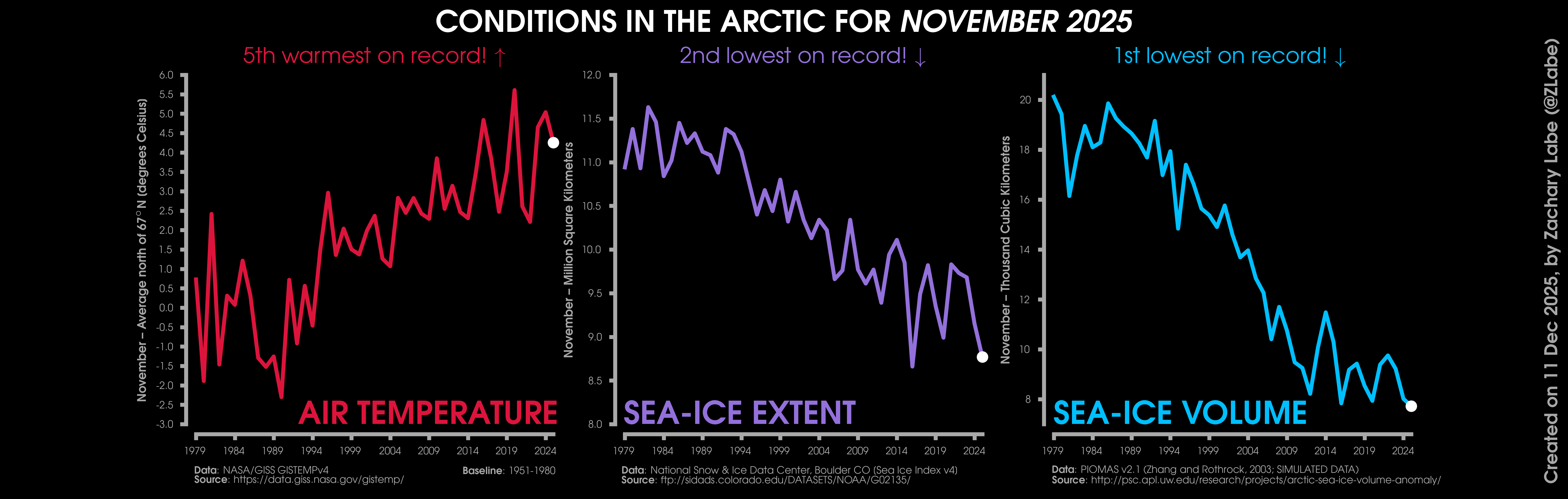
Changes in mean surface air temperature anomalies (GISTEMPv4; 1951-1980 baseline), mean Arctic sea ice extent (NSIDC; Sea Ice Index v4), and mean Arctic sea ice volume (PIOMAS v2.1; Zhang and Rothrock, 2003) over the satellite era. Updated 12/11/2025.
Now outside of the North Pole, the story is not any better. The total volume of Arctic sea ice last month set a new record for the lowest November in the PIOMAS dataset. Arctic sea-ice extent has also been setting new daily record lows for this time of year for weeks. At the same time, there have been numerous days with record high temperatures across the northernmost parts of the Arctic due to anomalous heat and moisture transport through the Barents Sea region. As discussed in my last blog (“October 2025”), the Arctic has experienced a historically poor start to the freeze season, particularly on the Atlantic side. The combination of record warmth and low ice puts the Arctic in a bad position heading into 2026. That said, as we know, weather conditions can change rapidly, so this does not tell us much about what summer 2026 will ultimately look like. But moving into the new year, there is a lot for climate scientists to be watching across the Arctic.
October 2025
Hi everyone! Instead of designing a new special feature visualization, this next ‘climate viz of the month‘ blog will focus on briefly summarizing the recent extremes in the Arctic. This may be a bit more provocative than my normal style, but I have been frustrated by how challenging it has become to get broader media coverage of some recent weather and climate extremes (like in the polar region). I have been posting near-real-time graphics of sea ice and other climate data on social media since the fall of 2016, and anecdotally (so take this with a grain of salt) the last few months are the first time that I can recall having difficulty generating more interest in these types of new data records. I acknowledge that I have the privilege of a large platform, and I am thankful for everyone who shares this work. However, it has become increasingly hard to reach beyond the climate-interested community lately. I am not proposing any hypothesis about why this is happening, and I am mostly using this blog as a small outlet to express that frustration. Maybe it is just a me problem! I also may be missing some of this coverage entirely. But we all need to vent once in a while…

Anyways, I wanted to highlight the recent records across the Arctic, including the exceptional warmth observed across the Arctic Circle in October. This is already a month that experiences strong warming due to Arctic amplification, and it is evident that the long-term trend continues to accelerate. The recent anomalous warmth was particularly pronounced near the North Pole and extended southward from the Canadian Arctic Archipelago toward the Barents, Kara, and Laptev Seas. In several areas, temperature anomalies exceeded 5°C above the 1981 to 2010 average. A number of daily temperature records were also set in early October across the northernmost latitudes (north of 80°N), driven in part by the poleward transport of heat and moisture from the North Atlantic Ocean.
It remains challenging to determine the exact direction of causality in these monthly mean maps. The relative warmth can suppress sea-ice formation along the outer ice edge, while the lack of sea ice can also enhance heat transfer from the open ocean to the atmosphere through turbulent heat fluxes. For instance, earlier this season we found record warm sea surface temperatures in the Kara Sea region in August. What is clear though is that sea-ice growth across the eastern half of the Arctic has been remarkably slow in recent weeks. Current sea-ice extent is at record low levels in regions such as the Barents Sea, as well as areas closer to Canada including Hudson Bay (almost no ice has formed yet) and Baffin Bay. Compared to any other year since at least 1979, the largest outlier this season is in Baffin Bay (located between Greenland and Ellesmere/Baffin Islands). So, it looks like it will be another December with a late ice freeze-up in these locations, which may affect the habitat for polar bear populations. This lack of ice in Canada can also moderate potential cold air outbreaks across eastern North America because the source region is relatively warmer, which is something to keep in mind for the longer-range outlooks. This is the time of year where a lot of people are tossing around winter outlooks for the United States, and in my view, it is crucial to take into account the background effects of our warming climate (due to the human emission of fossil fuels).
There has also been almost no southward expansion of the ice edge toward Svalbard so far this season. My animation of daily sea-ice concentration shows this influence of local weather conditions here around the marginal ice zone. While some of the recent ice retreat is linked to persistent southerly winds and wave activity that tries to push the ice edge poleward, there may also be contributions from deeper ocean heat (e.g., Atlantification). But it is impossible to separate these influences in real time due to the lack of spatially and temporally complete observations. We certainly need greater support for sustained Arctic data monitoring, particularly through moorings and buoys, in order to better understand these changes.
As of late November 2025, total Arctic sea-ice extent (taking into account all basins) is a record low for this time of year. The rapid changes in the Arctic will continue to produce wide-ranging impacts, and examining these local extremes provides critical insight into how this region is transforming.
The other side of the world has also observed some new climate records, including last month’s record warm October for the Antarctic Circle. Despite larger uncertainties in Southern Hemisphere data, multiple datasets now confirm this October record. I haven’t had the extra time to validate this statistic, but my sense is that it is quite unusual to have both poles set new temperature records at the same time. All in all, October 2025 was another very historic month for our climate.
Unfortunately, my Arctic climate dashboard remains unavailable. This is due to the recent pause in data from the near-real-time passive microwave satellite observations of Arctic sea-ice concentration. This gap is also preventing updates to Arctic sea-ice thickness and volume from PIOMAS, which appears to be connected to this same issue and the broader transition from SSMIS to AMSR2. I hope we receive an update soon, especially given the recent warmth across the Arctic and the already low average sea ice thickness observed in late summer. Until then, I am unable to update these visuals. It has been a very challenging year for maintaining, supporting, and developing these important climate datasets.
I hope everyone who celebrates Thanksgiving had a great one. As I mentioned earlier, I’m genuinely thankful for the opportunity to share climate science with such a broad audience – and even more thankful for your support along the way. Thank you for being here and keep telling these daily climate data stories.
September 2025
Hello! It’s the time of year again when I start showing the most dramatic maps of Arctic climate change. And most of my followers probably already know the associated headline: the Arctic is warming roughly 3 to 4 times faster than the global average. This is also referred to as Arctic amplification. However, the rate of that accelerated warming trend is not always the same throughout the year. In fact, in boreal fall (October to December) is when this rate of warming is even larger, especially over certain regions of the Arctic Ocean.
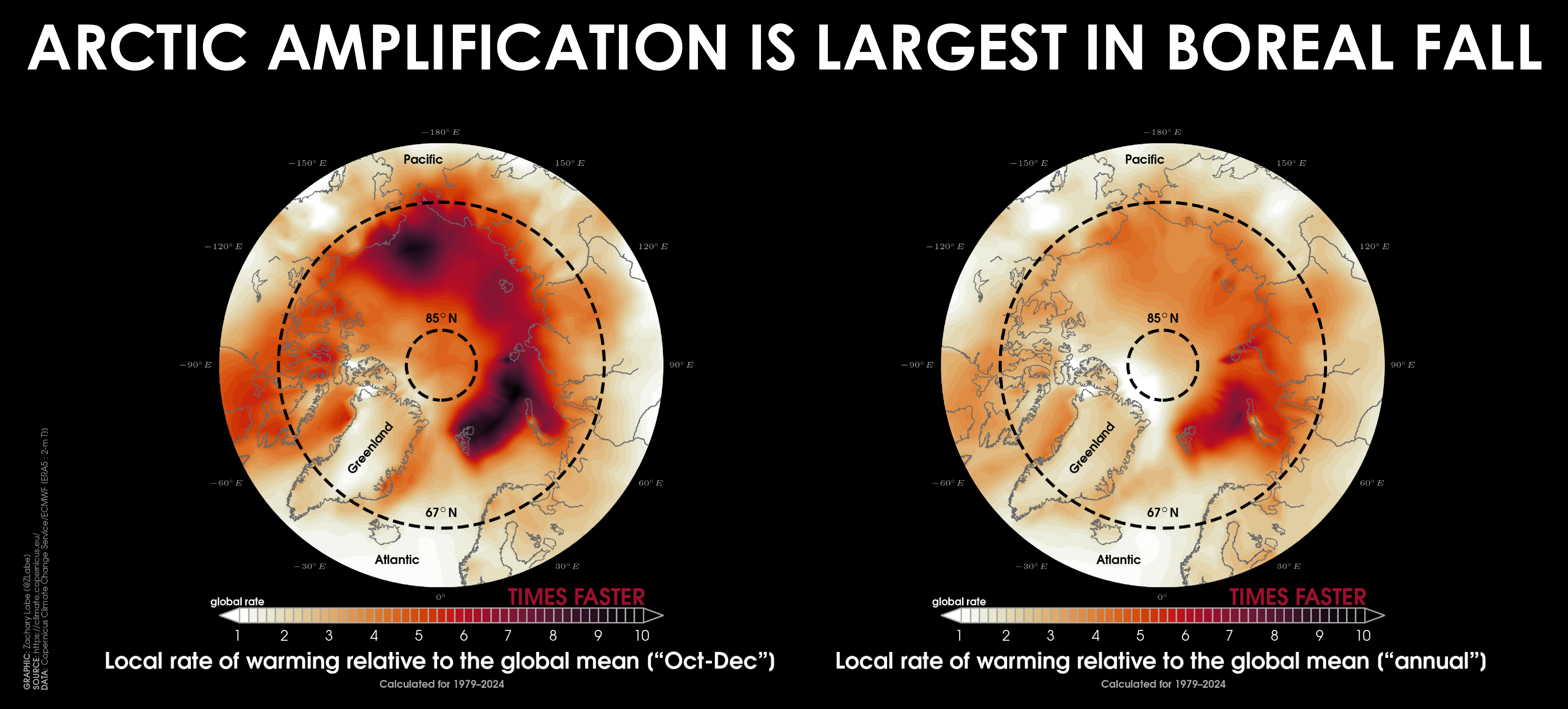
There are several reasons for this local maximum of warming in fall, but to keep it simple, it mostly stems from a single process – the loss of sea ice. Here is how that feedback works:
More and more sea ice melts in summer, exposing the dark ocean surface. Instead of sea ice reflecting that incoming sunlight, the darker ocean absorbs it as heat. As colder air returns in fall, that stored heat escapes upward into the overlying atmosphere. The temperature contrast between the ocean and air increases, leading to an acceleration of the heat transfer (known as turbulent heat fluxes). More atmospheric warming follows, which slows refreezing and sets the stage for even greater ice loss in the future.
This loop is one of the causes of Arctic amplification, though there are a number of other factors that contribute to the rapid warming (e.g., see Previdi et al. 2021). This extra heat doesn’t just stay put – it can influence regional weather patterns, terrestrial and marine ecosystems, sea-ice stability, and even the ocean circulation. We also see this warming and loss of autumn ice significantly affect Indigenous communities, which are seeing greater coastal erosion since the ice is no longer there to act as a buffer from strong storms bringing high winds, waves, and storm surge.
To visualize this seasonally accelerated warming in the above graphic, I calculated a local Arctic amplification factor using near-surface air temperature. This metric compares how much faster each location across the Arctic Circle is warming relative to the global average. Calculations are based on data from ERA5 reanalysis, with linear least squares trends expressed as local rates of warming relative to the global mean from 1979 to 2024. My visualization compares this for two cases:
Left: Warming rates during October-December Right: Warming rates for the full annual mean (averaging across all months of the year)
The contrast is dramatic. Nearly the entire Arctic is warming faster than the global mean, but in fall, the amplification spikes. Some regions are warming up to 10x faster than the globally-averaged mean surface temperature. These hotspots align with areas of long-term sea-ice decline, especially in the Chukchi, Kara, and Barents Seas. This includes in and around Svalbard. The rate of warming is smallest in summer, as any extra heat goes into melting ice.
I am very sorry, but I do not have an update for my Arctic dashboard this month, since data from NASA/GISS GISTEMPv4 and PIOMAS are temporarily not updating for temperature and sea-ice volume, respectively. This is due to the U.S. government shutdown. This is very unfortunate, since Arctic sea-ice volume is near a record low as of late summer, and we have also witnessed record warmth near the North Pole for the last few weeks. Other datasets providing Arctic sea-ice concentration are also temporarily on pause from the National Snow and Ice Data Center too. This data is critical to understand our changing planet, especially for sensitive areas like in the Arctic. In the meantime, my near-real time updates on current Arctic climate conditions will be on BlueSky/Mastodon.
August 2025
Well hello! Somehow another summer is already over across the Arctic. And once again, there were no new records for the annual minimum of total sea-ice area or sea-ice extent. Thickness might be another story though (we’ll talk about that later). This blog is mostly a recap of the past summer, but first I wanted to quickly highlight that we have a new book chapter published called “The Future of Sea Ice”. Unfortunately, the accessibility of the text is outside of my control (including for myself, sorry about that), but please reach out if you are interested. The review chapter summarizes the state of both Arctic and Antarctic sea-ice science. My favorite part is probably a little table that shows how projections of future sea ice have evolved from the very first Intergovernmental Panel on Climate Change (IPCC) report in 1990 all the way through to the Sixth Assessment Report. We close the chapter with this:
“The future of sea-ice research will be defined by our ability to synthesize across disciplines, scales, and knowledge systems. Success in predicting and adapting to polar change requires not only advancing the frontiers of science but ensuring that knowledge and data remain accessible and relevant to the communities and ecosystems most affected.”
I may circle back to this chapter in a later blog, but for now, let’s take a look at the most recent summer conditions across the Arctic.
My visualization for this ‘climate viz of the month’ blog shows changes in daily Arctic sea-ice concentration from 1 May 2025 to 15 September 2025 using a high-resolution algorithm (~3 km grid) from the AMSR2 satellite instrument. Note that there are some satellite-related artifacts along coastal regions that occasionally return false positive sea ice pixels, but you can mostly ignore them. I intentionally made the GIF animation speed really fast so that you can see how changes in weather affect patterns of ice movement and melt. This is common every summer. As a reminder, sea ice follows a seasonal cycle, growing through the winter to reach its maximum extent in March and melting through the summer to reach its minimum in September.
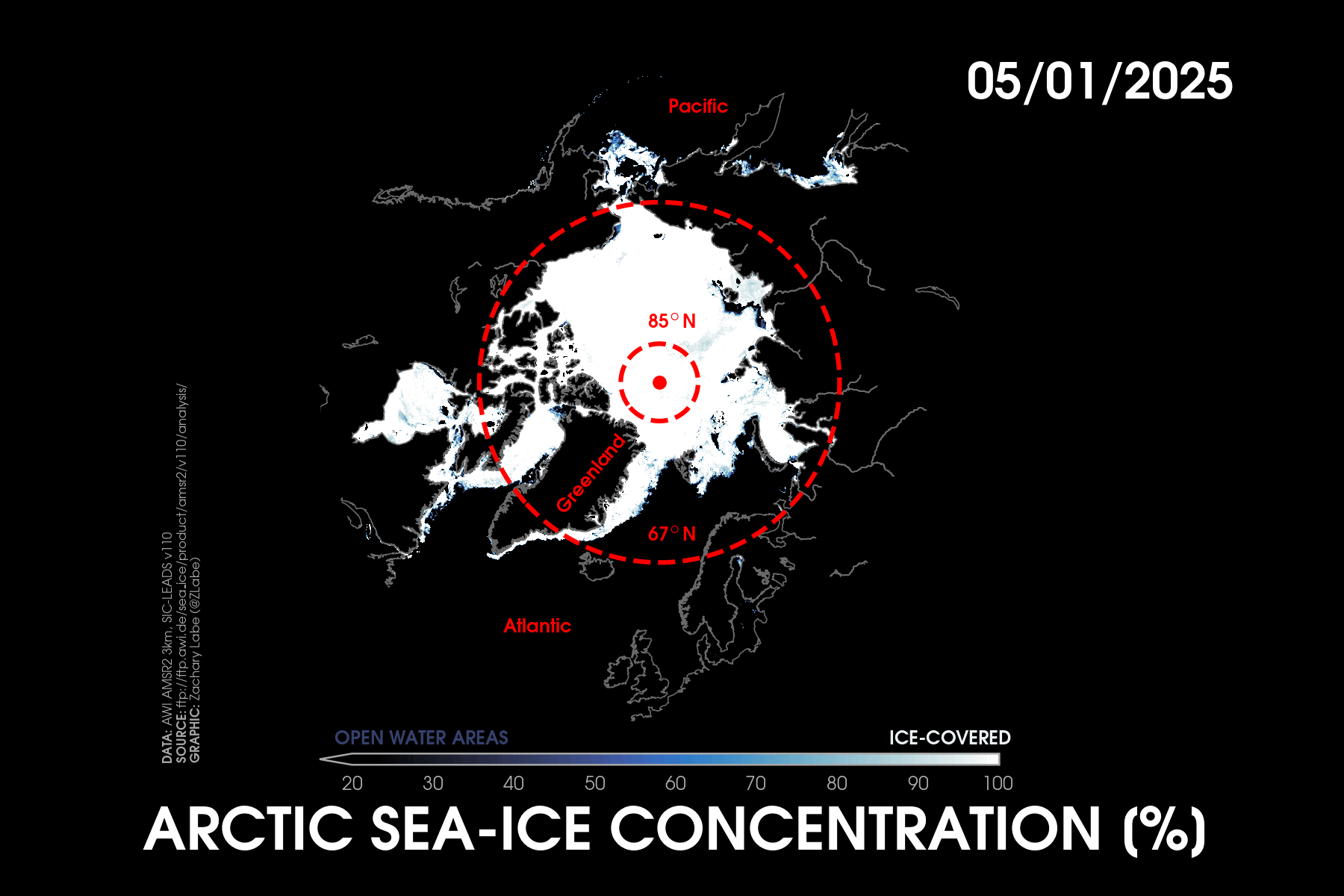
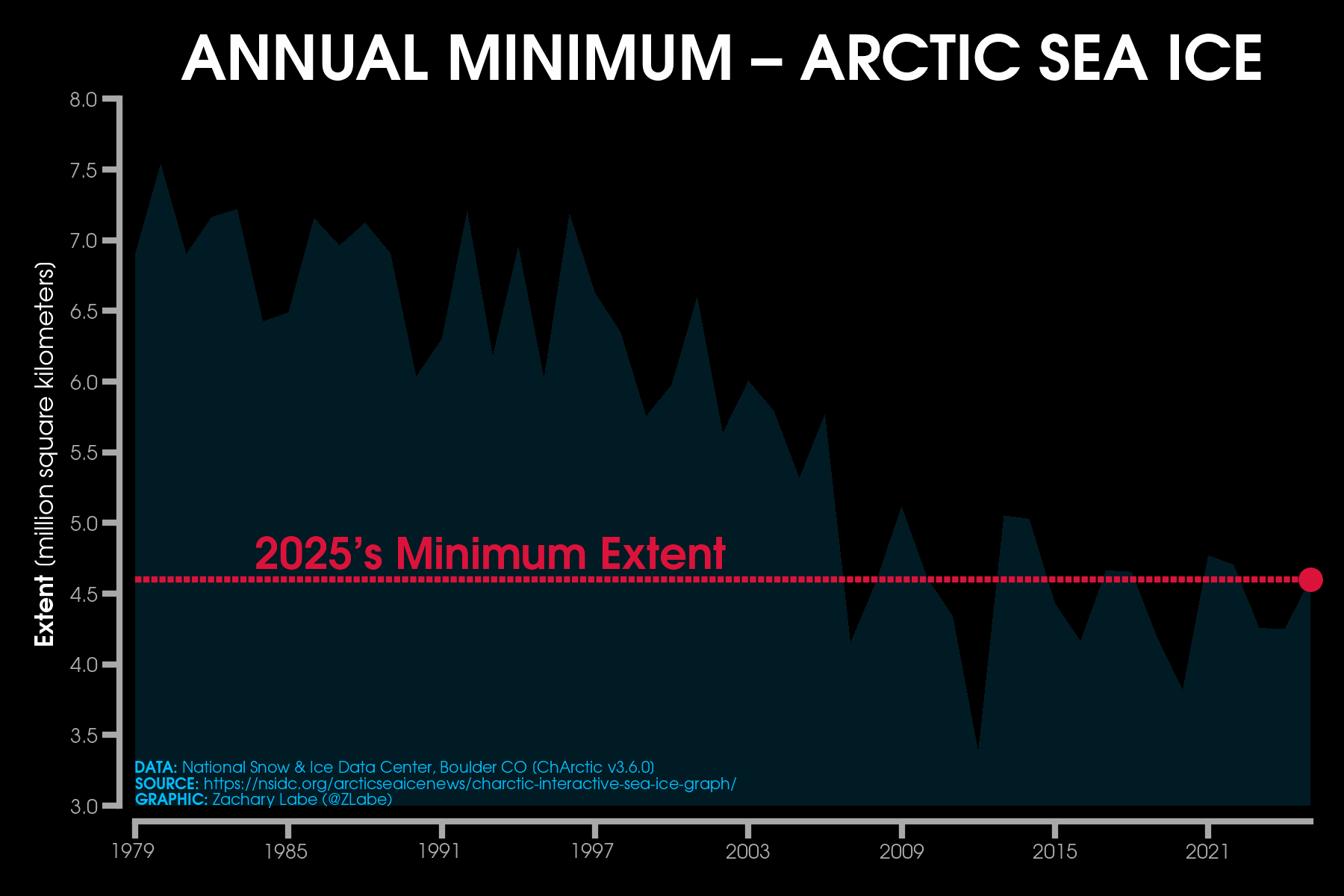
Preliminary data from the National Snow and Ice Data Center (NSIDC) show that this year’s annual minimum Arctic sea-ice extent was statistically tied for the 10th lowest on record, along with 2008 and 2010. For 2025, Arctic sea-ice extent fell to 4.60 million square kilometers (1.78 million square miles). This is approximately 1.62 million square kilometers (625,000 square miles) below the 1981-2010 average. The minimum on September 10th was set 4 days earlier than average. For context, last year ranked 6th lowest, while 2012 still holds the all-time record. As of writing this blog, daily sea-ice extent is still the 10th lowest on record (for the date) with the freeze season now well underway. This remains close to levels for the 2010s decadal average. This summer adds another point to the stretch of little-to-no trend in average summer sea-ice extent since the early 2000s. This is not necessarily a surprise. England et al. (2025) shows how internal variability can temporarily slow the pace of melt even in a rapidly warming climate. The opposite is also true: variability can accelerate ice loss, like around 2007. State-of-the-art climate models show these types of decadal swings fairly well. If you want a deeper dive into the science behind this temporary pause in summer sea-ice loss, I wrote a longer blog on it in March 2024 (https://zacklabe.com/blog-archive-2024/). In short, several factors may be at play, including cloudier and cooler summers, changes in ocean heat transport toward the pole, shifts in the large-scale circulation affecting ice drift, and feedbacks that allow thinner ice to regrow more easily.
It is only a matter of time before summer melt accelerates again. This is not a good news story, especially since the long-term downward trend remains clear throughout the rest of the year. Remember… earlier this year the Arctic set a new record low for maximum winter sea-ice extent. The connection between winter and summer ice is complex, but the overall trajectory is unmistakable. While some claim these short-term decadal shifts are unexpected, climate model large ensembles show otherwise. In my view, climate scientists should be using large ensembles for all future projections work, but I digress. Enough of the technical details. Here is a closer look at regional conditions this summer around the Arctic Ocean.
Melt in the Beaufort Sea was surprisingly slow to start this summer. Ice extent actually resembled conditions from the 1980s or 1990s during the months of June and early July. But eventually, significant melt ponding developed, setting the stage for accelerated ice loss later in the season. By late July, this melt really picked up north of Alaska and resulted in some areas of very low ice concentration, although total ice extent still remained higher than in many recent years. I suspect that at least part of the reason for the slower start to the melt season in the Beaufort Sea was related to an arm of thicker, older multi-year ice that was positioned across the basin and not too far off the coast of the North Slope in spring. Meanwhile, a low-pressure system over the Pacific side of the Arctic brought cooler and cloudier weather conditions, which acted to also limit ice loss into the East Siberian Sea for much of the first half of summer.
In contrast, the Kara Sea experienced near-record low ice cover throughout the summer. This coincided with record-high sea surface temperatures in the Arctic Ocean, with each factor amplifying the other. Northern Siberia also recorded August air temperatures more than 5°C above the 1981-2010 average. The result was extensive open water along the Atlantic and Eurasian side of the Arctic that would normally be ice-covered. Early melt was also observed in Hudson Bay and the Canadian Archipelago, including sections of the Northwest Passage that are nearly navigable for shipping (especially the narrower southern routes). And once again, the Northern Sea Route remained largely free of sea ice for navigation.
Regional extremes like those seen in the Kara Sea this year highlight that the Arctic is already dramatically different from past decades. In our upcoming sea surface temperature chapter of the Arctic Report Card (to be published in December 2025), we show how basins like the Kara Sea and Laptev Sea observed a dramatic change in the warming trend starting around 2007. On the other hand, there are no statistically significant trends in ocean temperature warming in summer for the Chukchi Sea basin.
Overall, my August 2025 data dashboard shows the Arctic was exceptionally warm on average (ranking 2nd in the ERA5 dataset) and featured particularly low ice volume. In fact, one of the key takeaways from this summer is ice thickness. Simulated data from PIOMAS and other models indicate record-low average thickness for this time of year. Heading into fall, we’ll begin receiving more satellite-derived thickness data, including from CryoSat-2, which will help confirm current conditions. On average, Arctic ice is about 1 meter thinner than the 1981-2010 mean in PIOMAS, and across regions north of Greenland and the Canadian Arctic Archipelago it is more than 2 meters thinner. Strong winds and waves dispersed some ice outward this summer, temporarily boosting area and extent, but the overall ice pack remained very thin and likely vulnerable to future breakup. Southerly winds near Svalbard and Greenland also limited ice export into the Fram Strait (affecting the amount of total sea-ice extent). This is a good reminder that while the atmosphere (ice top) and ocean (ice bottom) govern melting, the strength and direction of winds during an individual summer contribute largely to the orientation of the marginal ice zone and overall position and variability of the ice edge.
This all remains a clear signal of Arctic system change, driven by human-caused climate change from the emission of greenhouse gases. In the coming years, I expect that climate scientists will continue to study how natural climate variability interacts with long-term warming to shape summer weather patterns and ice conditions. The Arctic remains a complex system, and it’s important to communicate both the nuanced processes at work and the stark regional extremes we continue to observe, along with their far-reaching impacts.
I also want to end with a huge shout-out to the heroic efforts by the NSIDC this summer in developing the Sea Ice Index v4. Despite budget cuts, external pressures, and an absurd number of uncertainties and conflicting information regarding the DoD passive microwave satellite instruments, they did a tremendous community service in transitioning critical datasets to AMSR2 to avoid any data gaps. Well done – we appreciate you.
As always, thank you for taking the time to read and engage with my research. I truly appreciate your support. If you have been enjoying these climate data visualizations and would like to help sustain their infrastructure (and my daily caffeine intake), I have this coffee page: https://buymeacoffee.com/zacklabe. No pressure at all, your engagement means the most. Thanks again. You can find the full archive of my 2025 blogs here: https://zacklabe.com/blog-archive-2025/, along with all other years since 2022.
July 2025

Hi! Another summer is winding down, and once again the Arctic looks very different from the 20th century. Wide open areas of water now stretch along the entire Eurasian coastline, with most summers nowadays including an open Northern Sea Route for shipping. To look more closely at changes in the number of days with open ocean waters, this month’s “climate viz of the month” blog takes a quick look at these trends. I used the NOAA/NSIDC Climate Data Record of Passive Microwave Sea Ice Concentration (Version 5), focusing on daily observations from 1 January 1979 through 31 December 2024. To assess regional ice-free conditions, I am simply counting the number of days when each grid cell observes a sea-ice concentration of effectively no ice (<1%). I tested the more standard threshold of 15%, but the differences in counts were fairly negligible. I then calculated the linear least squares trend across these annual counts from 1979 to 2024 to produce the map shown here.
Unsurprisingly, the patterns of changes in ice-free days are highly regional and match closely with my standard long-term sea-ice concentration trend maps. This metric is especially helpful for thinking about impacts, since it’s often easier to picture “more open water days” than changes in ice concentration percentages. More open water in the Arctic is leading to accelerated warming (i.e., Arctic amplification), and contributes to habitat loss, coastal flooding and erosion, more shipping and resource drilling, shifts in marine food webs, and consequences for Indigenous communities that rely on ice for travel, hunting, and cultural traditions. Many regions of the Arctic Ocean are seeing an increase of 5 to 15 additional open-water days per decade. In parts of the Barents Sea, the increase is even more dramatic, with more than a full month each decade. This translates into several extra months of open water compared to the 1980s. There are, of course, caveats to this map, as my method was just a basic count and likely overestimates the actual changes in ice-free days, partly due to the linear trend assumption over the 46 years. If you are interested in this type of metric, I recommend checking out Crawford et al. 2021.
Does this way of looking at Arctic change resonate with you? If so, I’d be happy to spend more time refining the definition and adding some new visualizations to my resource pages.
In the meantime, here’s my latest overview of Arctic climate conditions in the last month.
July temperatures averaged across the Arctic Circle in 2025 were rather unremarkable compared to some recent years. This was partially related to a strong contrast in the pattern of temperature anomalies, with cooler-than-average conditions in the Canadian Arctic Archipelago and warmer-than-average temperatures across the Eurasian coast and northern Siberia. Temperatures were also well above average over the highest portions of the Greenland Ice Sheet, with readings even approaching the freezing mark in mid-July at Summit, Greenland. This heat wave over Greenland also contributed to a rapid decline in surface albedo (reflectivity), with near-record low values as fresh snow rapidly melted and left a very dark surface. A darker Greenland surface can accelerate warming as more sunlight is absorbed.
Persistent ice across the Beaufort Sea continued through July 2025, with total ice extent over the region actually matching levels seen in the 1980s in early July. This regional anomaly is especially remarkable given the long-term trend of declining sea ice. While sea-ice concentration has continued to drop over the Beaufort Sea (especially now in mid-August), it is likely that some of this ice will prevent new record lows from occurring this September during the annual minimum. The reason this ice has been slow to melt (along with parts of the East Siberian Sea) is due to the recent position of the large-scale atmospheric circulation, as well as extensive areas of older multi-year thick ice.
Elsewhere across the Arctic, sea ice is quite low. In fact, the Northern Sea Route is open for travel, as are portions of the Northwest Passage. Another point worth noting is that average Arctic sea-ice thickness and volume dropped to record low levels by the end of July, according to the PIOMAS dataset. This suggests that even though total sea-ice extent will not set any new records this summer, ice thickness remains shockingly low compared to only a few decades ago. I will have more to say about this summer’s Arctic sea ice conditions later in the fall, along with some commentary on how this aligns with the excellent new paper by England et al. (2025). Note that many of my previous blogs have highlighted the importance of recognizing both long-term climate change in the Arctic and the influences of internal climate variability.
June 2025
Hello! My latest ‘climate viz of the month’ dives into another method of visualizing temperature anomalies, which is particularly helpful for understanding regional change. As a reminder, the word “anomaly” is a bit of jargon – climate scientists use it to refer to a departure from average. Typically, that average is calculated over a 30-year period, such as 1981-2010 or 1991-2020. There is no right or wrong 30-year period, and different scientific institutions around the world use different baselines. For example, the maps in this visualization compare temperatures to the 1951-1980 reference period, which is the standard used by Berkeley Earth (the source of the data here). Unfortunately, some of my climate-informed readers send me very angry messages about the choice of reference period, so I’ve written more about this on my Frequently Asked Questions page… I swear there is no conspiracy here.

Anyway, the right-hand column here shows the temperatures at every point on a map for 2024 (top) and 1997 (bottom), compared to their averages calculated from 1951-1980. Any areas shaded red are warmer than the 1951-1980 mean, and blue areas are colder. Reference periods just change how “red” the maps appear (i.e., the magnitude of the anomaly) because of the long-term warming trend from human-caused climate change. Although it’s only two years, comparing 1997 and 2024 clearly shows how much the climate has warmed, especially given that 1997 was transitioning into a super El Niño year. El Niño years (warming of the equatorial Pacific Ocean) are typically warmer globally as excess heat from the ocean is released into the atmosphere. So, even in a strong El Niño year like 1997, we see that 2024 is much, much warmer around the world. This is another striking indicator of global climate change.
As the climate continues to warm, these temperature maps will become even more red. This makes it difficult to see the regional differences, which are crucial since regional variability reflects actual societal impacts. After all, we don’t live in the global mean. One method that climate scientists use to better visualize these regional anomalies is by removing the global mean from each point on the map. Using this approach, the red and blue shadings now reflect the relative anomalies compared to the global average. This is a very simple but powerful way to highlight spatial patterns and regional contrasts. This type of information is helpful for things like regional adaptation planning, timing of emergence, and capturing extreme events.
The left-hand side shows these maps with the global mean removed for 2024 (top) and 1997 (bottom). Now we can see some very interesting features emerge. In 2024, land areas were warmer than the global mean, especially across the higher latitudes of the Northern Hemisphere. An Arctic amplification signal is also visible, even in this single year, with some of the largest deviations around Hudson Bay and the Canadian Arctic Archipelago. On the other hand, some of the coldest conditions relative to the global mean were across the southeastern Pacific Ocean (a very marginal La Niña year).
I selected 1997 to compare with 2024 to show an example of this approach for better distinguishing the strong El Niño pattern… though admittedly, this signature is quite visible in the regular temperature anomaly map on the right too. Globally, 1997 was a much cooler year than 2024, and this regional variability is more clearly reflected across land areas of both the Northern and Southern Hemispheres. Notably, the Arctic warming signal is absent in 1997.
As the climate continues to warm, it may become increasingly helpful for climate scientists to visualize global temperature anomalies by removing the global mean. This is important because regional anomalies, especially in fields like sea surface temperature, are useful for identifying forecasts of opportunity in subseasonal-to-seasonal (S2S) climate prediction. This approach is already being considered for better capturing El Niño–Southern Oscillation (ENSO) events, such as using the Relative Oceanic Niño Index (RONI) method to help isolate long-term tropical warming.
Let me know what you think about this approach for visualizing regional climate anomalies! Though to be clear, I fully recognize that these maps aren’t necessarily the most helpful or accessible way of communicating to broad audiences.
Now, shifting to the Arctic last month (June 2025), temperatures were unusually cool compared to recent years. This was due to the state of the large-scale atmospheric circulation, with lower sea level pressure across the North Atlantic extending into Eurasia. The phase of the N(AO) was slightly positive in June. While daily sea-ice extent set some new record lows during the month, this was mostly due to a quick melt-out in Hudson Bay and the Kara–Laptev Seas region. In contrast, sea ice remains unusually extensive across the Beaufort Sea. This is due to a large arm of thicker, older sea ice, which takes a lot more energy to melt. Given the orientation of this multi-year sea ice, it is unlikely that this summer will see a new record low in September. Sea ice is thinner than average across the rest of the Arctic Ocean, however, and total ice volume was the second lowest on record for June.
Lastly, I still don’t think any of us know what will happen to some of these key datasets after the transmission of SSMIS stops at the end of the month. Stay tuned. 😦
May 2025
Hi! Over the last few months, we’ve been working on a new book chapter about the future of sea ice at both poles. Since it is also the summer melt season in the Arctic, I thought it would be fitting for this month’s climate viz to spotlight future projections of Arctic sea ice. One of the top questions I always get is: “When will the Arctic be ice-free?” As you will hopefully see, that is a surprisingly tricky and uncertain question to answer. I’ll be sure to share the book chapter once it is out, as it dives much deeper into all of this.
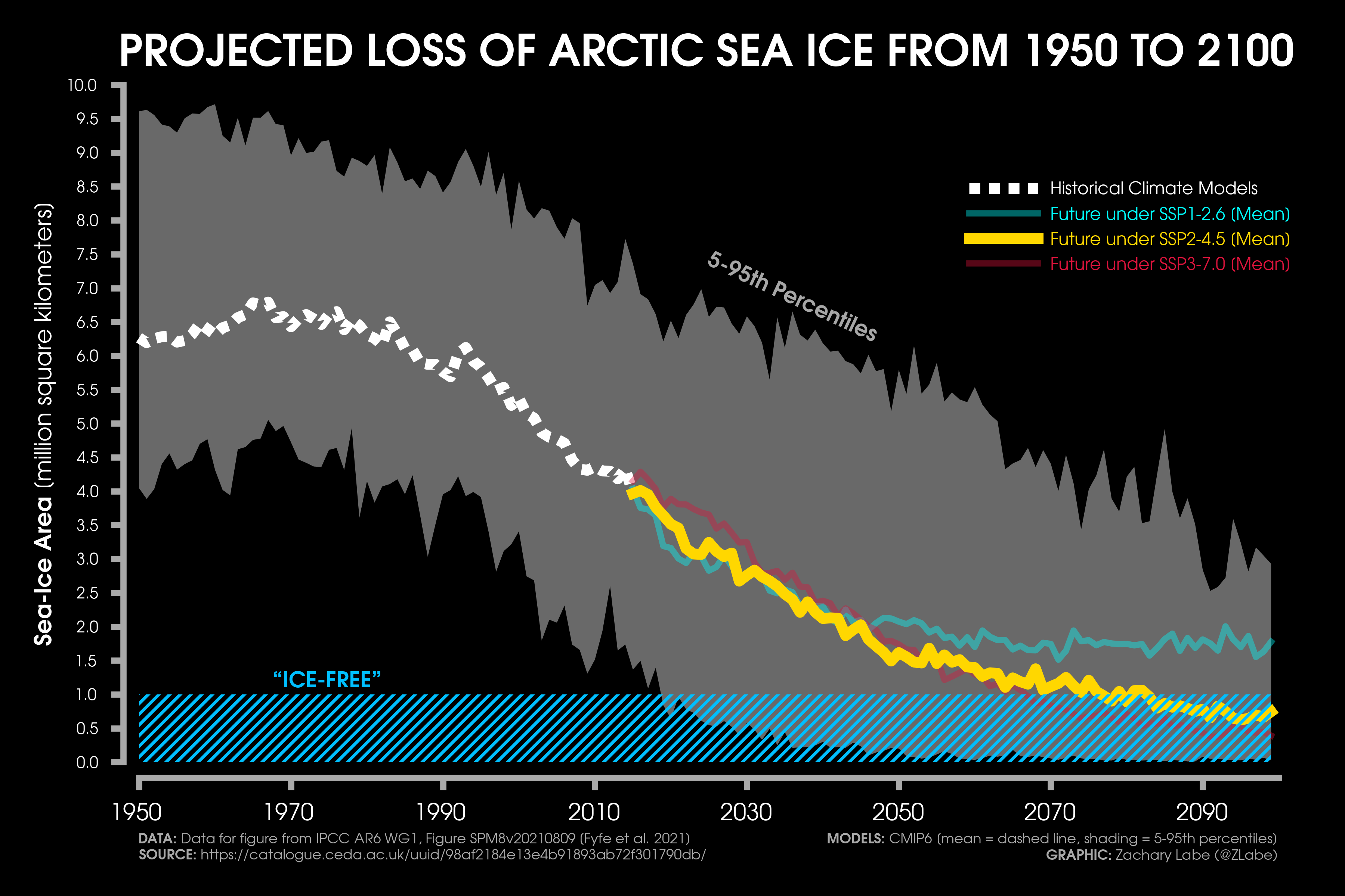
This visualization shows data using state-of-the-art global climate models from the Coupled Model Intercomparison Project Phase 6 (CMIP6). Scientific institutions from around the world contribute to this collection of climate models (CMIP) and support each new assessment report from the Intergovernmental Panel on Climate Change (IPCC). While model development for the next generation is currently underway (i.e., CMIP7), this graphic represents our current state of understanding via climate model output. Of course, dozens of studies have also been written to refine this sea ice data even further, such as using emergent constraints, model weighting, or statistical recalibration; there is no agreement in the literature on the best approach. An excellent review paper on this topic can be found in Jahn et al. (2024).
There are three key sources of uncertainty in assessing the timing of the first ice-free summer in the Arctic:
- Year-to-year variations in summer ice conditions are highly dependent on regional weather conditions (i.e., internal climate variability). This cannot be predicted at long lead times, and some estimates suggest this leads to ice-free approximations with nearly 1-2 decades of added uncertainty. I have talked about internal variability quite a lot before, as this is such an important topic in understanding future climate change and local risk assessments. It is also likely one reason that we have not observed a new summer sea ice record in well over a decade.
- As I mentioned earlier, there is no agreement on the best approach to project changes in future sea ice. This is partially due to significant climate model uncertainties (e.g., biases and structural issues between different models). However, it is also unclear what the best method is to post-process this data. There have been even some attempts to only leverage statistical models to predict the future ice state based on known relationships identified in the historical record. However, these statistical models have their own issues. For example, linear, quadratic, and exponential functions that extrapolate into the future do not properly account for key sea ice processes and feedbacks or natural variability. My personal recommendation is to lean away from these time series predictive models.
- The decision is up to us – humans and society. In climate model terminology, this is also known as scenario uncertainty and is related to the exact trajectory of future greenhouse gas emissions (and aerosols). These decisions will play a huge role in how the Arctic might look later in the 21st century. I should also point out that there is a significant amount of research that shows we are not locked into a future ice-free Arctic quite yet if dramatic reductions to the burning of fossil fuels are made. It is not too late.
To help address some of these uncertainties, climate modelers run their experiments to account for a range of future climate scenarios (i.e., different levels of greenhouse gases) as well as design large ensembles to capture the noise of the climate system (i.e., internal variability). However, when thinking about an ice-free summer, there are even questions about what the correct definition of this might be. Historically, climate scientists have referred to an effective “ice-free” summer when ice extent drops below 1 million square kilometers. This is generally because some small areas of thick ice will be slower to melt north of Greenland and the Canadian Arctic Archipelago. But more recently, some research has focused on “sea ice area” as a better indicator for monitoring this metric. And I am not even mentioning the uncertainty related to using different satellite-observation products!
There are also questions about the timing. It is extremely possible that the first ice-free summer may occur many years (or even decades) before summer conditions repeatedly fall below this threshold. This is again due to internal climate variability. In other words, the first ice-free summer could be an outlier due to an extreme weather or climate event.
And finally, in many ways the timing of an ice-free Arctic is only a communication or policy statistic. The measure alone does not represent a change to the physical climate system (or tipping point). In other words, there is essentially zero difference in impacts between 1.5 million square kilometers of sea ice versus 1 million square kilometers. Of course, the records get the media headlines, but my consistent science communication approach has been to instead highlight the impacts of the long-term decline. The Arctic has already rapidly changed. This is impacting people and ecosystems now. If we wait longer to address human-caused climate change, these impacts will amplify significantly. The time to address this is now.
Before I wrap up, I should probably describe this visualization a bit better, which is a reproduction of Figure SPM8 in the IPCC’s AR6 WG1 report. The spread across climate models is shown with gray shading for the 5-95th percentiles, and the mean is shown with the dashed or solid lines. I show three different future climate scenarios (called SSPs), but I focus on the gold line which is the most realistic future pathway that is called SSP2-4.5. It is important to note that the real world will NOT follow the mean. Reality will look much more variable. Sometimes it will be above the mean, and sometimes well below the mean. As you can see, there is a big range in when sea ice area is projected to drop below 1 million square kilometers. In future blogs, I will further explore how the real world might look compared to the multi-model mean.
In summary, we do not know exactly when the first “ice-free” summer in the Arctic will be. This is due to many uncertainties, both in the science and communication of it. A goal of mine in the coming year is to provide more visualizations and communication tools around this important future Arctic question (see some here). But for now, this line from the IPCC Summary for Policymakers continues to represent the state of the science well:
“The Arctic is likely to be practically sea ice-free in September at least once before 2050 under the five illustrative scenarios considered in this report, with more frequent occurrences for higher warming levels.”
Now I will turn to a summary of Arctic conditions from May. Near-surface air temperatures across the Arctic were above average in May 2025, from Greenland to the Barents Sea region and west/central Siberia. Some of the largest warm anomalies (departures from average) were across north-central Siberia near the Laptev Sea coast, with deviations of more than 5°C above the 1981–2010 average. Cooler conditions were observed over the Bering and Chukchi Seas region, including along the North Slope of Alaska. However, this has rapidly switched in June, with quite persistent warmth over this same area.
I have a regional breakdown of Arctic temperature statistics on my website, which highlights that near-record warm conditions were found in the northernmost region of the Arctic in May. This is also consistent with early sea ice melt in this area. Sea ice melt has accelerated over the last few weeks and is now the lowest on record for the date. This is especially notable given that May tied for the 7th lowest sea ice extent on record. However, PIOMAS data continues to show that sea ice remains quite thin. In fact, May 2025’s average sea ice volume was the 2nd lowest on record. Some of the thinnest ice, relative to average, is around the Kara and Laptev Seas, contributing to early melt in these regions as well.
As we are now moving into the peak melt season, a big question is always whether this year will break 2012’s record. Unfortunately, this is nearly impossible to answer at this stage. Despite the clear long-term climate change trends across the Arctic, year-to-year fluctuations are highly dependent on regional weather conditions. For example, 2012’s record low was influenced by a strong Arctic cyclone that broke up the ice. This type of weather phenomenon is not possible to predict this far in advance. So, for now, we will just have to keep an eye on how conditions unfold and whether the temporary slowdown in September ice extent continues for another year or not.
Of course, I must also acknowledge a key data challenge for the weeks and months ahead. The Department of Defense (DoD) announced it will no longer process passive microwave satellite data (SSMIS) after 30 June 2025. Most sea ice products (e.g., NSIDC’s Sea Ice Index and the NOAA/NSIDC Climate Data Record of Passive Microwave Sea Ice Concentration) use SSMIS data, and therefore a significant gap in our observing ability is about to occur. There are some alternatives, such as JAXA’s AMSR2, but it will take time to create data products that serve the same purposes as SSMIS. As for my visualizations, I have already been using JAXA data for quite a few. These graphics are therefore not affected, and I will continue to update them in near-real time as usual.
At this stage, the only thing I can say is that this is a tragedy. I am so sorry we are now in this situation. The SMMR and SSM/I–SSMIS data are the reason we know that Arctic sea ice is declining. They have provided us with a temporally and spatially consistent record of change since the late 1970s. This data is also used by many outside of just the physical sciences, ranging anywhere from Indigenous communities to marine fisheries to industrial shipping.
We need more data, not less, to understand Arctic system change. And these decisions to eliminate this key data source affect everyone around the world.
Please have patience as we figure out this ever-changing situation and try to limit sea ice data gaps as much as possible. I’ll be sure to post updates on changes to my sea ice graphics on social media, but for now, the JAXA-based visualizations should be sufficient to at least monitor daily pan-Arctic conditions.
April 2025
Hi again! My next ‘climate viz of the month blog’ takes a look at a key change to the Arctic cryosphere, and one that I probably should mention more often: changes in springtime snow cover. But before I get started, I want to give a special shout-out to those that have contributed to my new Buy Me A Coffee. It’s very much appreciated, so thank you!
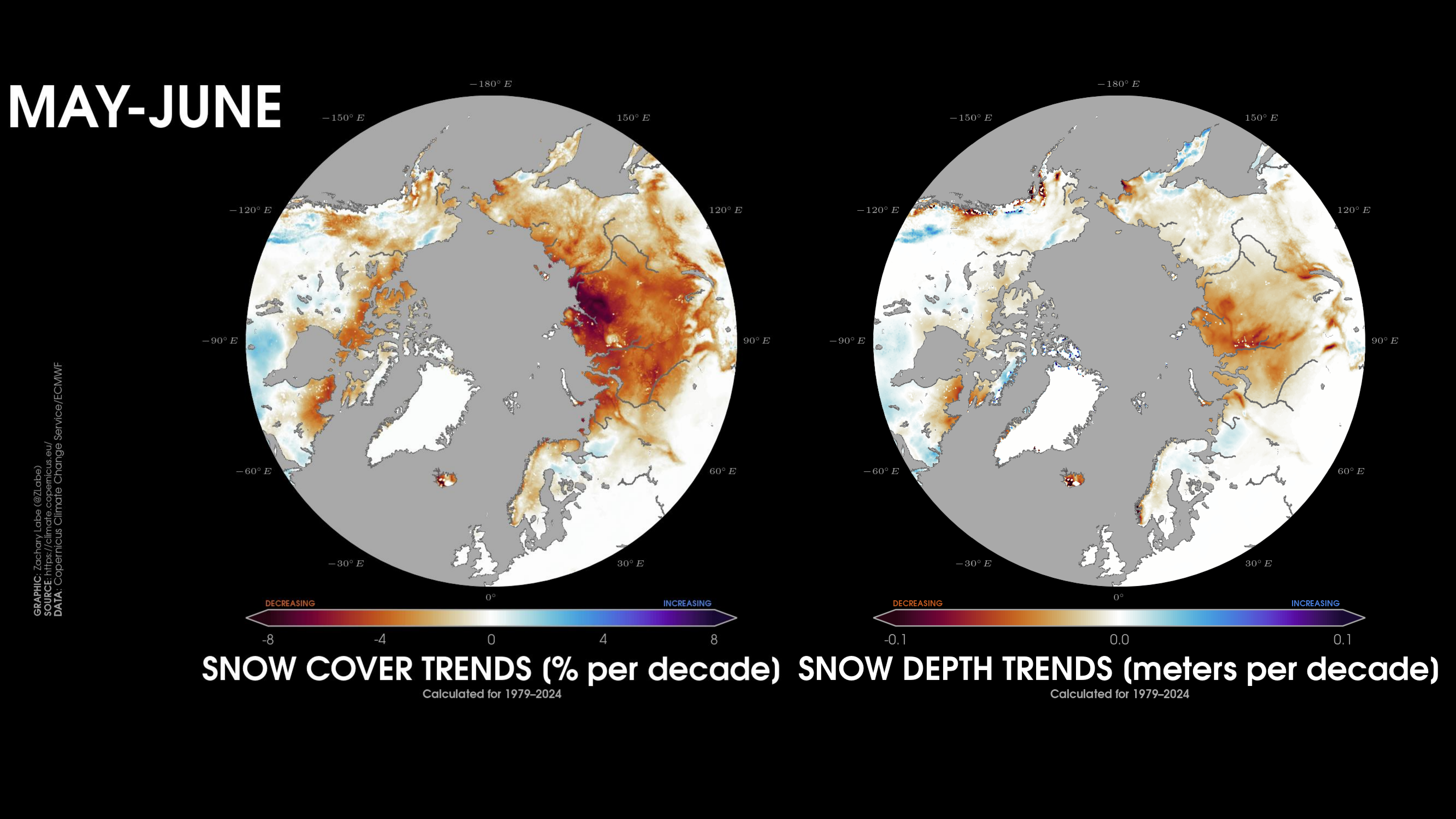
This month’s visualization shows two side-by-side maps, which reflect changes in some properties of snow during the months of May and June. This includes the trend in regional snow cover (left) and the trend in regional snow depth. Another useful metric for understanding changes to snow is the “snow water equivalent,” so I should probably include that one as well in the future. Here, the trends are calculated during the satellite-era from 1979 to 2024 for each point on the map. The data is provided by ERA5-Land reanalysis. This dataset is similar to the standard ERA5 reanalysis by the ECMWF, but it focuses on simulating land fields at the particularly high spatial resolution of 0.1° by 0.1° (latitude by longitude). This helps to better resolve coastlines and topography, as well as other key land properties and variables. For these two maps, I use a diverging colormap, where red shading indicates a decrease in snowfall. This color choice is intuitively meant to associate red with being warmer and thus melting snow.
Snow is a particularly challenging variable to observe in our historical record, so it is important to mention that there can be significant differences between reanalysis products and even across different satellite-based observational data. When looking at these graphics, I would focus on the bigger regional patterns, rather than the local fine-scale details. Overall, the message is pretty clear though… snow is declining around nearly the entire perimeter of the Arctic Ocean during the spring season. This is especially striking over north-central Siberia, such as along the coastline of the Laptev Sea and near the Lena River Delta. Significant losses of snow cover are also found in the northern Canadian Arctic Archipelago, and if you look closely, you can also see losses of snow around the coastline of the Greenland Ice Sheet. Unsurprisingly, there is still quite a bit of spatial variability, which is important to keep in mind for any analysis of long-term climate phenomena.
Changes to springtime snow cover have many significant impacts to the Arctic region. These impacts include effects on freshwater availability, soil moisture conditions, permafrost thaw, river discharge, vegetation growth, wildfire risk, and consequences for animals that depend on stable seasonal timing. Summers with high wildfire and drought risk across the boreal and tundra regions are almost always linked to an unusually early reduction in springtime snowfall. In fact, many of the recent extreme heatwaves in Siberia were directly tied to a lack of spring snow that subsequently fueled the dry soils that then accelerated land-atmosphere heat flux exchanges.
Another major consequence of this decline in snow cover is directly linked to the dramatic changes in the snow-ice-albedo feedback. Snow is an extremely bright and reflective white surface (i.e., a high surface albedo) that reflects a significant amount (nearly 90%) of incoming solar energy (sunlight/heat). As the snow melts due to the shorter winter season, the albedo of the surface begins to sharply decrease as more and more ground is exposed from snow-free conditions. This contributes to a warming of the surface, which leads to more melting and heat. There’s that positive feedback again that results in Arctic amplification. Changes in spring snow cover play a key role in this feedback loop and are a crucial part of the changing Arctic cryosphere.
For an updated annual assessment of terrestrial (polar) snowfall, I recommend checking out the NOAA Arctic Report Card: https://arctic.noaa.gov/report-card/report-card-2024/terrestrial-snow-cover-2024/. Interestingly, trends in Northern Hemisphere snow cover are not always as intuitive as spring (i.e., warmer temperatures lead to earlier snow melt), but that’s a story for another day.
In summary, there has been a rapid reduction in the extent of snow cover across the Northern Hemisphere in May and especially June. Some of the largest reductions in terms of snow depth have occurred along the Laptev Sea, which directly correlates with recent increases in wildfire risk and extreme summertime heat. Earlier snow loss has significant consequences for marine and terrestrial ecosystems, as well as available freshwater. Given the major uncertainties in this important climate variable, especially for metrics like snow water equivalent, we need more research and funding support to develop new observational products to improve data accuracy and geographic coverage. We also need more research on ground truth validation of this snow data from summer fieldwork stations across the region. This will be increasingly critical as the Arctic continues to warm at an alarming rate… our planet’s refrigerator. Going forward, I will also try to provide more updates on this key climate change indicator.
April conditions were unusually quiet across the Arctic, with the rate of sea-ice extent decline particularly slow compared to other Aprils in the historical record. However, sea ice remained much thinner than average, which contributed to sea-ice volume being the 2nd lowest April on record in the PIOMAS dataset. These conditions have rapidly changed now in May, as the rate of ice decline started to rapidly accelerate across the Arctic. This is partly in response to a number of very warm days across the northernmost areas of the Arctic during the first two weeks of the month. If you check out my real-time Arctic sea ice page, much of this decline is coming from across the Siberian Arctic. In fact, it’s the earliest start to the melt season in this basin in the satellite-era record. However, It’s still too early to say how the summer melt season will more broadly unfold. This is definitely not a good start though. I will have more information on this subject in upcoming blogs and social media posts. Stay tuned.
March 2025
Hi! It is great to be writing here again. Welcome to my ‘climate viz of the month’ blog, which disappeared for a little while — for reasons I’m sure you can guess. Over the last couple of weeks, I have been adding quite a few new climate graphics, especially for real-time visualizations of global temperature. Check them out at https://zacklabe.com/climate-change-indicators/ and let me know what you think! I am always open to suggestions for weather and climate visualizations to add, so feel free to reach out any time. Lastly, I recently set up a Buy Me a Coffee account… just giving it a try. If you are enjoying my science communication work, you are welcome to support it here: https://buymeacoffee.com/zacklabe. No pressure at all, and thanks for following along! I’m now more motivated than ever to communicate evidence-based weather and climate data as a critical tool in addressing global climate change.
Edit (4/22/2025): Happy Earth Day 2025! It is especially important to recognize it this year to celebrate the history of environmental protection and action. I’ve also included an update to my annual Earth Day climate graphic, which shows the big challenge ahead of us.
This month’s visualization is my own version of a timeline of global change. In future iterations, I am hoping to add some annotations like for volcanoes and major El Niño-Southern Oscillation (ENSO) events. Using data from version 6 of the NOAA Merged Land Ocean Global Surface Temperature Analysis (NOAAGlobalTemp; Yin et al. 2024), I am showing global mean surface temperature anomalies for each month and year from January 1850 through December 2024. In climate science, an anomaly refers to a deviation from a reference point. Here the reference is using a “pre-industrial” baseline averaged over 1850-1900. Pre-industrial is in quotes, as one can make an argument that this doesn’t actually represent the earliest period useful for quantifying total temperature change (e.g., Hawkins et al. 2017). However, 1850-1900 is more understood along the lines of the Paris Agreement thresholds, and 1850 is also the earliest year of data available from NOAAGlobalTemp. Colors that are red indicate warmer than average conditions, and shading that is blue indicates colder than average conditions. Of course, the story is obvious. Our planet is warming due to human-caused greenhouse gas emissions. This is indisputable, and I wish we still didn’t need to keep saying this. But given the times, so it goes.
Now that we got that out of the way, there are plenty of other interesting features within this visualization. For example, the global imprint resulting from the strong El Niño of 1877-1878 is quite striking (read more about that event in Huang et al. 2020). The early 20th century warming is also evident, which is related to a number of causes (e.g., Hegerl et al. 2018) – some of which may be methodological uncertainties in sea surface temperature data (Chan and Peter, 2021; Sippel et al. 2024). Visually, using this color scale, the 1997-1998 super El Niño is actually quite washed out compared to early 2016. It’s also a bit hard to see just how remarkable (in a scary way) the global warmth was in 2023 and 2024, where several months averaged at or above 1.5°C above pre-industrial levels. Perhaps I should annotate these in my next version of this graphic too given how it blends into the black background… open to ideas! What other physical climate science phenomena do you see represented through this graphic of monthly global temperature?
In the Arctic, we are now underway in the sea-ice melt season. This is after setting a new record low for this winter’s annual maximum. Recall that Arctic (and Antarctic) sea ice has a strong seasonality and expands each winter until the maximum which usually occurs in March. The corresponding minimum is then at the end of the melt season in September. The long-term net declining trend is therefore a result of more ice being lost during the summer than can regrow during the winter.
During the 2024-2025 winter, sea ice was anomalously low and completely absent along almost the entire ice edge. This is a somewhat unusual spatial pattern, as typically sea-ice anomalies in winter are confined to only a few regions and not necessarily the entire ice edge. The low Arctic sea-ice extent also coincided with thinner than average ice across nearly the entire Arctic Ocean. This contributed to total Arctic sea-ice volume falling to around the 2nd lowest on record for this time of year. The winter has also been incredibly warm – well compared to a typical Arctic winter that is. This was partially due to a number of extreme poleward heat and moisture transport events from the north Atlantic and into the Arctic Ocean through warm air advection and occluding extratropical cyclones. In fact, the early February event brought temperatures to nearly the 0°C/32°F freezing point around the North Pole for a few days.
In summary, this was a winter to remember for unusual warmth and low sea ice across the Arctic Circle. Unsurprisingly, this is entirely consistent with human-caused climate change projections, and we can anticipate an increasing probability for these types of winters to occur in our future. The Arctic remains a very different place than just a few decades ago, and I personally agree with the characterization of “a new Arctic regime.” However, despite these conditions this past winter, many open questions remain for what this means for the 2025 annual minimum. This high uncertainty is due to the importance of summertime weather conditions impacting sea ice, which is still quite difficult to predict in our seasonal forecast models. Stay tuned!
Other Blogs (Monthly):
My visualizations:
The views presented here only reflect my own. These figures may be freely distributed (with credit). Information about the data can be found on my references page and methods page.